Winclap
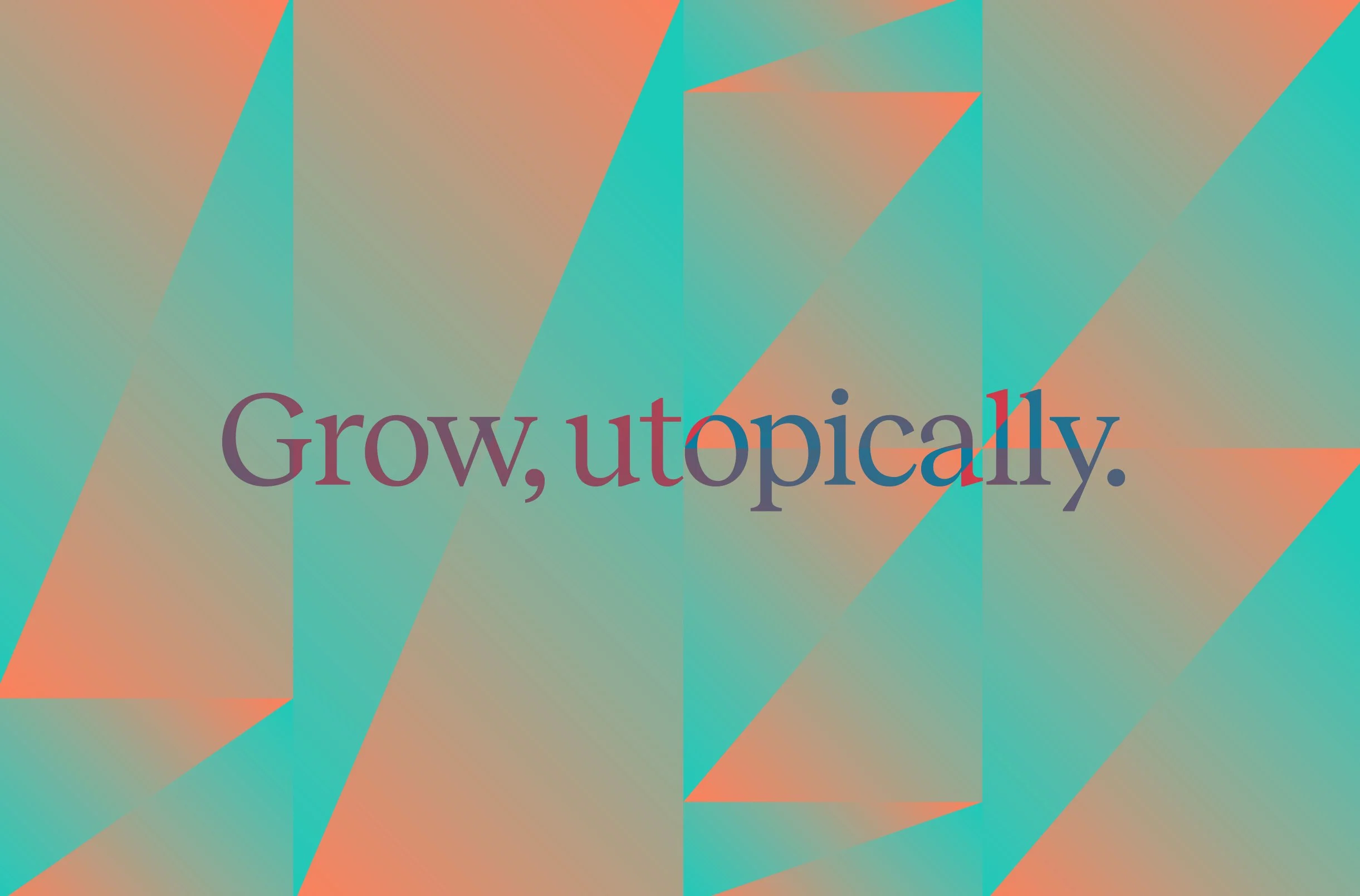
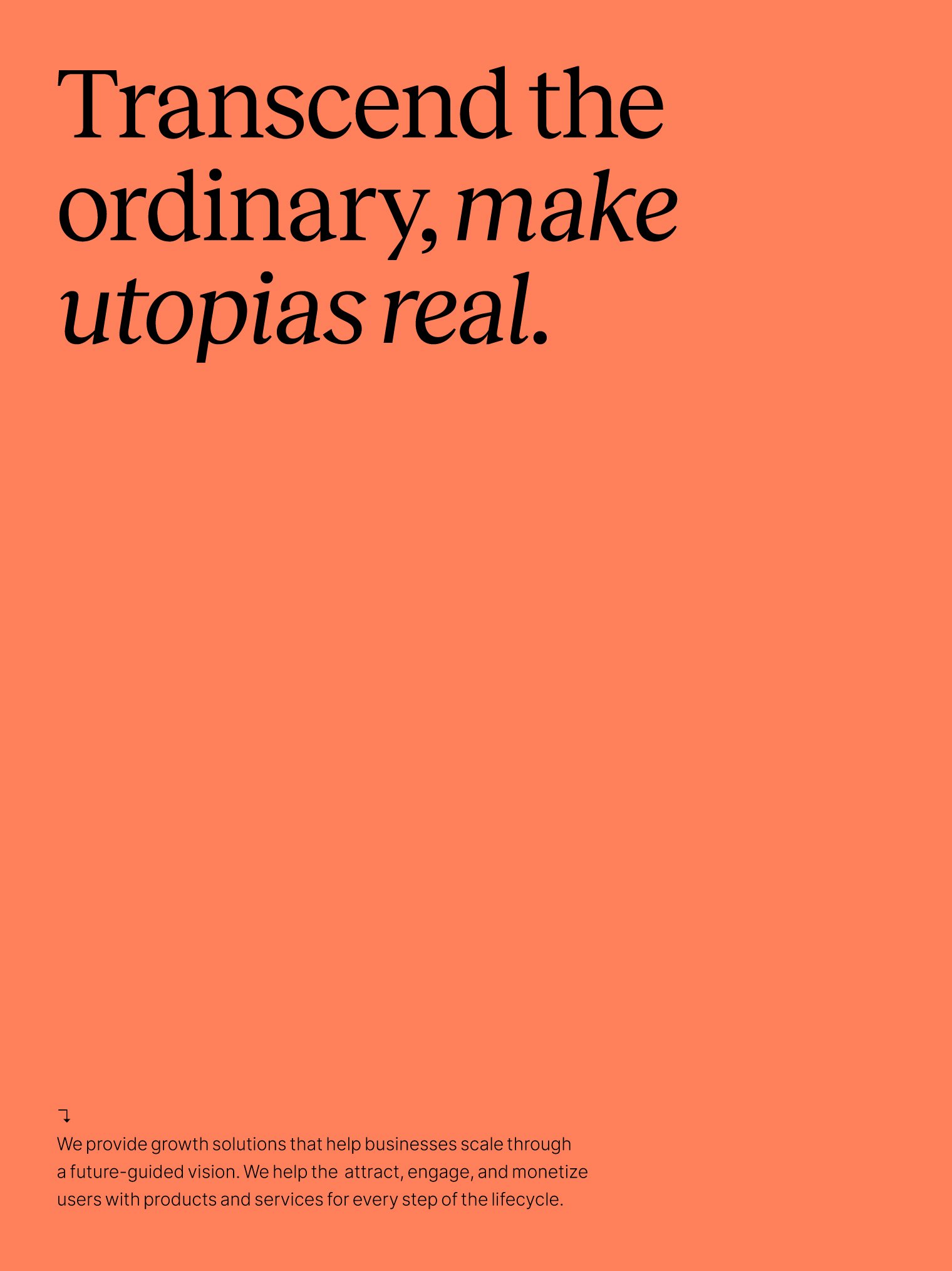
Utopic growth
We delivered a comprehensive and brand new ecosystem for the growth transformation company that boosts the thriving of its clients by making their utopias real, promoting transcendence based on knowledge and expertise.
Client: Winclap
Year: 2022
Country: Latam & USA
Sector: Digital Marketing
Brand Strategy
Brand Positioning
Visual Identity
Verbal Identity
Motion Behavior
Illustration
Brand Guidelines


The Challenge
Winclap’s marketing department approached us with the objective of communicating a new era in the company’s history.
This fast-growing business was represented by a childish and soft brand identity and required a new ecosystem, able to truly represent the team’s philosophy, becoming a tool for the in-house creatives, and a dynamic system for different –and thriving– business units.
The digital marketing startup brand should evolve to introduce the company's new main goal, becoming a robust and grown-up growth transformation company.
As part of this complex challenge, Winclap required a future-proof brand able to represent both consultancy and creative services in a proper way, defining specific assets for each of them, while representing the ‘Clappers’ community values and becoming a tool for the marketing team to recruit new talent.
What we did
We worked closely with Winclap’s team to rethink the brand strategy and positioning, defining new brand values and purpose to match the culture and philosophy of the company, ensuring it's assimilable by their audience and the 'Clappers' team.
The people-centric, savvy, and transformative pillars worked as the cornerstone for a visual system development that reflects the brand personality, both visually and discursively.
In terms of positioning, we saw the opportunity of inserting Winclap in the market as a 'visionary mentor', making the impossible possible through an understanding of the world, intelligence, analysis, and innovation, and achieving transcendence through knowledge.
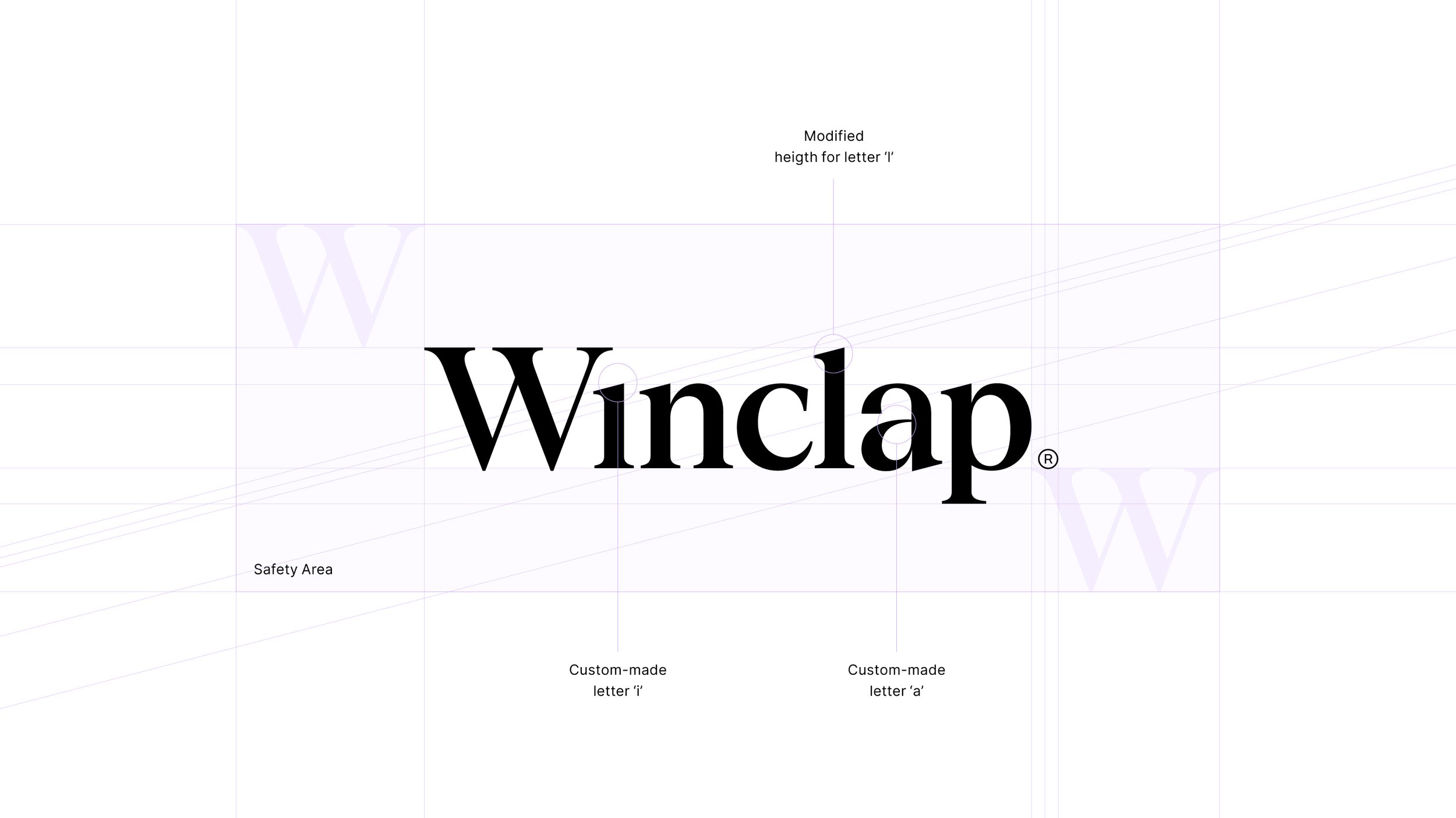
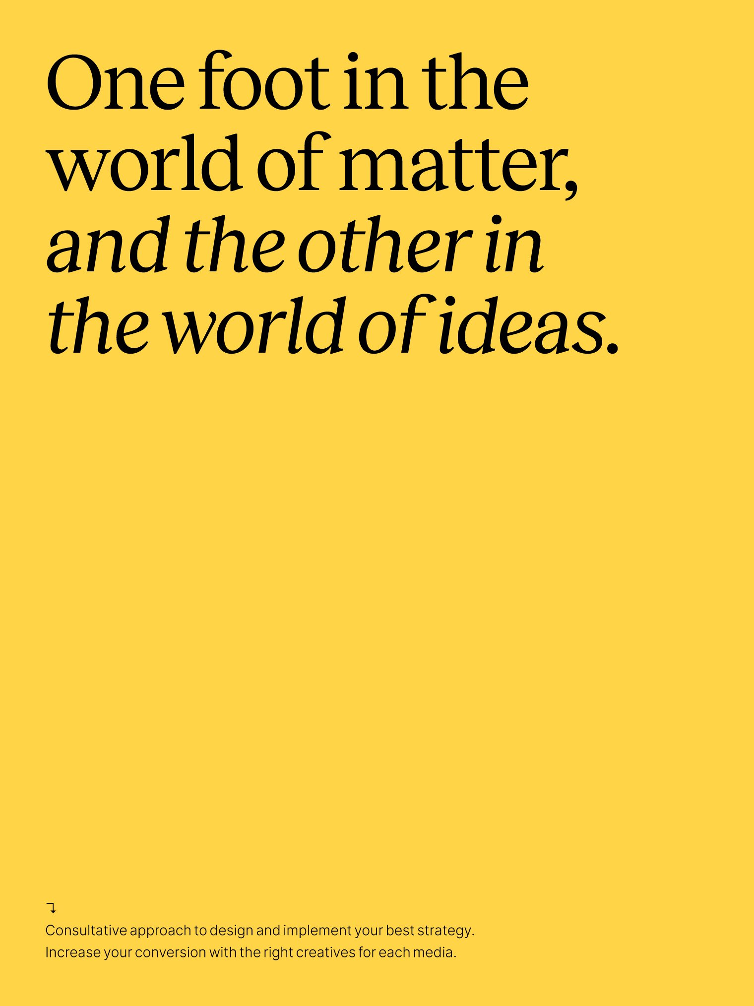
After the strategy and positioning definition, we developed a brand identity system based on the simple and straightforward idea of growth, representing this concept abstractly and in different ways.
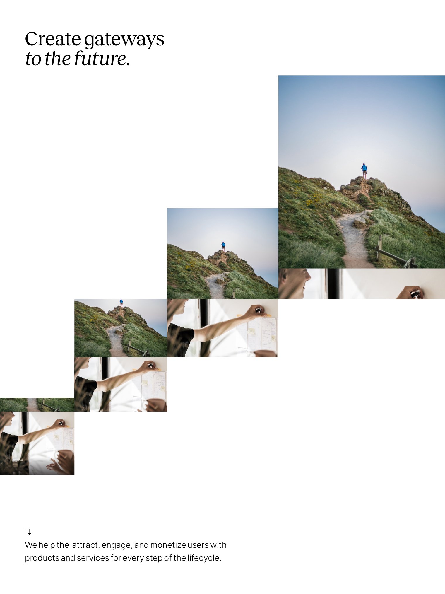
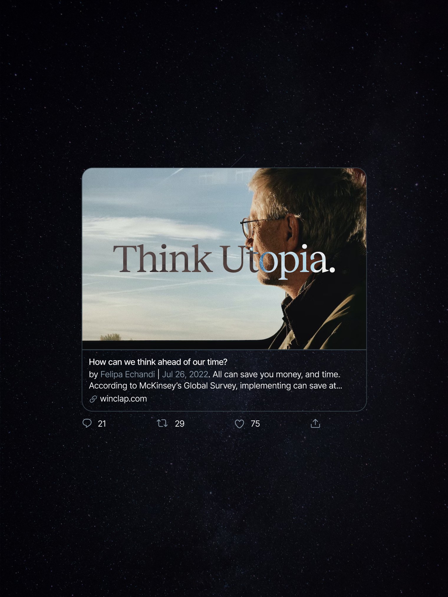
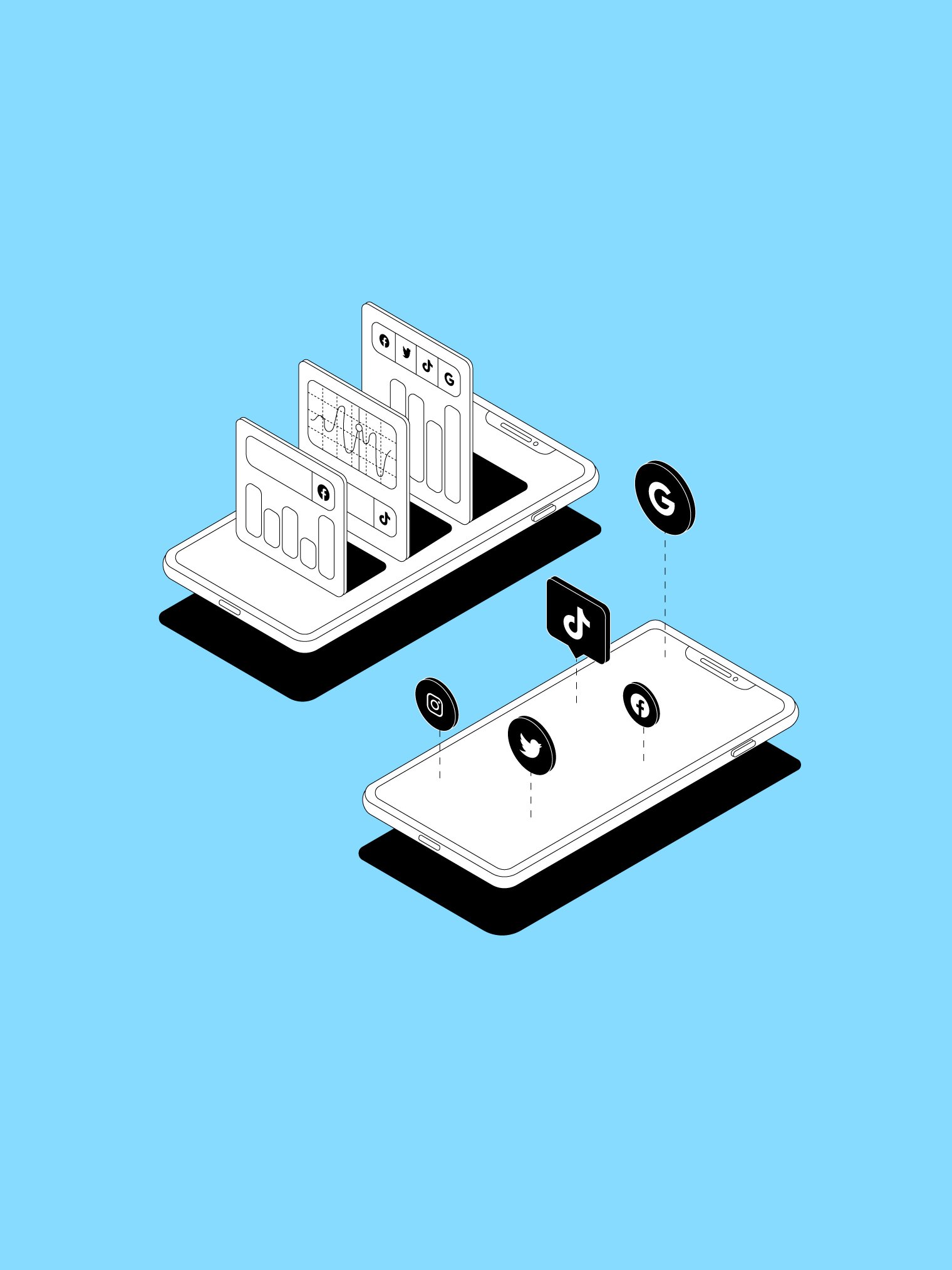
The visual approach features key arts representing visual gateways to the future along with an editorial serif wordmark in contrast with a linear and geometrical brand symbol. The color palette is open, dynamic, and changing, adapting to different areas of the brand architecture and the typographic identity allows the team to easily develop daily-life digital presentations and social media posts.


The key
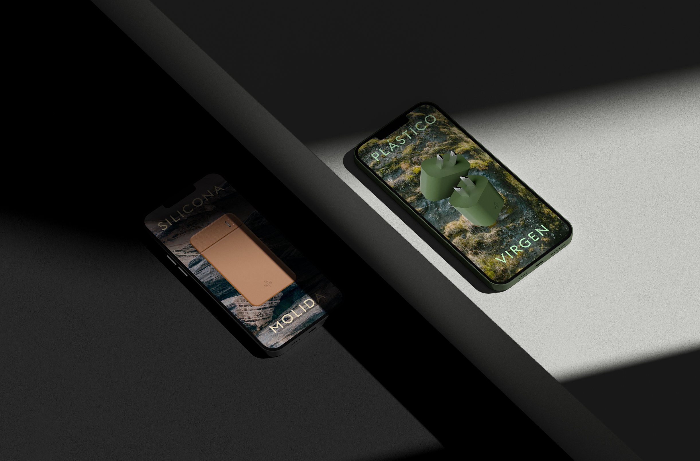
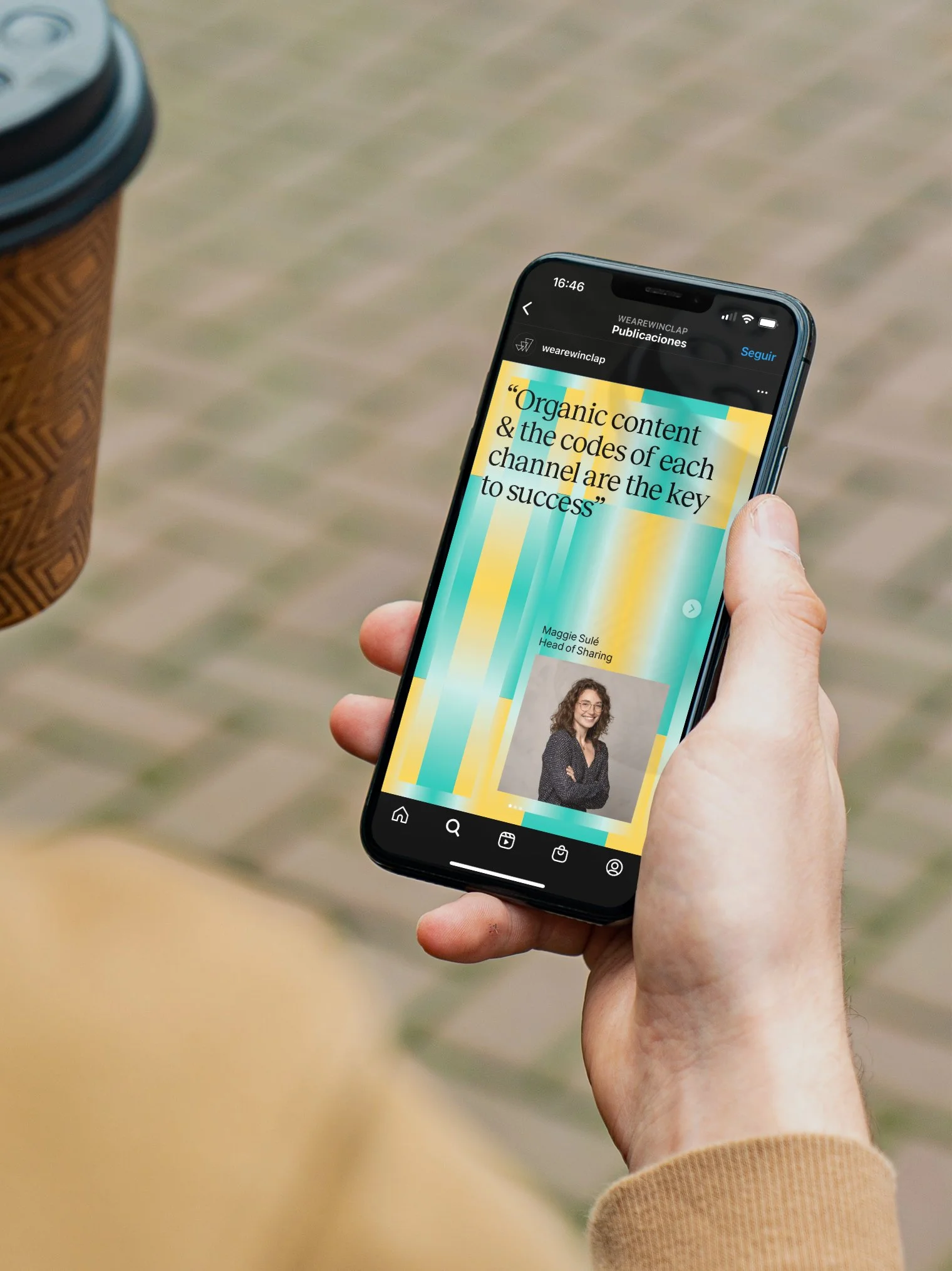
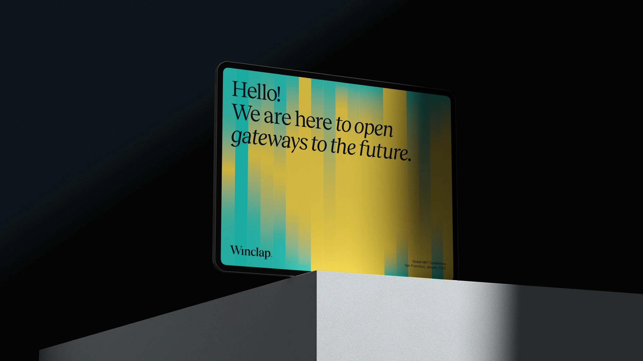
Winclap’s identity system is characterized by its dynamic and vibrant patterns.
These visual gateways to the future –as we call them– become the key graphic element that represents the brand’s transformative attributes.
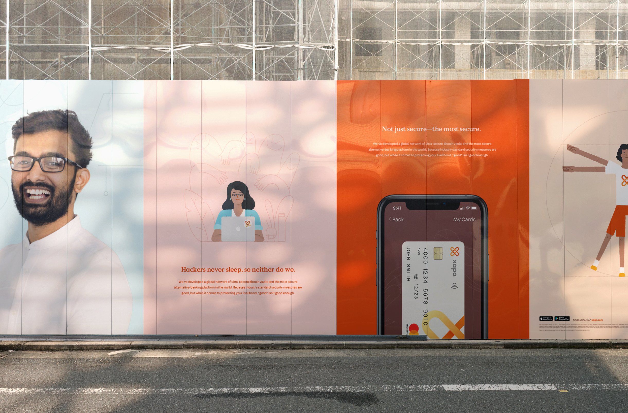
In daily life applications such as keynotes, brand reports, client presentations, and digital documents, these elements easily narrate the brand attributes, being a functional, easy-to-use, and appropriable tool for the in-house designers.
The combination of these with the display font Reckless, the black and white environment, the illustrations, and the team photographs, create a balanced ecosystem that represents transformation, savviness, and humanity in a magic way.


“They had the flexibility to adapt to changes and unexpected new requirements on the fly. They did a great job involving and aligning many stakeholders and meeting deadlines, and the results were very well received both internally and externally. We have raised the bar as a brand.”
Juan Morán, Marketing Manager


Other projects you may like: