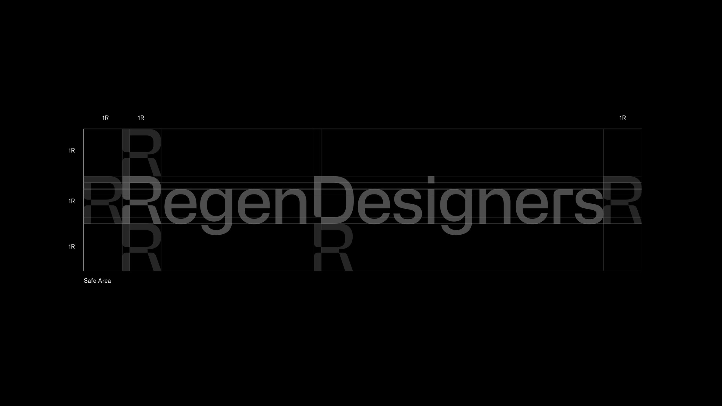
RegenDesigners
A coalescence toward vitality
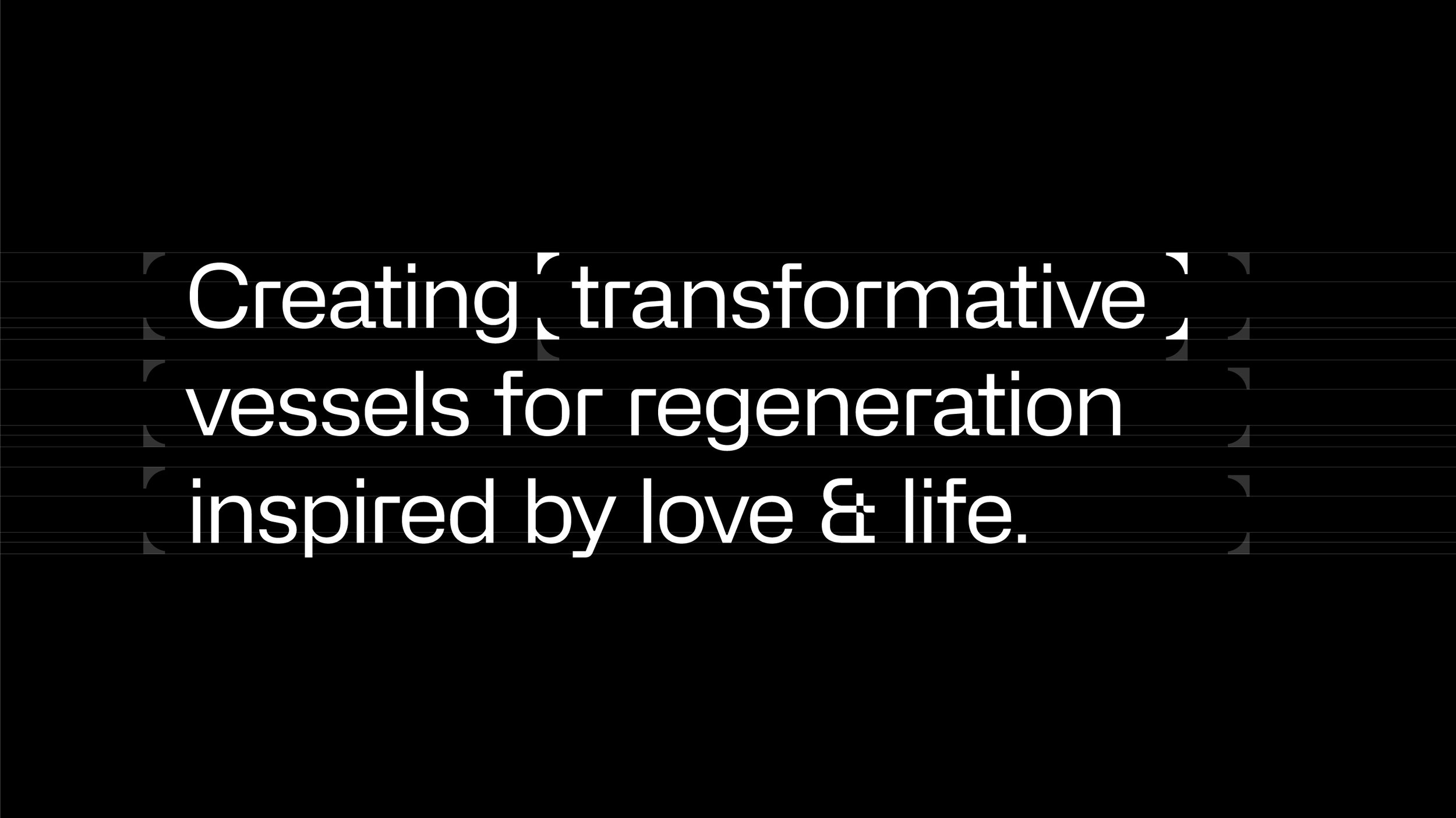
Branding a platform for regeneration that cares, transforms, and inspires change with all living systems in mind through conscious-designed frameworks.
Client: RegenDesigners
Year: 2022
Country: USA
Sector: Regeneration & Sustainability
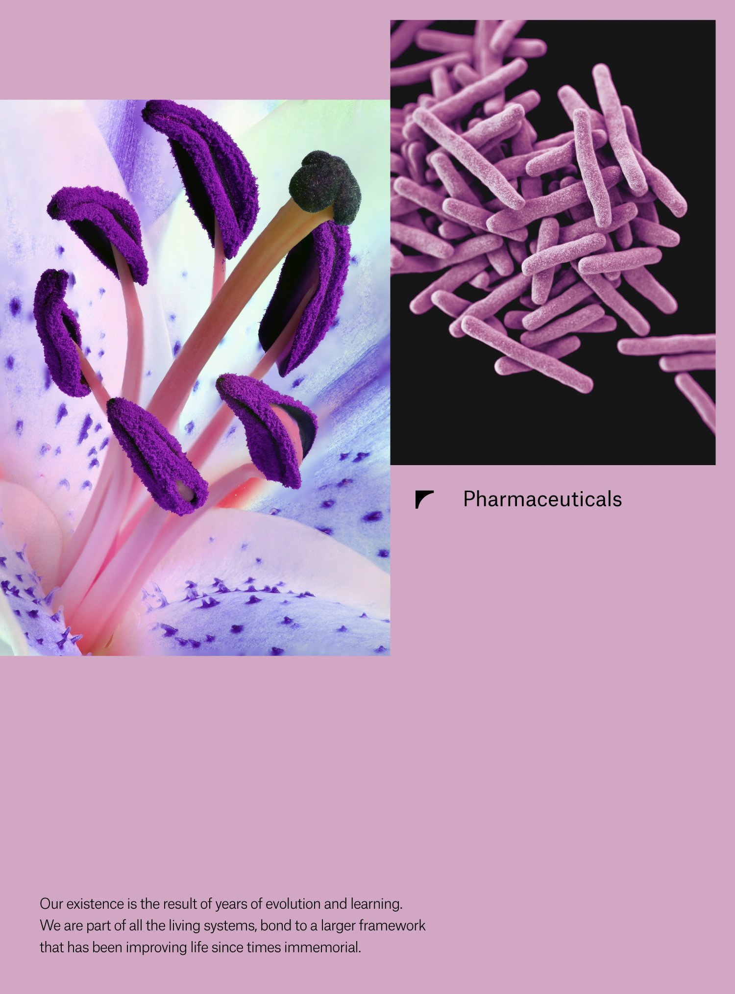
Brand Strategy
Brand Positioning
Visual Identity
Verbal Identity
Motion Behavior
Custom Typeface
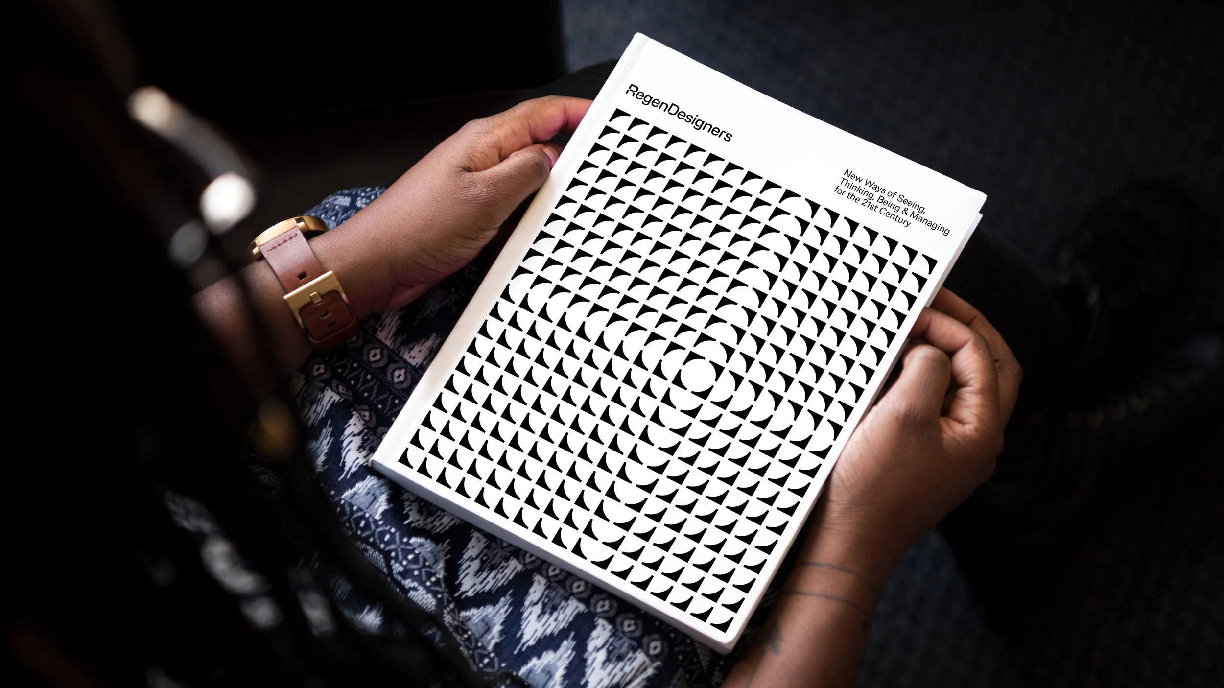
Brand Guidelines
The Challenge
We’ve been approached by RegenDesigners to represent the principles of the regenerative movement with an additional challenge, forget the usual methods for brand creation and immerse ourselves into regeneration principles to create a whole new way to understand and develop their communicational approach.
In order to do so, we developed a custom-made strategy and positioning framework that allowed us to work becoming part of the movement, thinking like them, and guiding our process by the same principles.
The challenge also involved the creation of a brand able to represent the community members’ values while becoming a tool for them to appropriate for their own messages.
What we did
We worked closely with RegenDesigner’s team to think, design, and bring to life a new identity system that combines its caring, transformative, and inspiring spirit with the world of finances and business development.
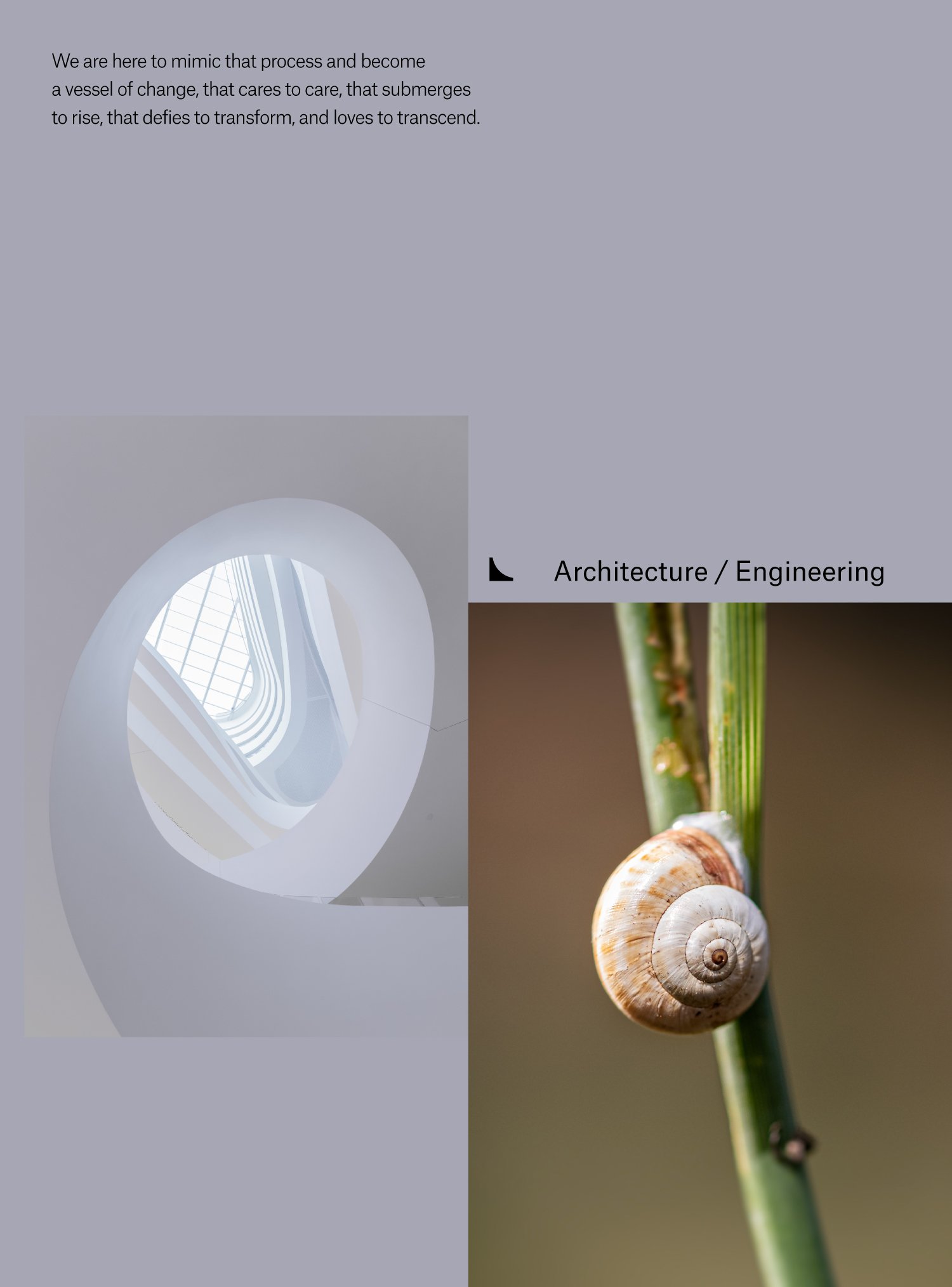
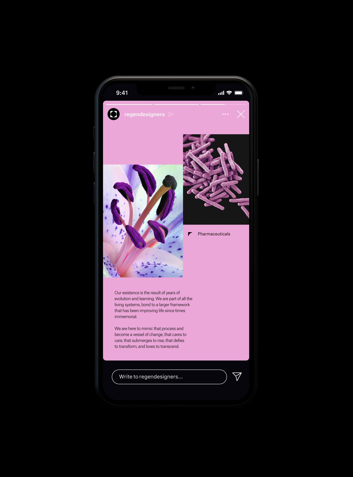
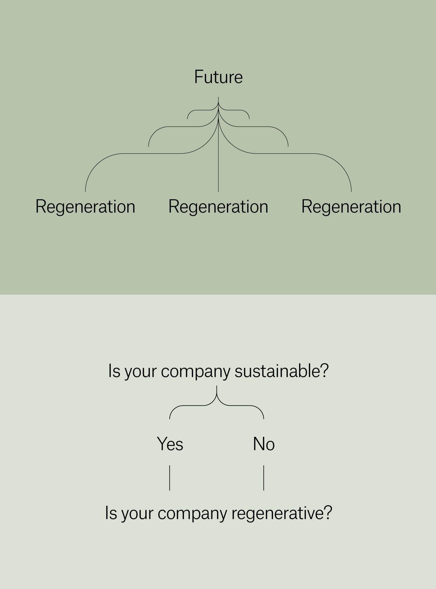
We developed a brand identity system supported by the blend of the Shepherd and Creator archetypical figures as communication pillars, positioning the brand as a vessel for change that cares to care, submerges to rise, defies to transform, and loves to transcend.
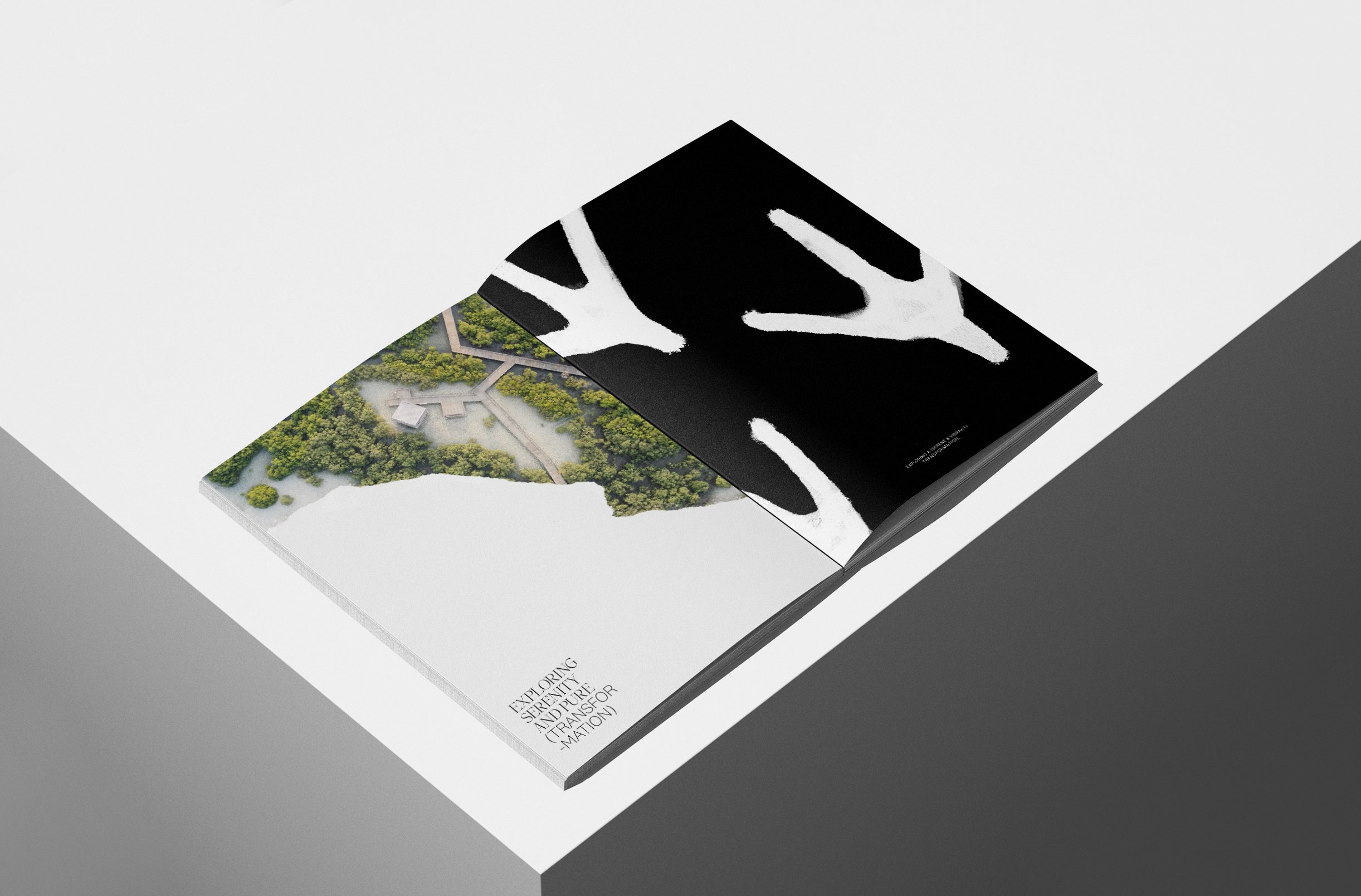
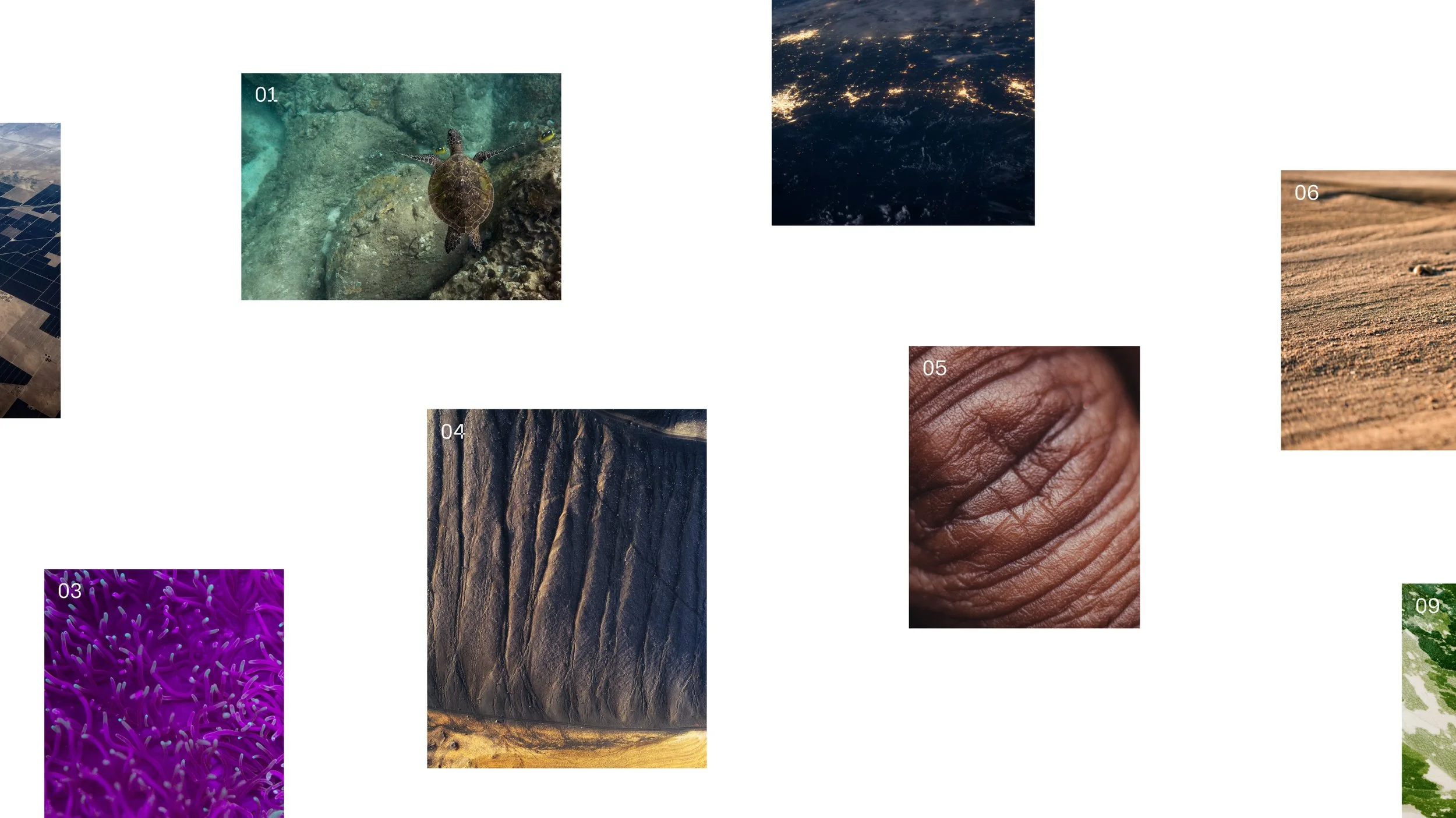
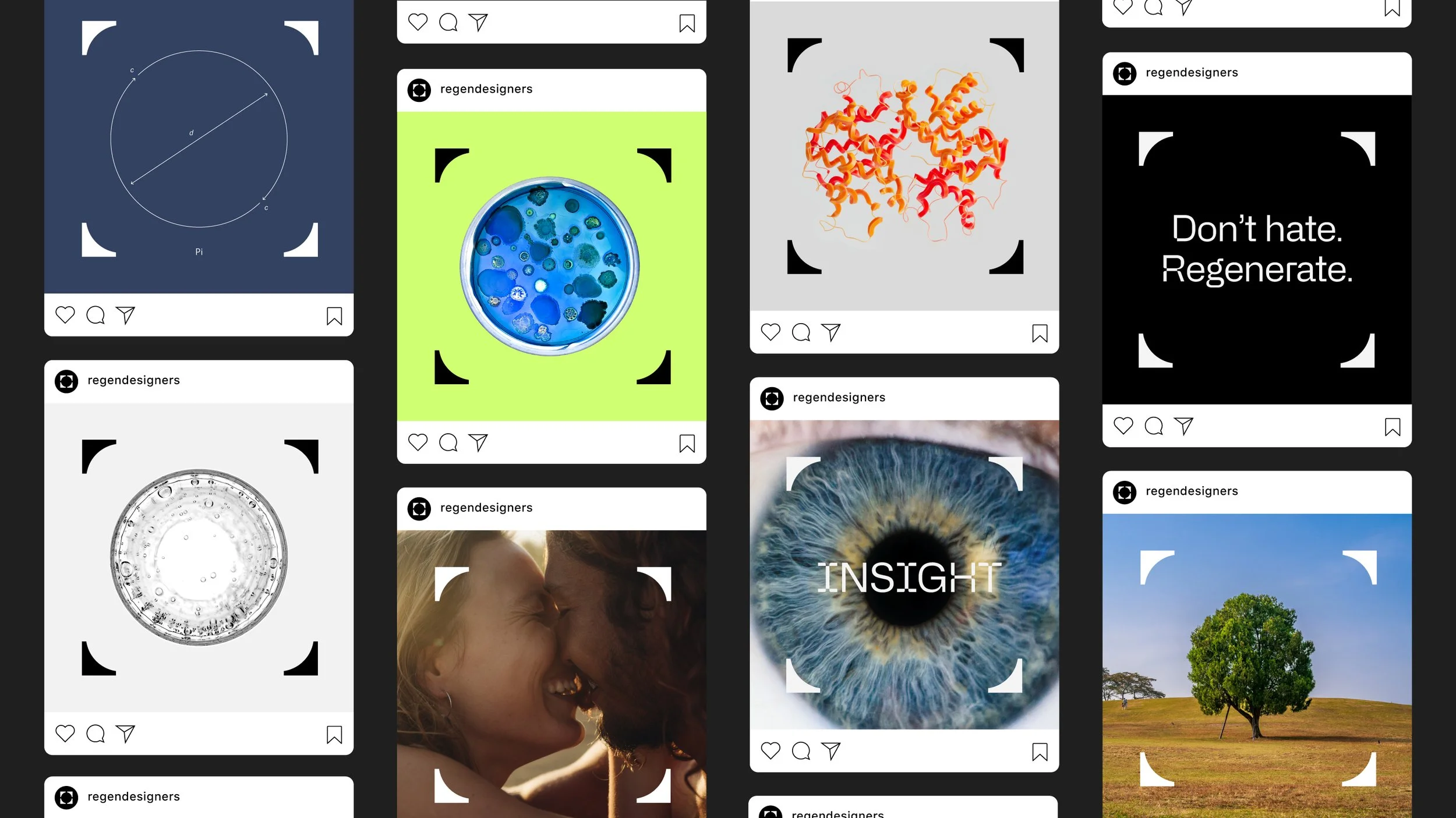
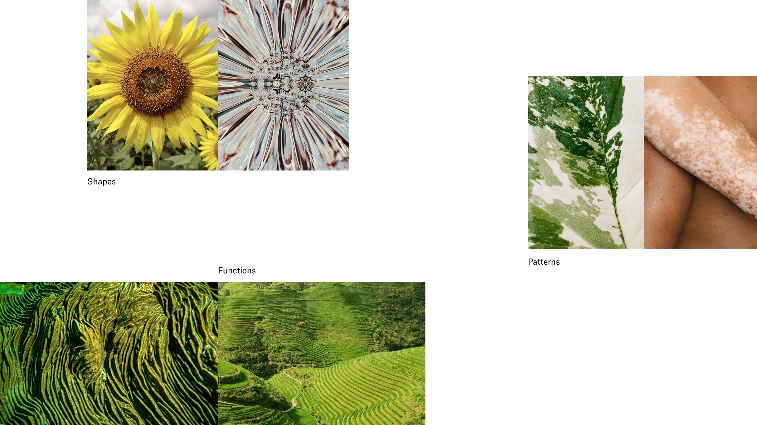
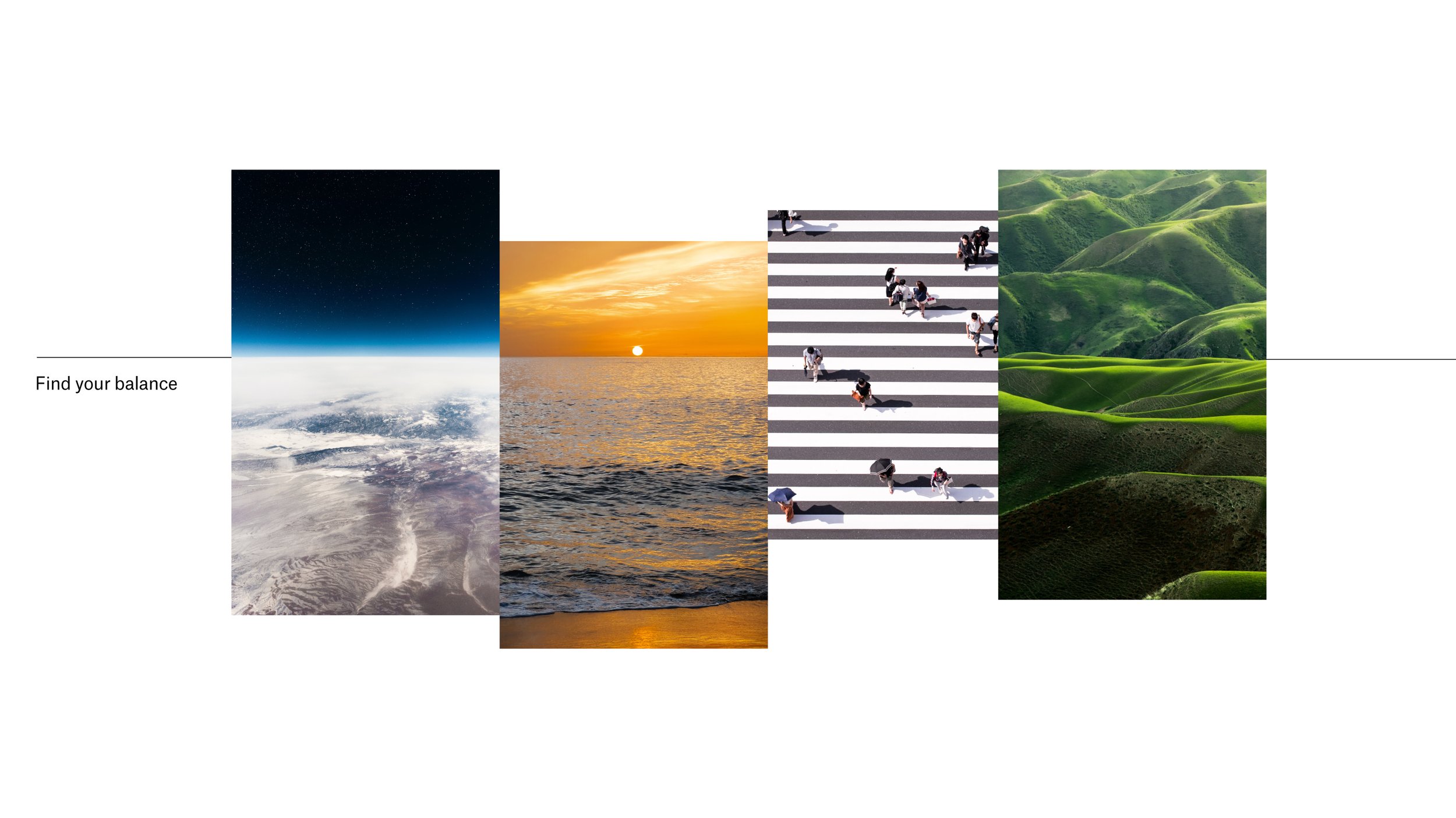
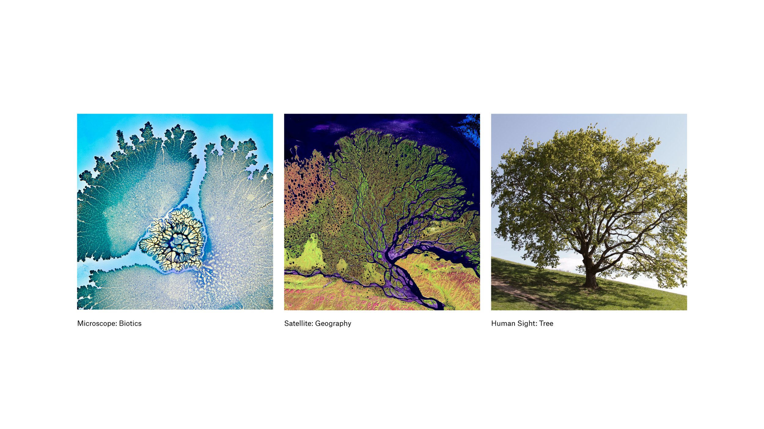
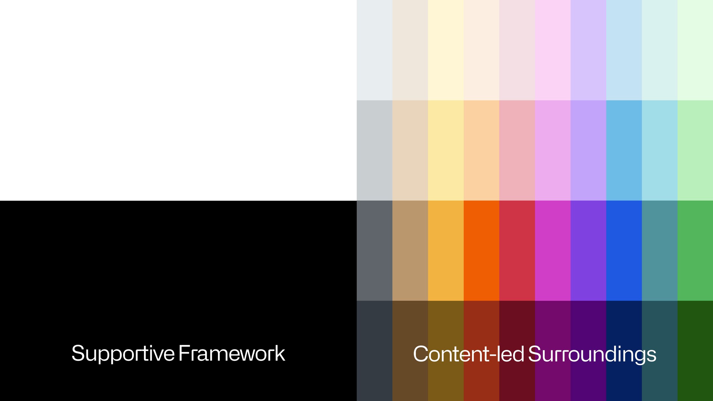
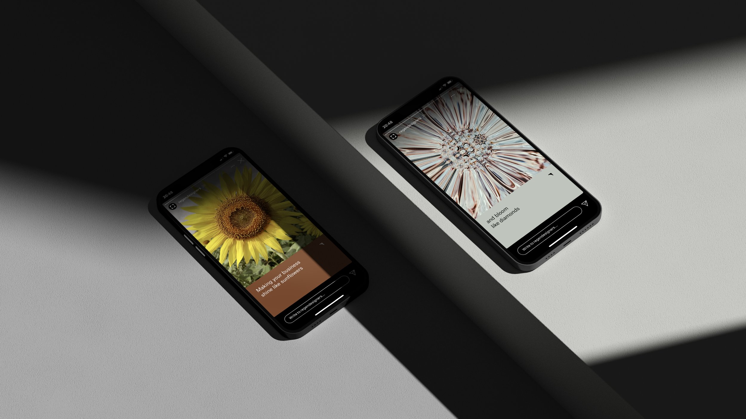
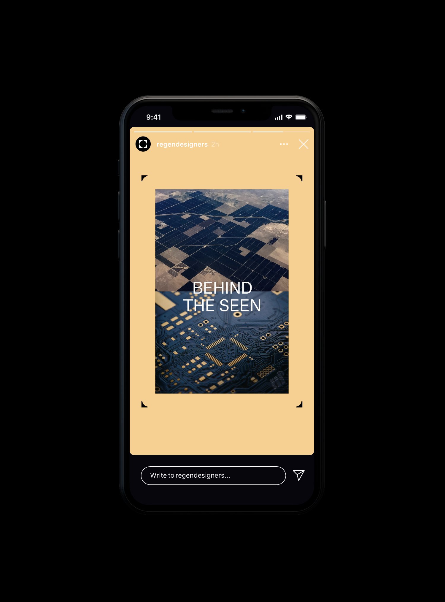
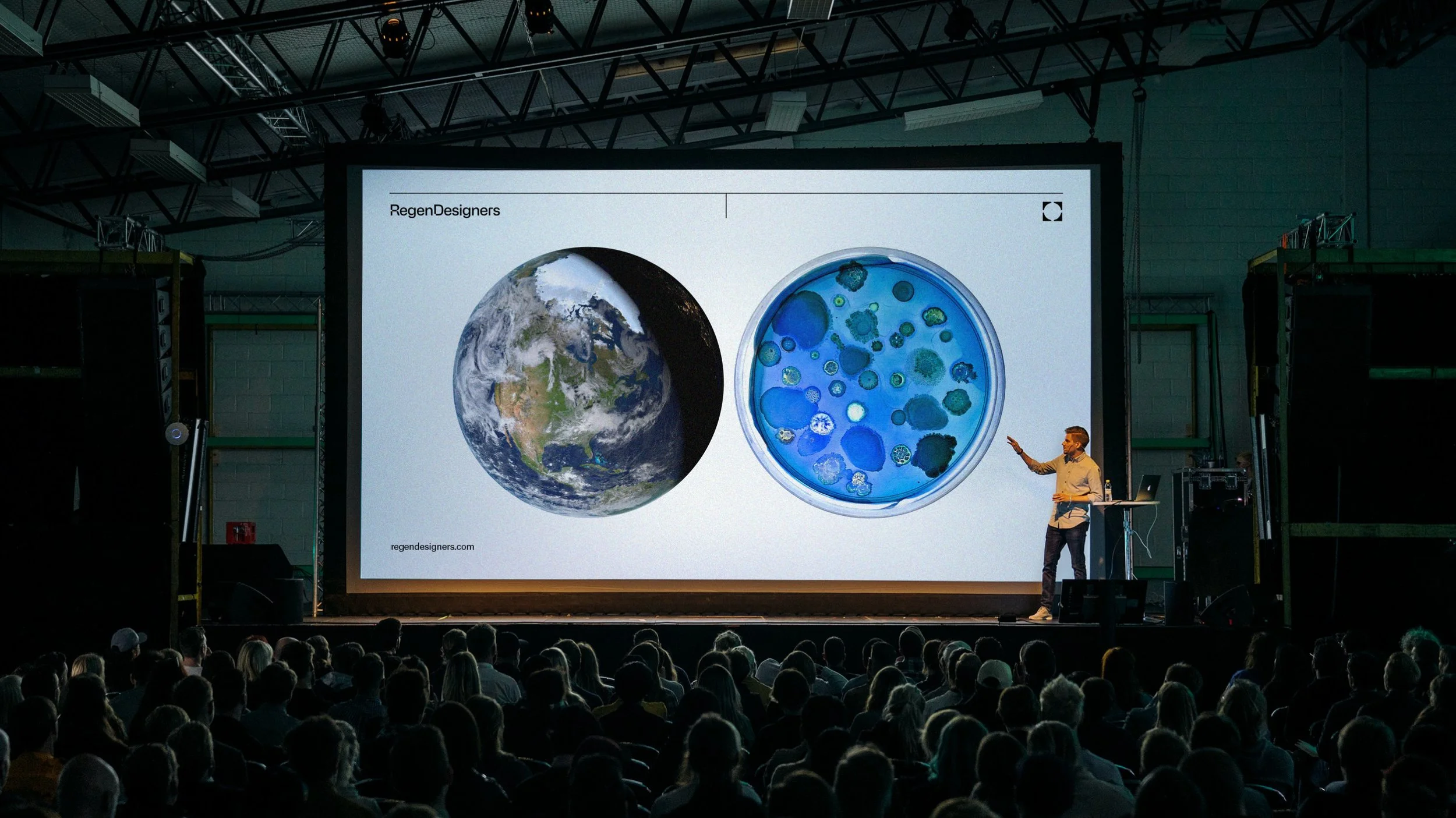
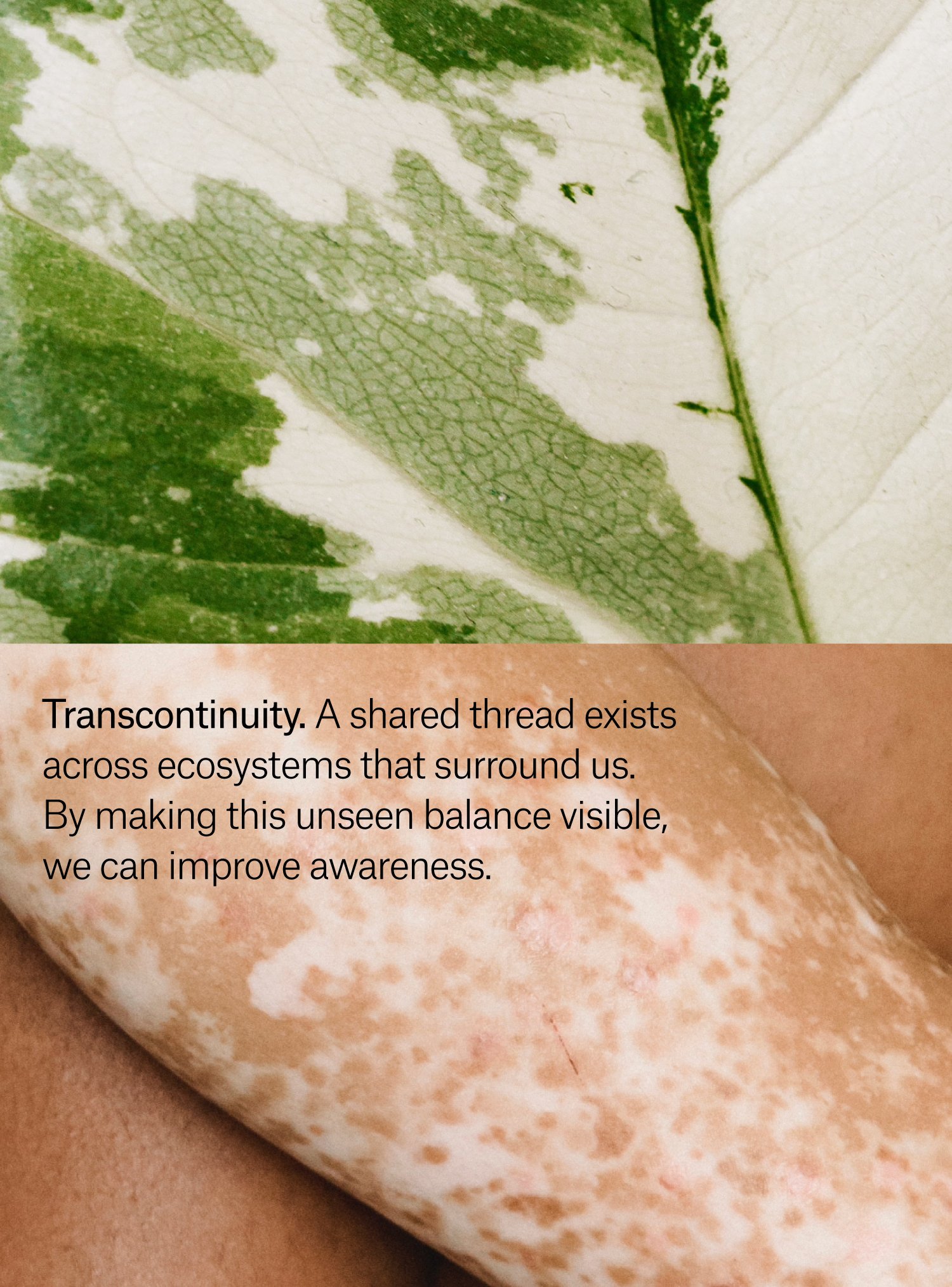
The visual approach combines neutrality and precision with the impactful representation of the environment, featuring a vast set of curated photographs.
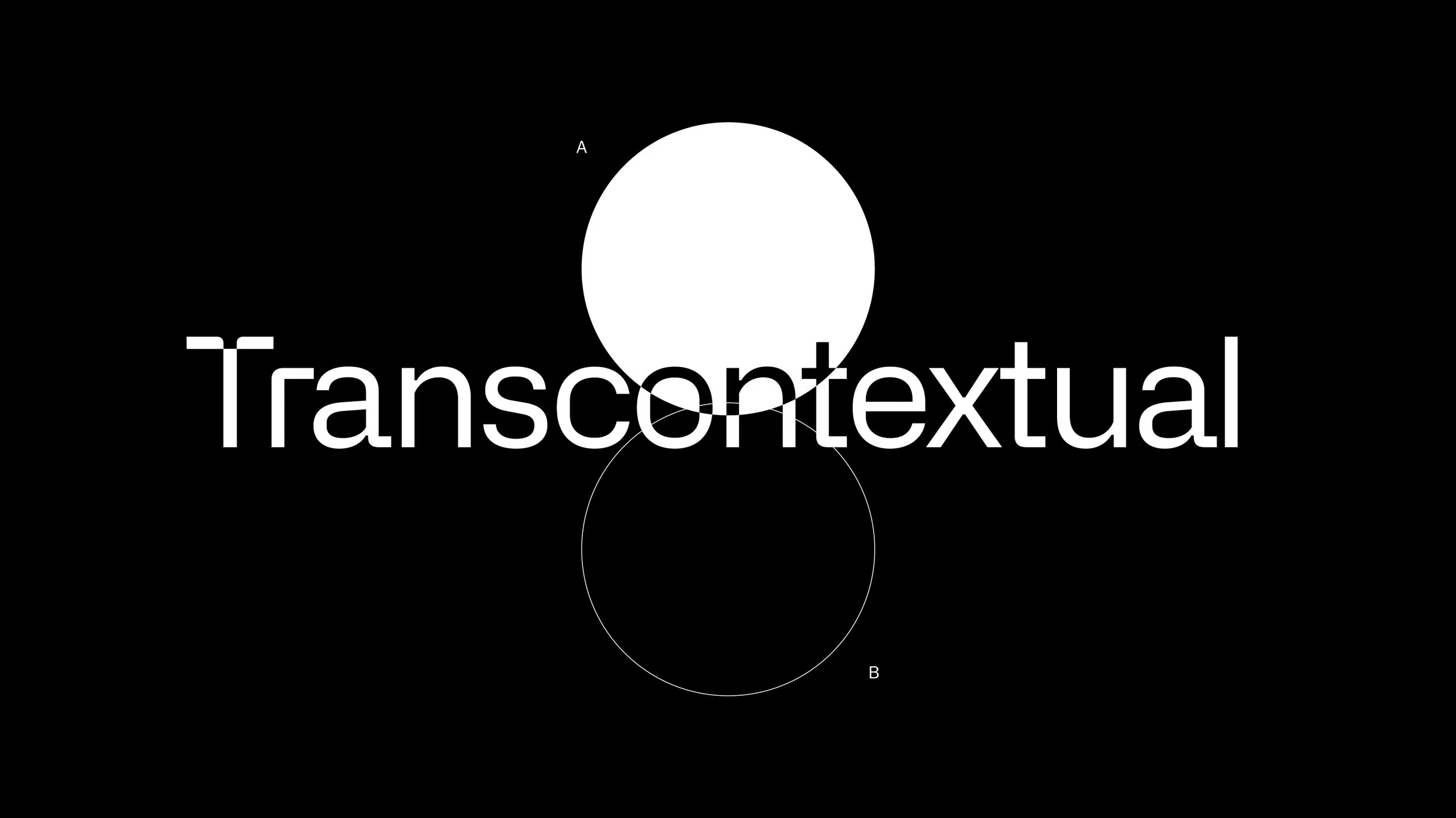
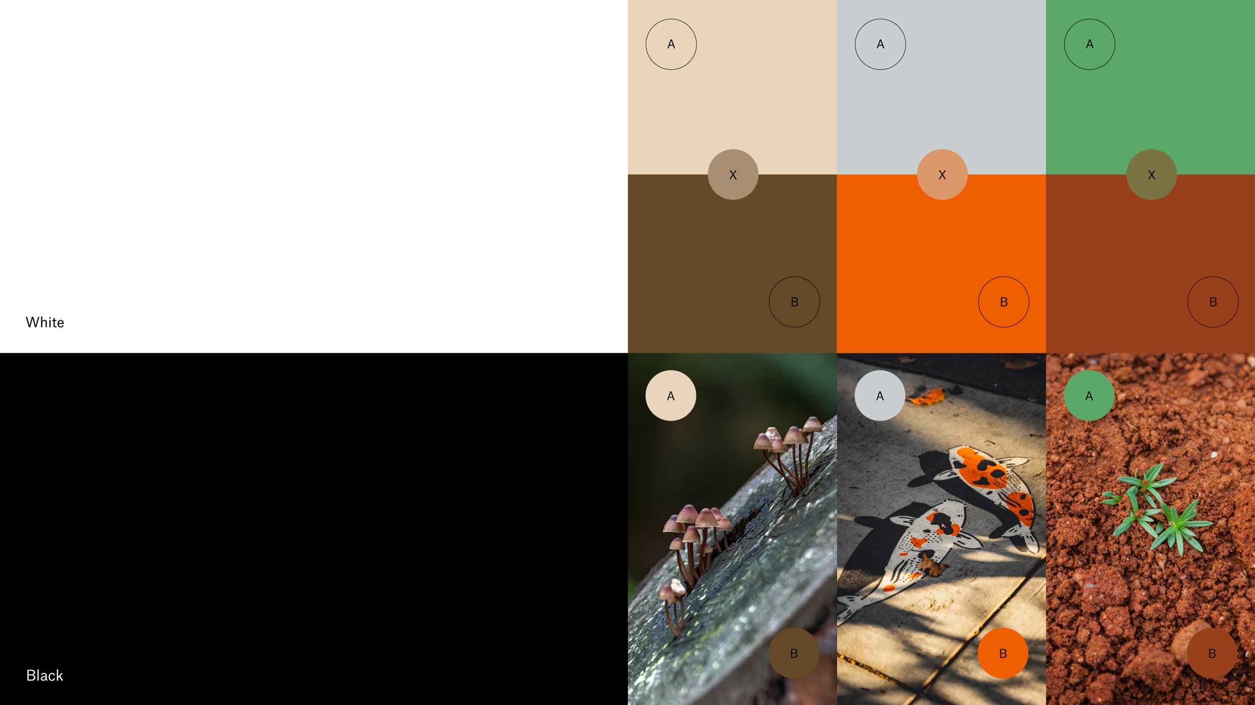
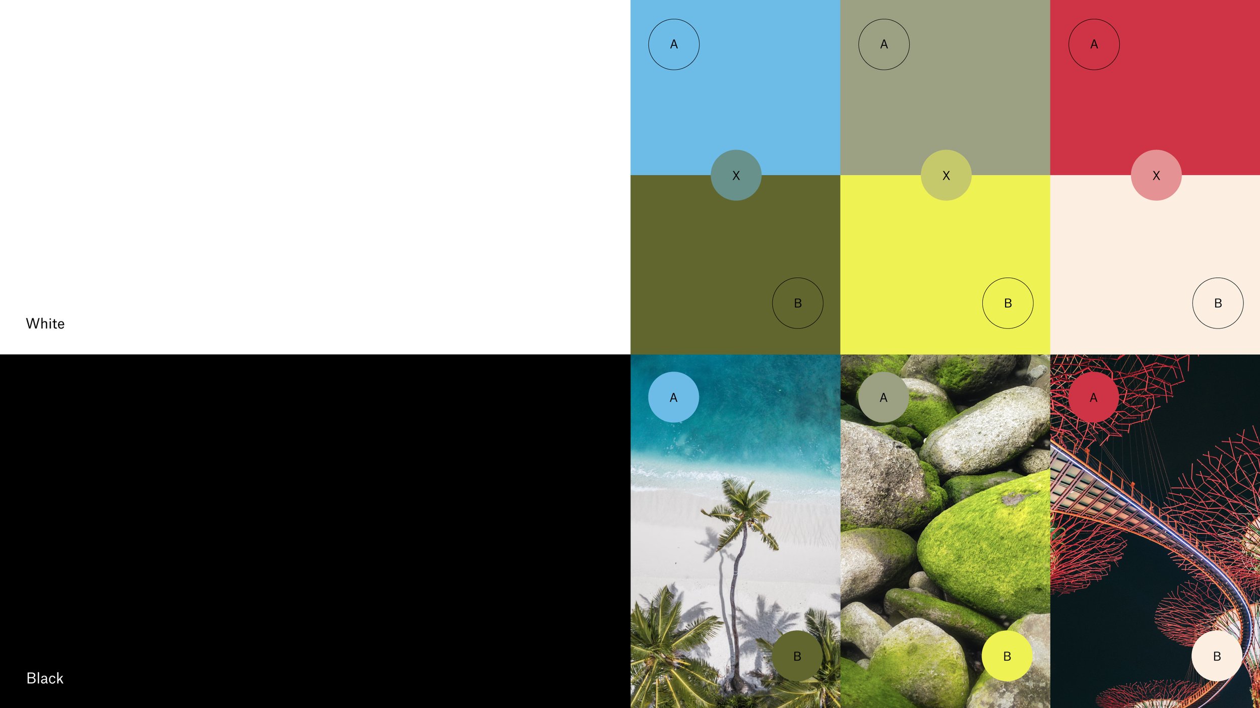
The color was approached through the concept of ‘Transcontextuality’, becoming a variable tool that captures the true essence of nature and people.

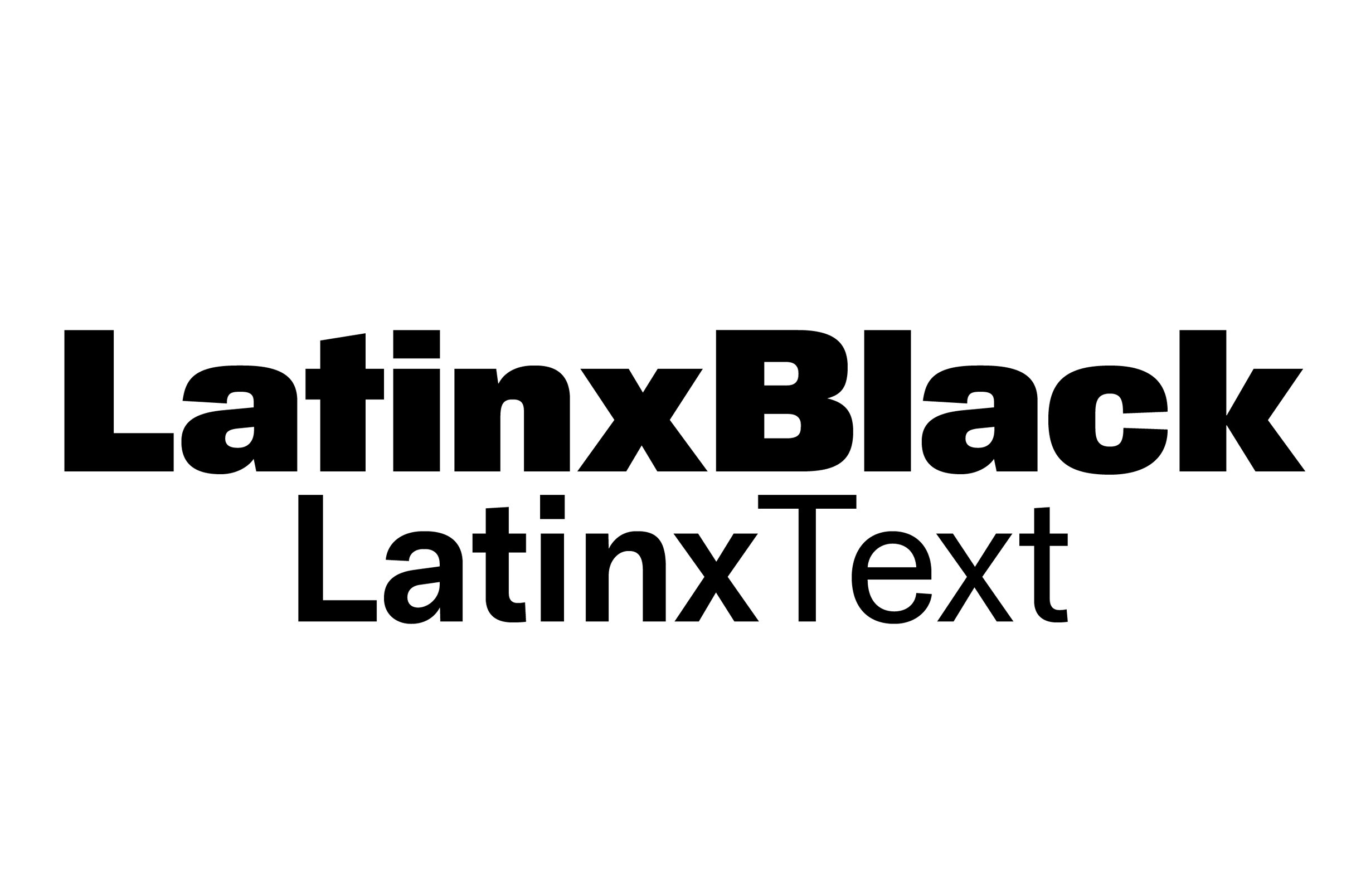
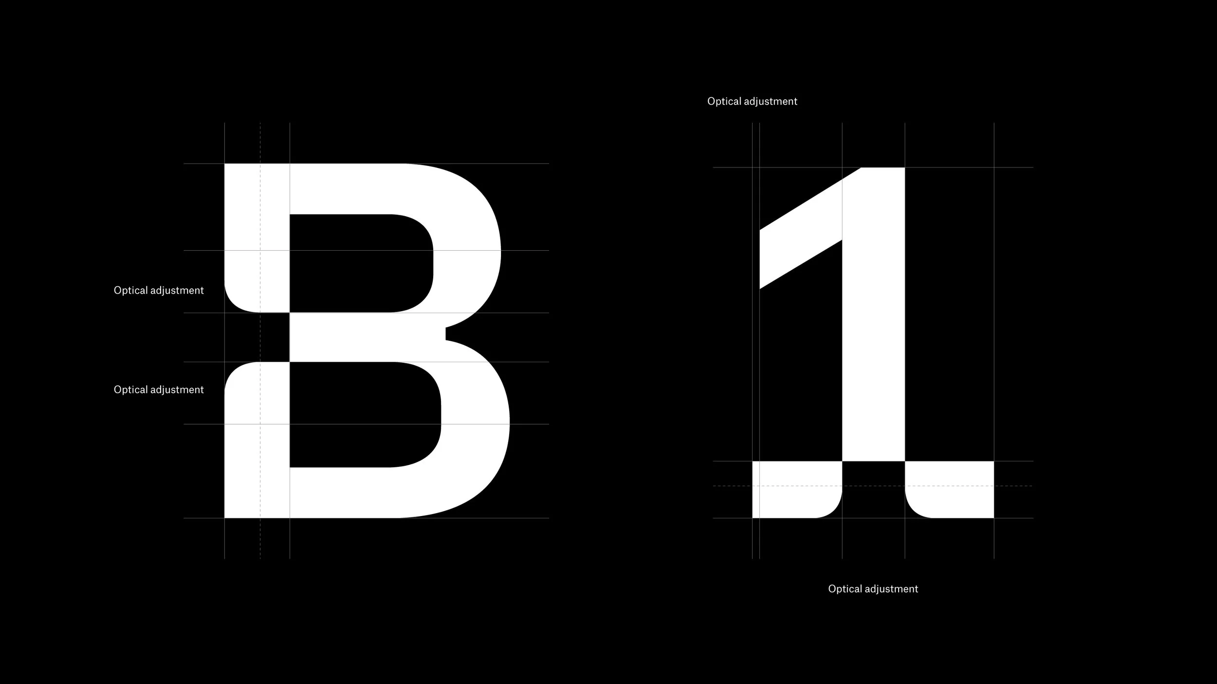
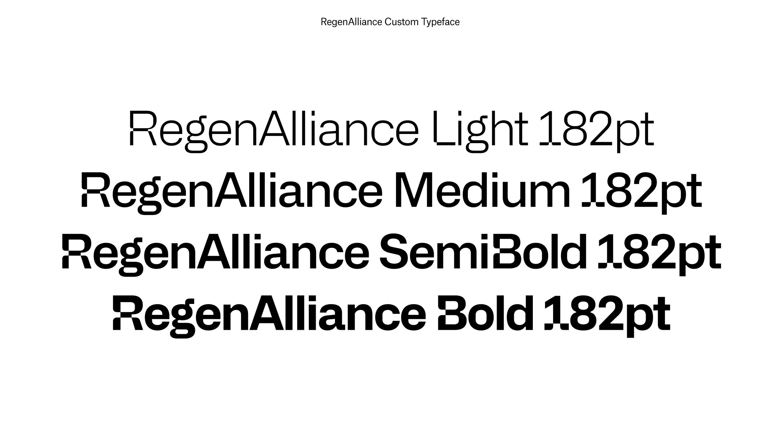
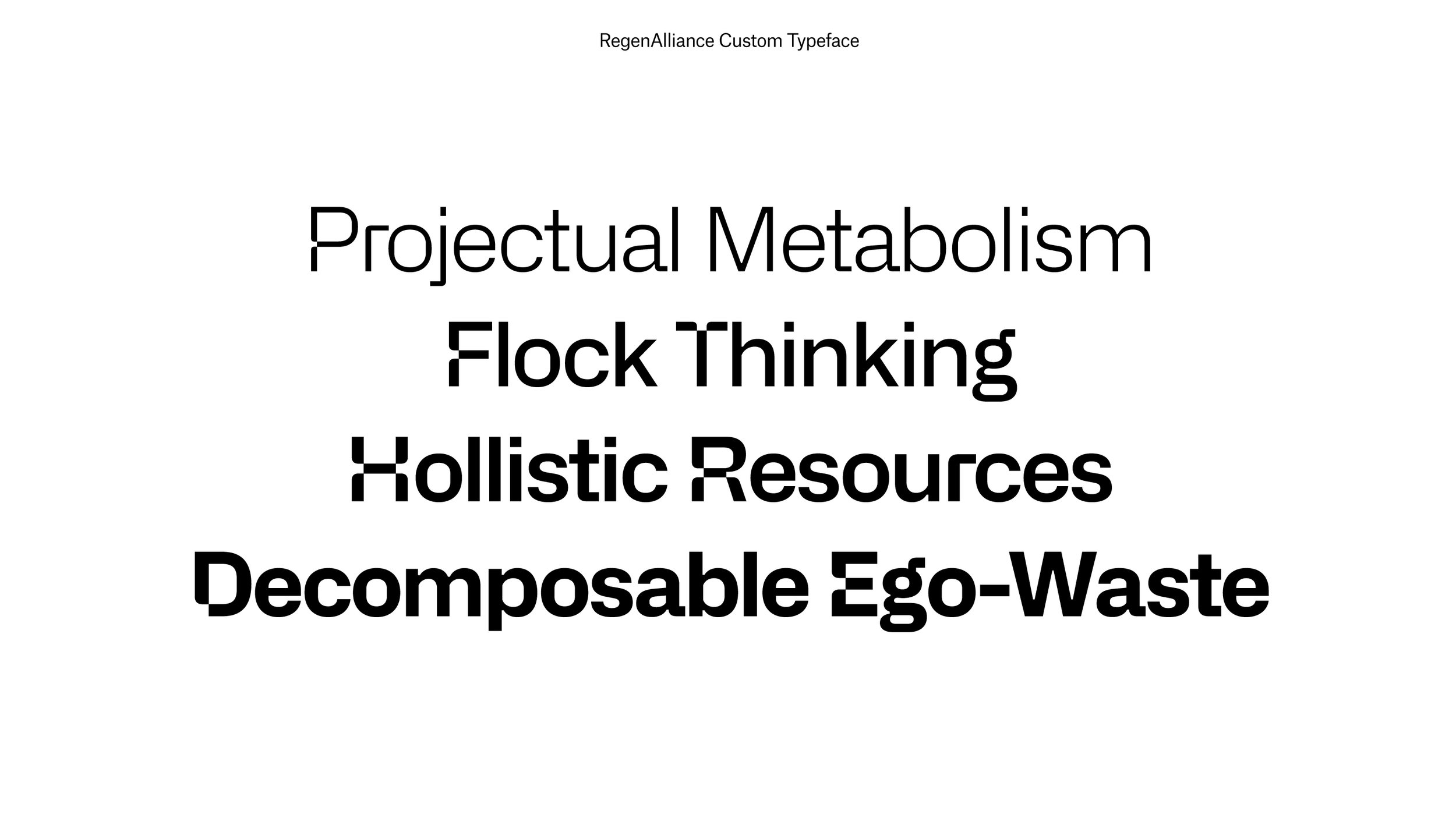
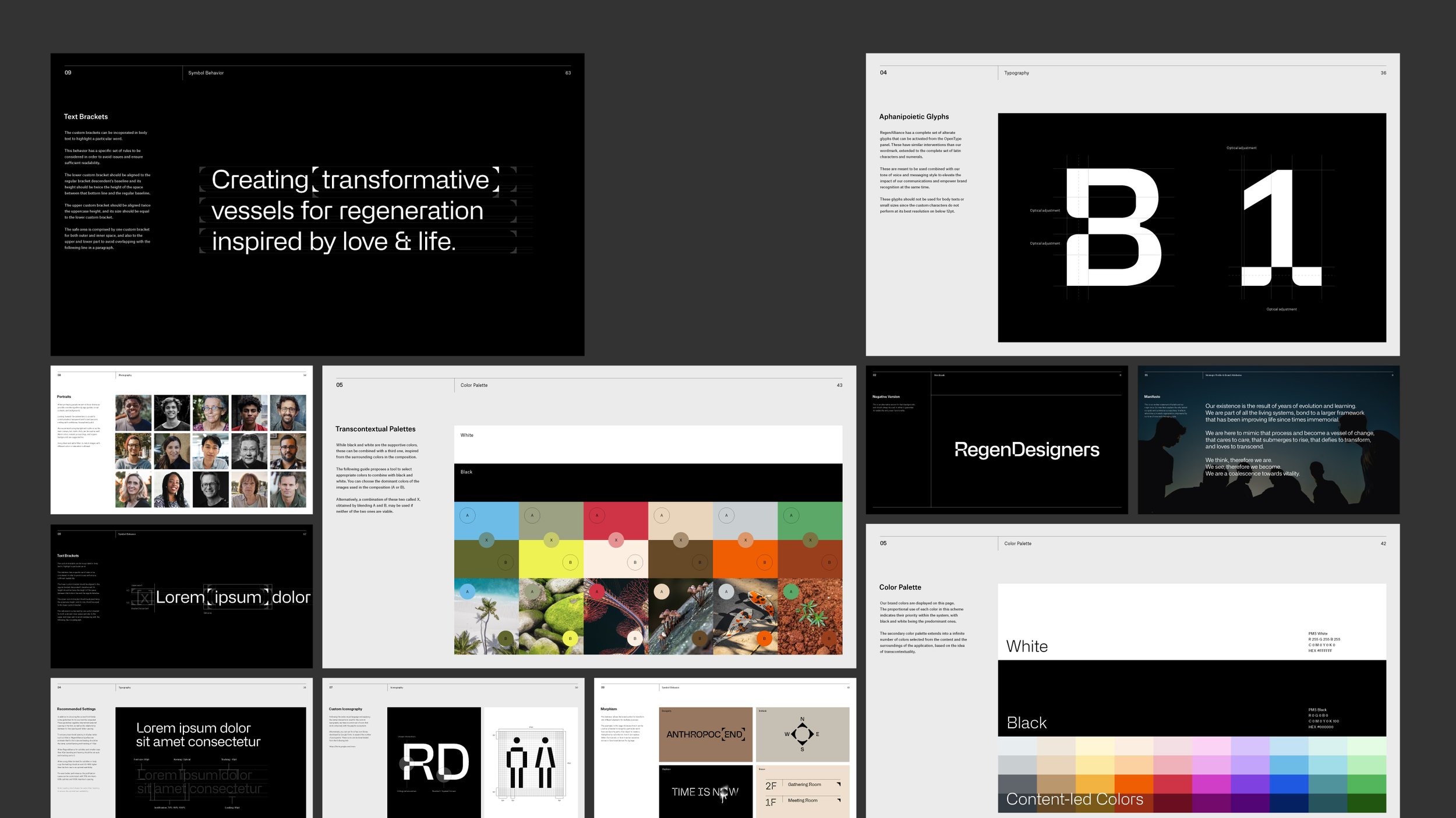
Custom Typeface
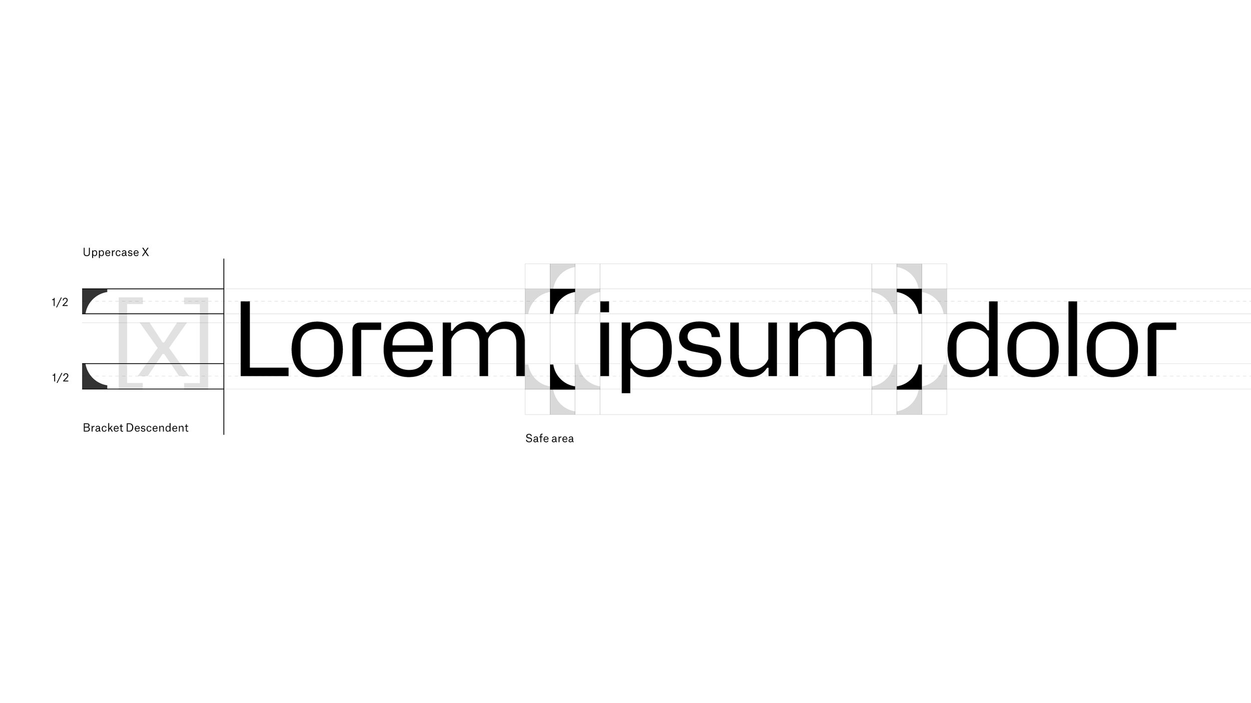
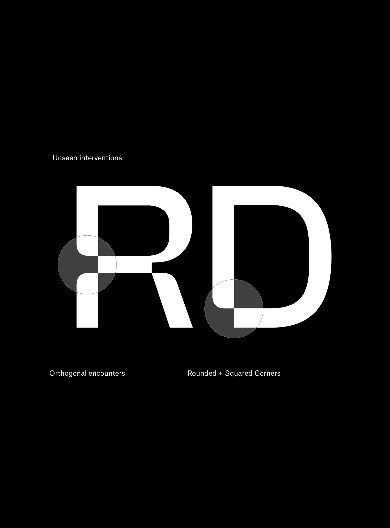
Using the ‘Aphanipoiesis’ concept and the idea of seen and unseen, we created a variable custom typeface that reflects the brand story and becomes a tool to be provided to strategic partners and members.
We partnered with Indonesian foundry Degarism to customize their Alliance font family in order to represent the ‘Aphanipoiesis’ concept by adding special glyphs to the family.
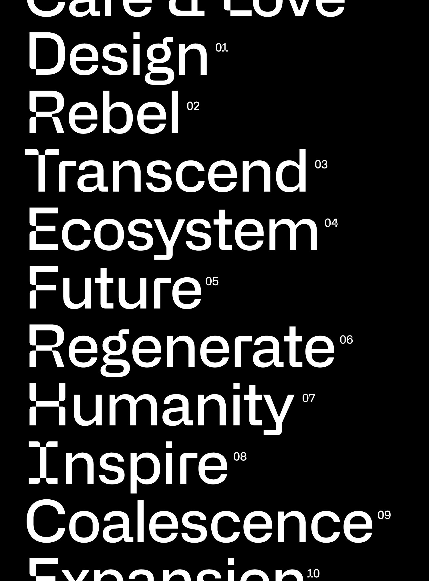
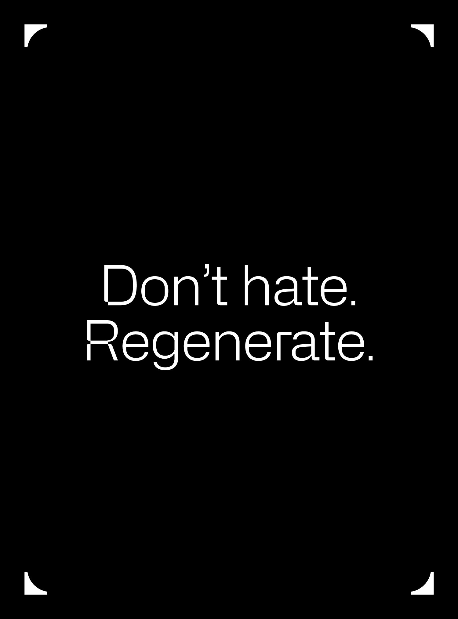
This custom-made typeface carries a tone of voice that’s caring, creative, rebellious, and unexpected – highlighting the transformation and contrast between old and new paradigms and playing with statements that resemble something familiar but with a new meaning.
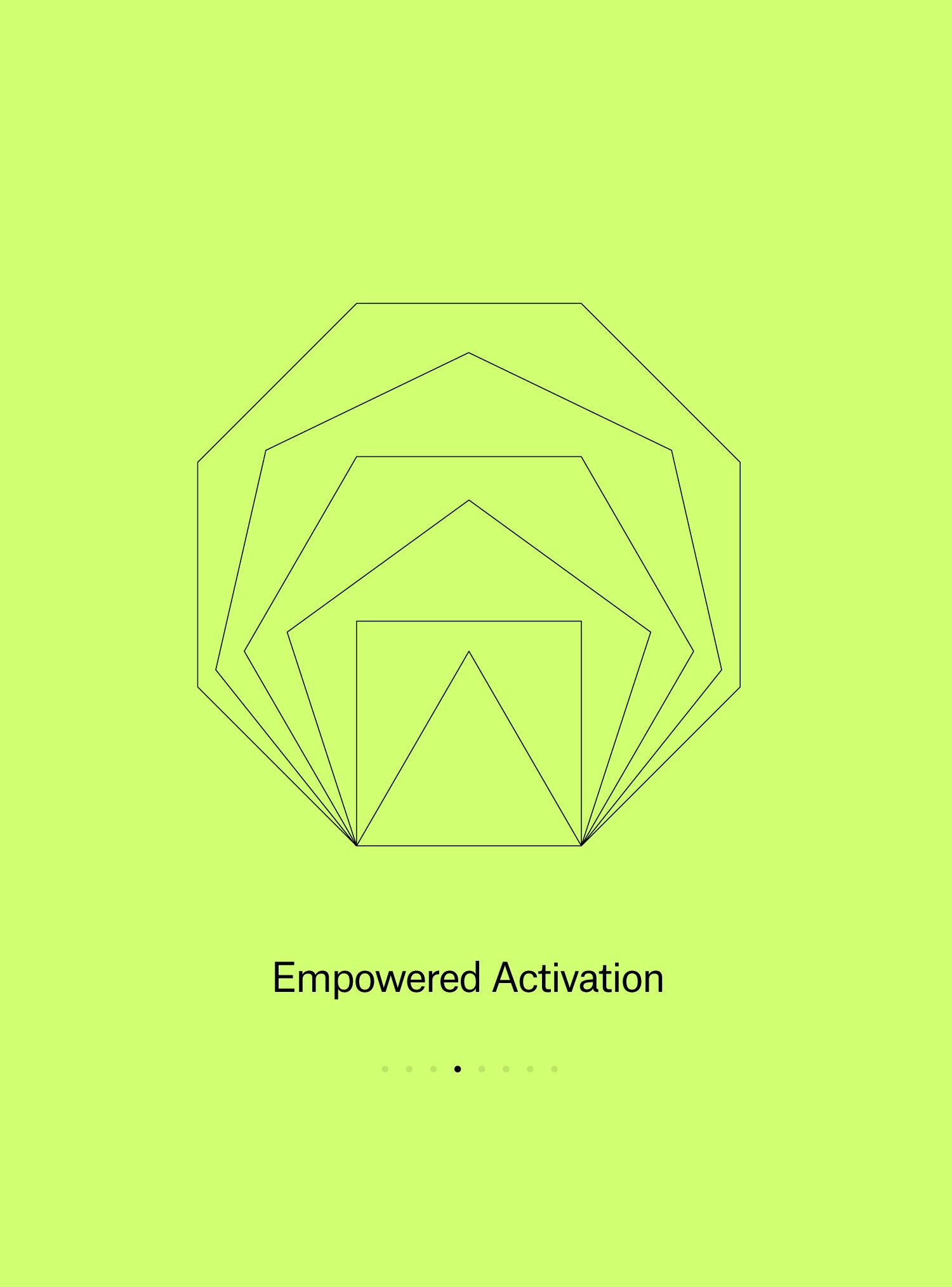
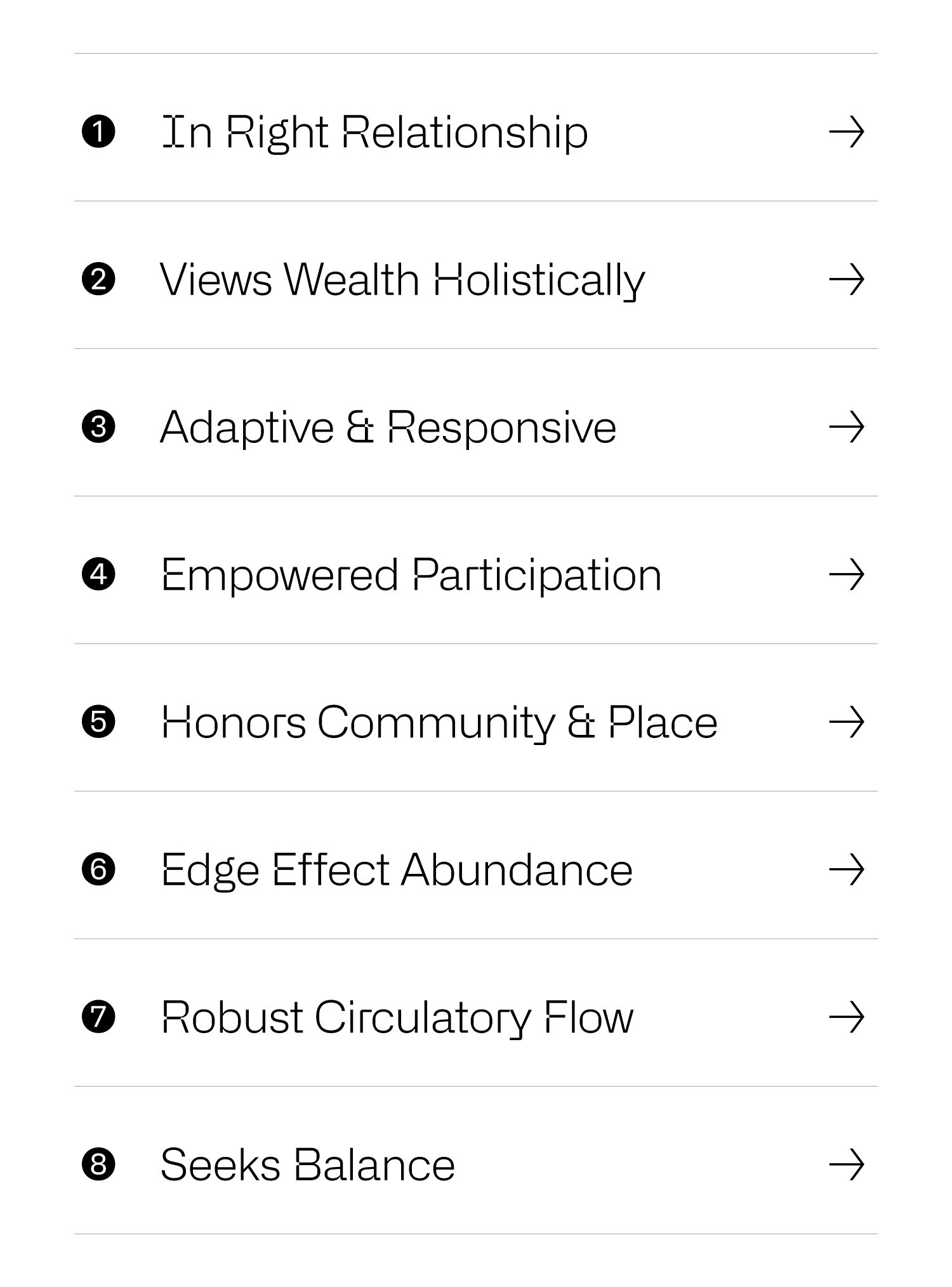
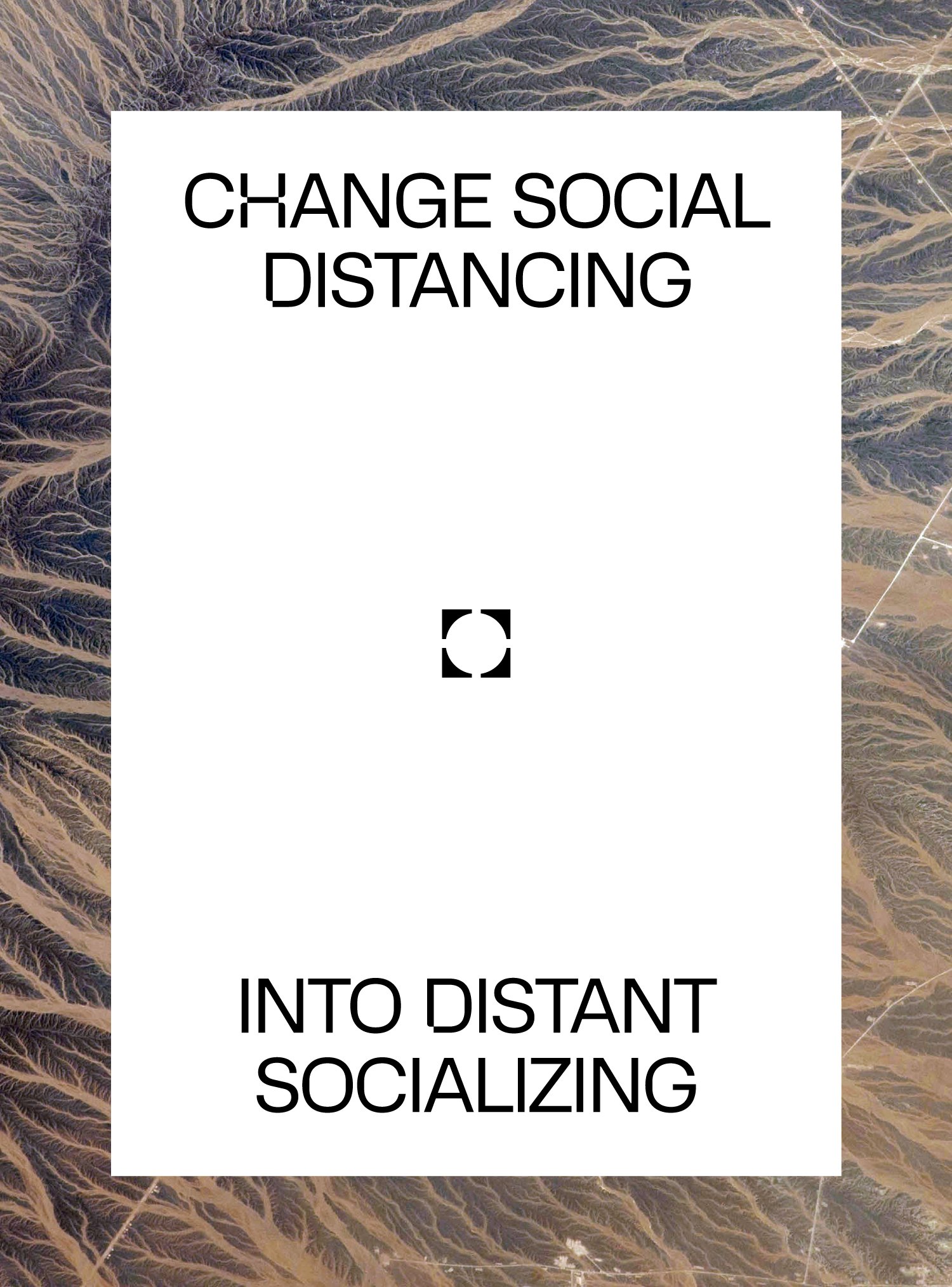
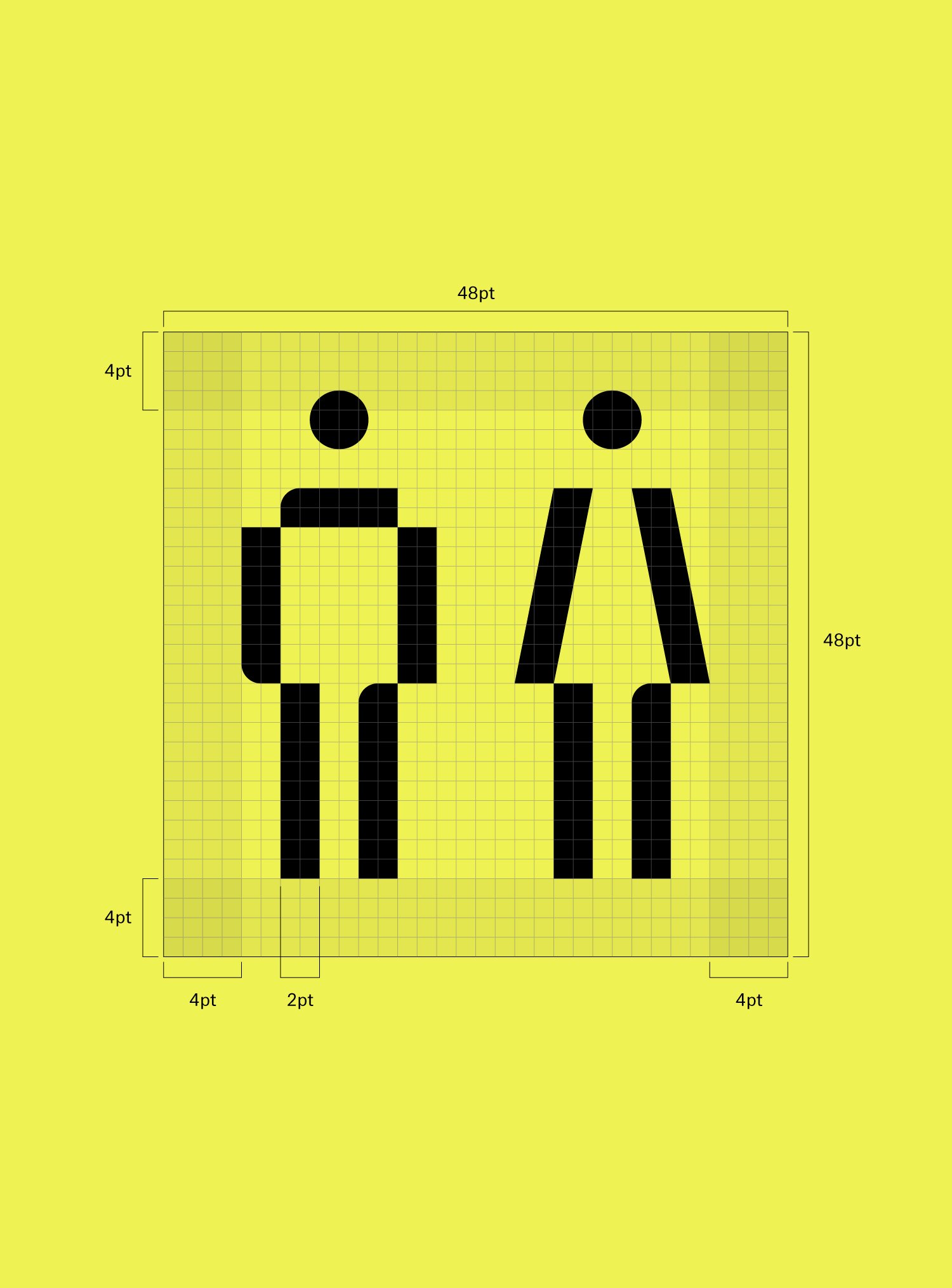
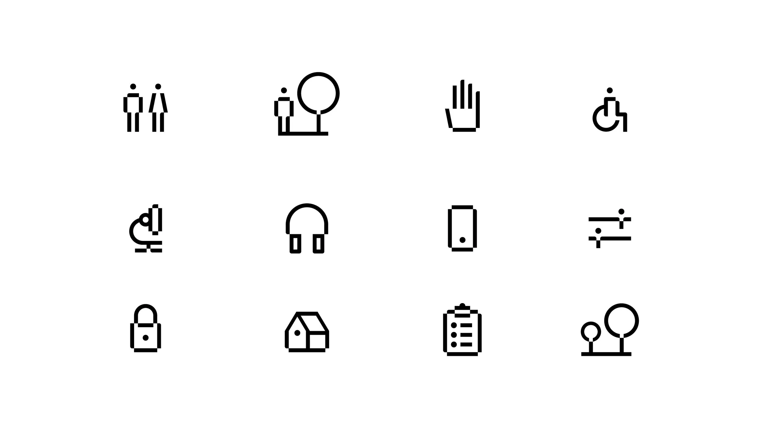
Following the same concepts and principles, we developed an icon library that matches the custom typeface style and provides the brand with a set of pictograms to be used across its communication system.
This resource –along with the rest of the primary brand assets and the verbal identity– was carefully detailed and standardized in a digital brand book to be shared with design teams, coders, event planners, and RegenDesigners’ member companies.


Other projects you may like: