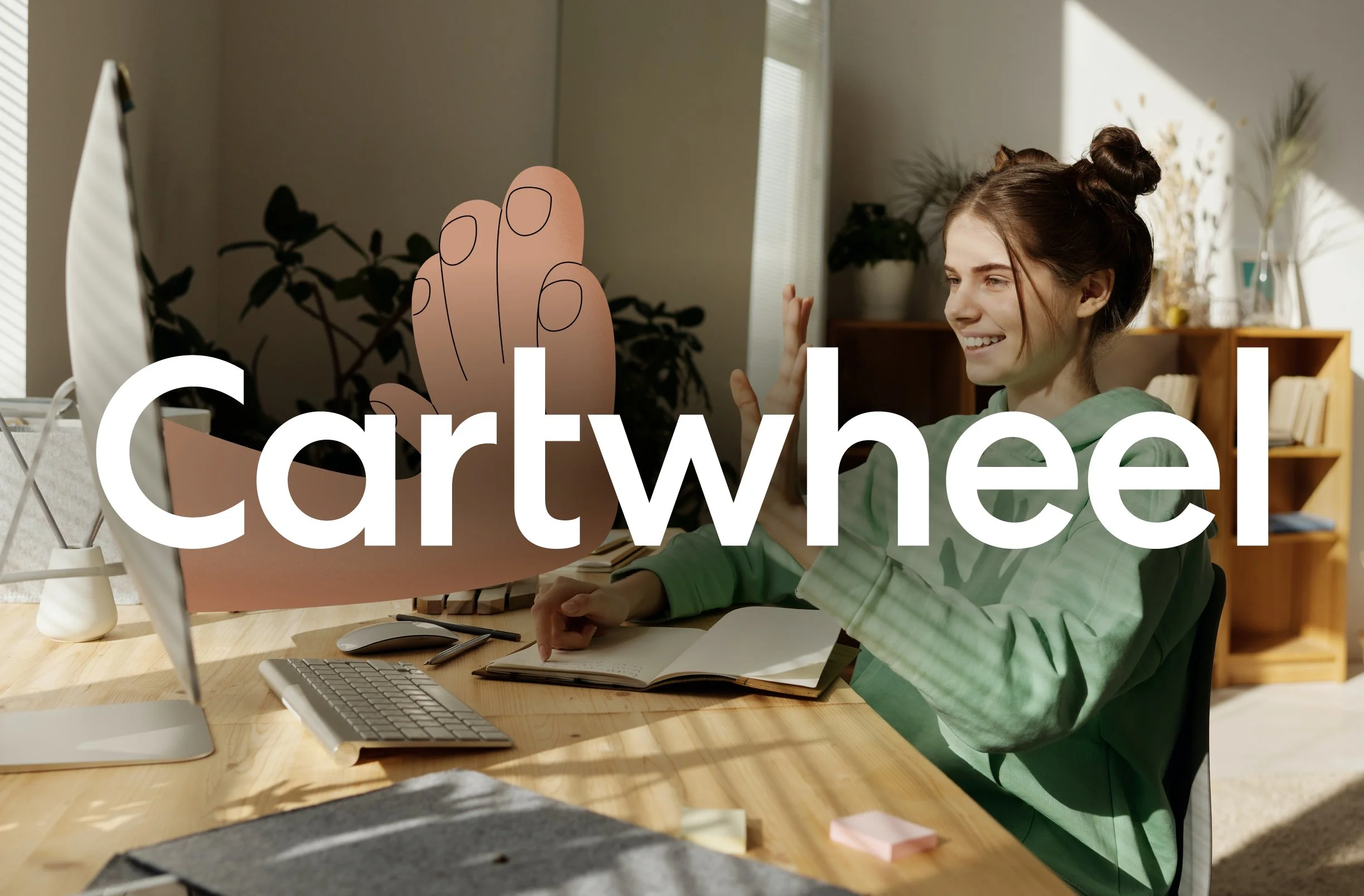

Cartwheel
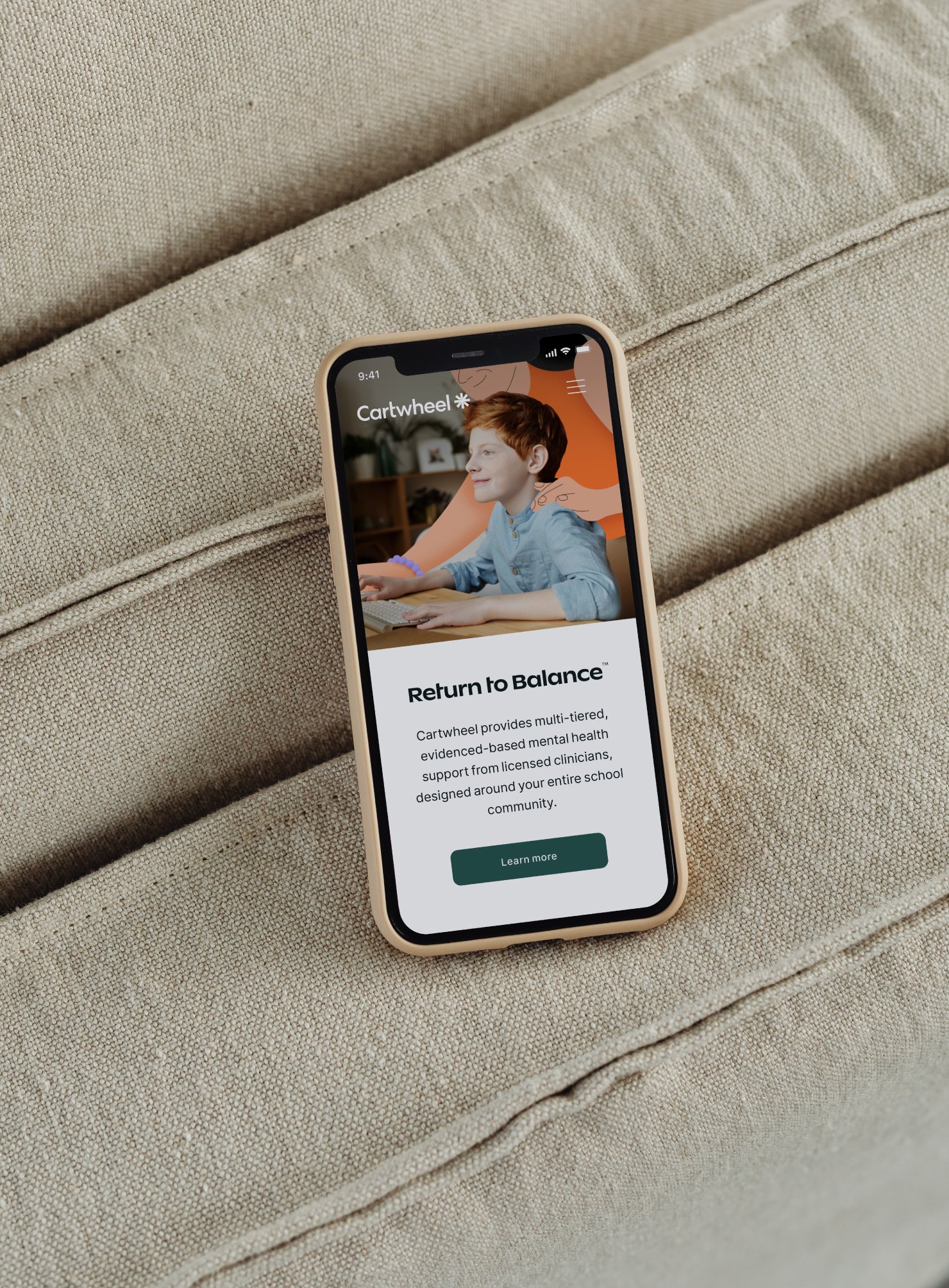
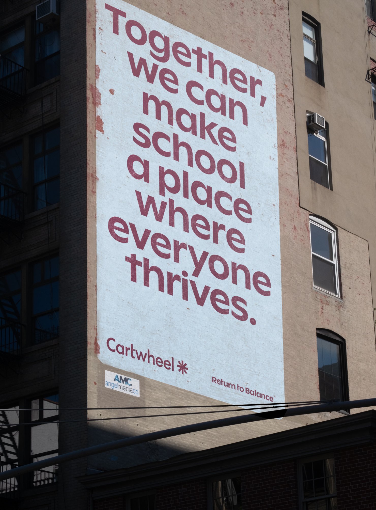
Return to balance
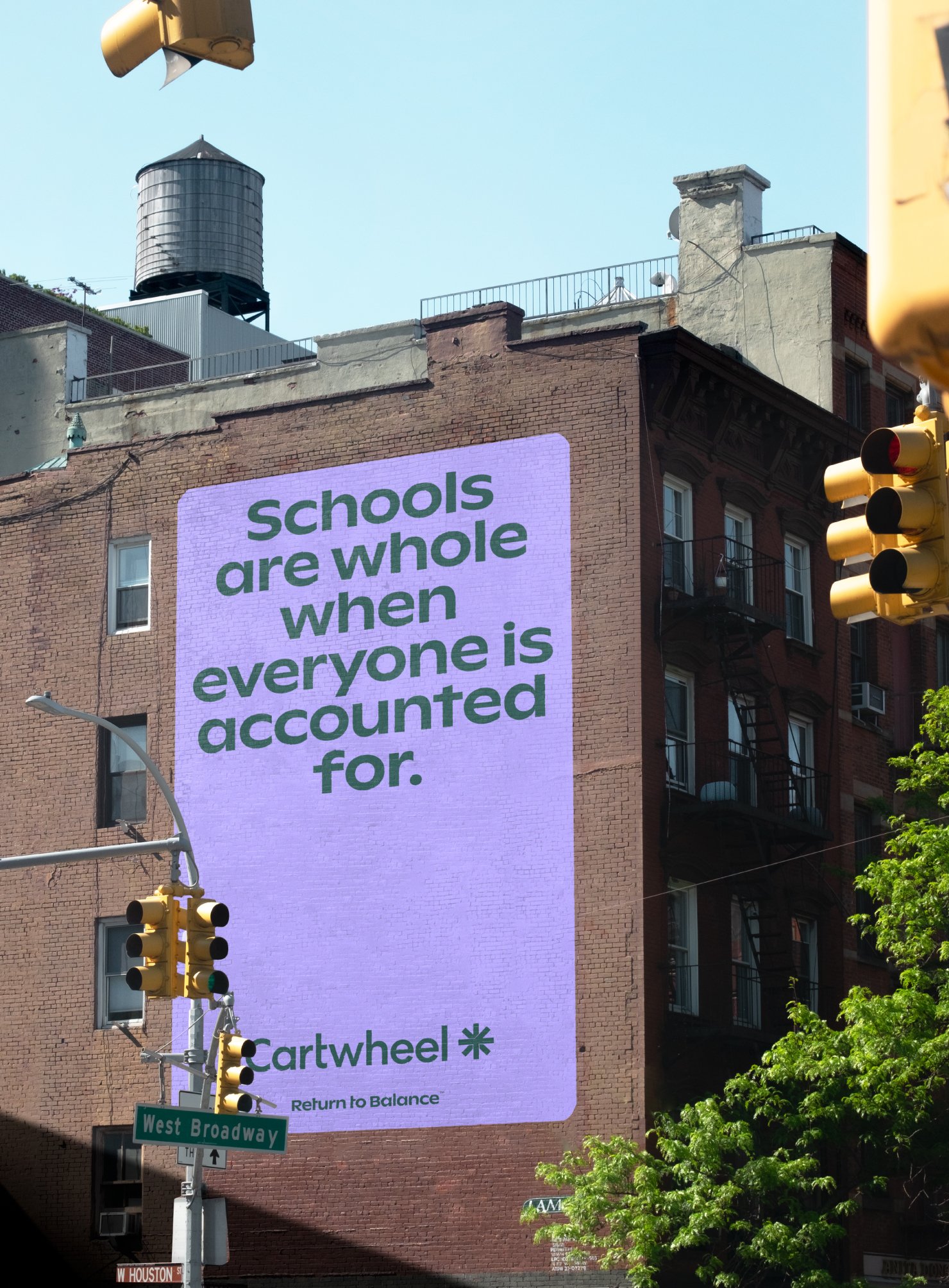
Cartwheel provides evidence-based mental health support from licensed clinicians, designed around your entire school community. We were committed by NYC-based agency Underdog to work on its brand new visual identity system, delivering a warm, close, yet entertaining and vibrant brand ecosystem.
Client: Cartwheel Care
Year: 2021
Country: USA
Sector: Healthcare
Agency: Underdog
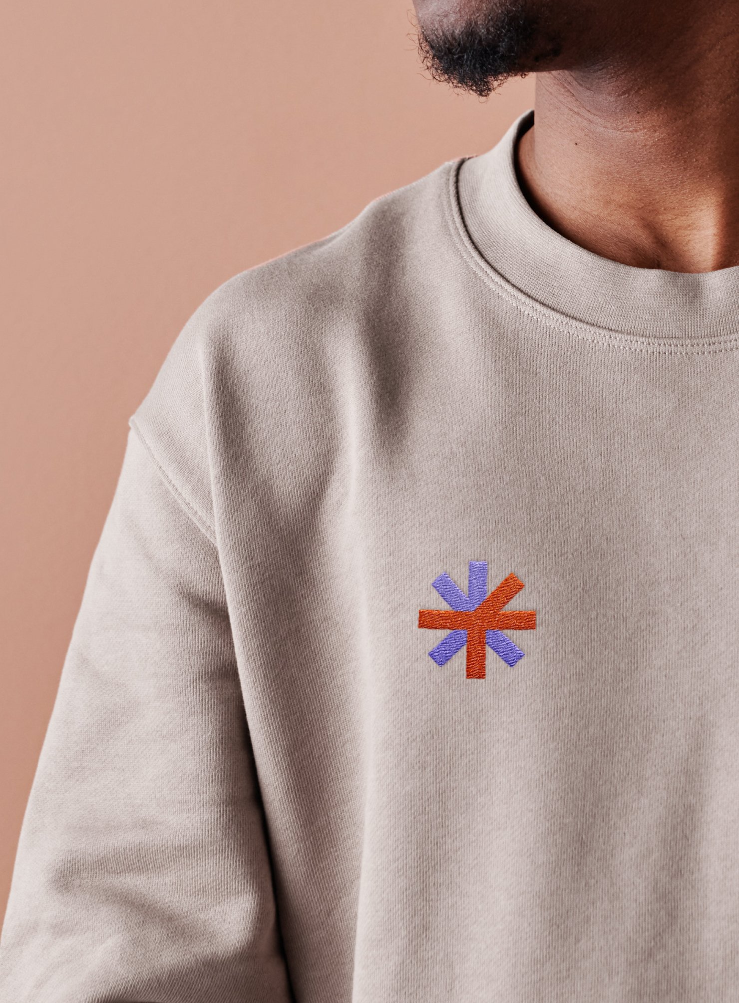
Visual Identity
Illustration
Brand Applications


The Challenge
We were committed to develop a brand identity system able to showcase inclusion and wellbeign within the classroom. This way, the brand should be able to portray both the support of the professionals behind it and be approachable for parents and students.


What we did
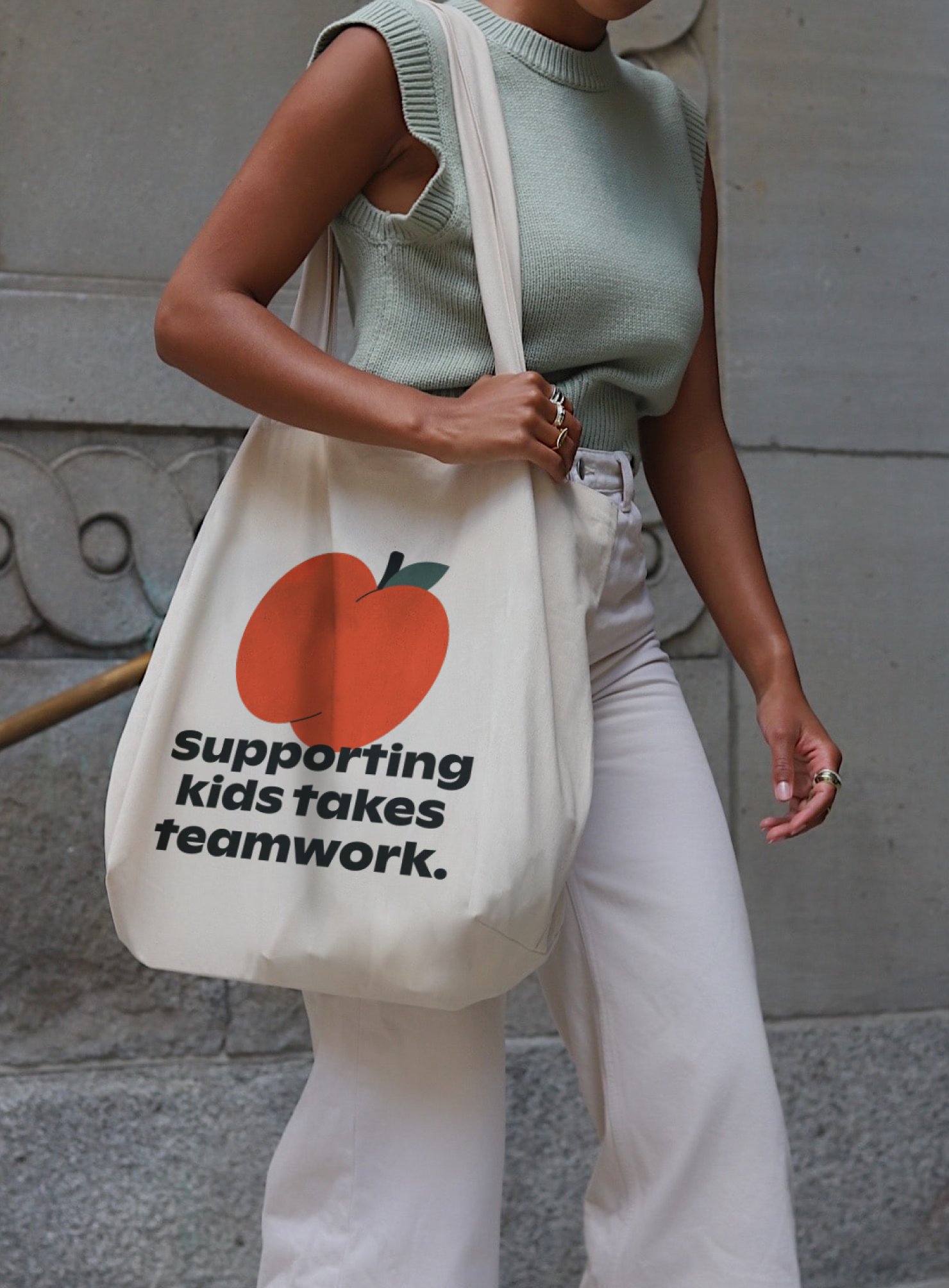
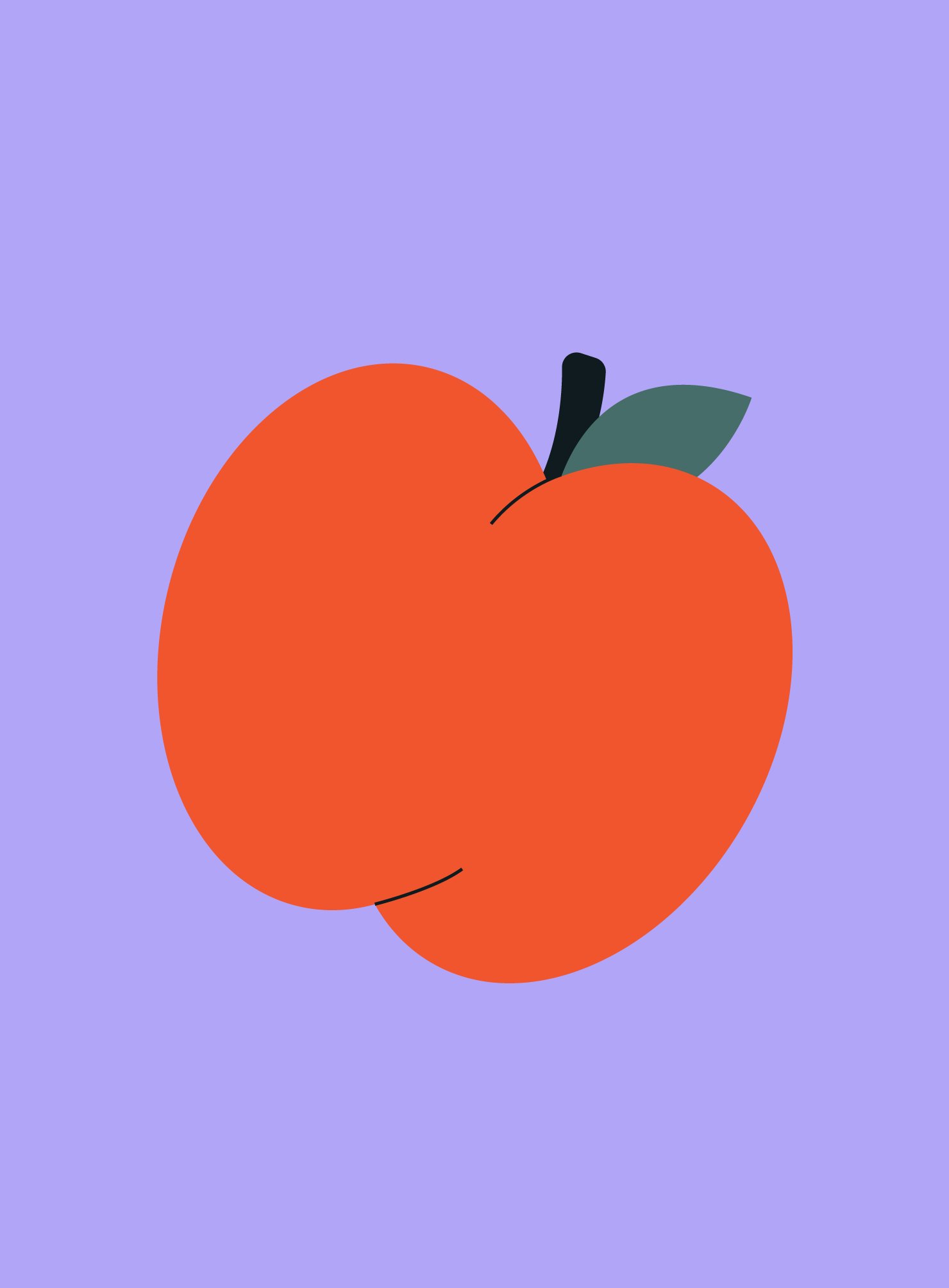
We have crafted a brand ecosystem founded on the concept of balance. At its core is a brand symbol that reimagines the cartwheel in a contemporary and synthetic manner. In addition to this primary sign, we have meticulously developed a visual toolkit composed by typographic system, color palette, and photography style, all of which encapsulate the project's essence — an approachable, warm, and inviting aura.
Within this ecosystem, we have seamlessly integrated photography with illustrations, fostering a dialogue between these two visual elements. This symbiotic relationship strives to evoke a sense of support and companionship, further enhancing the brand's overall appeal.


Other projects you may like: