

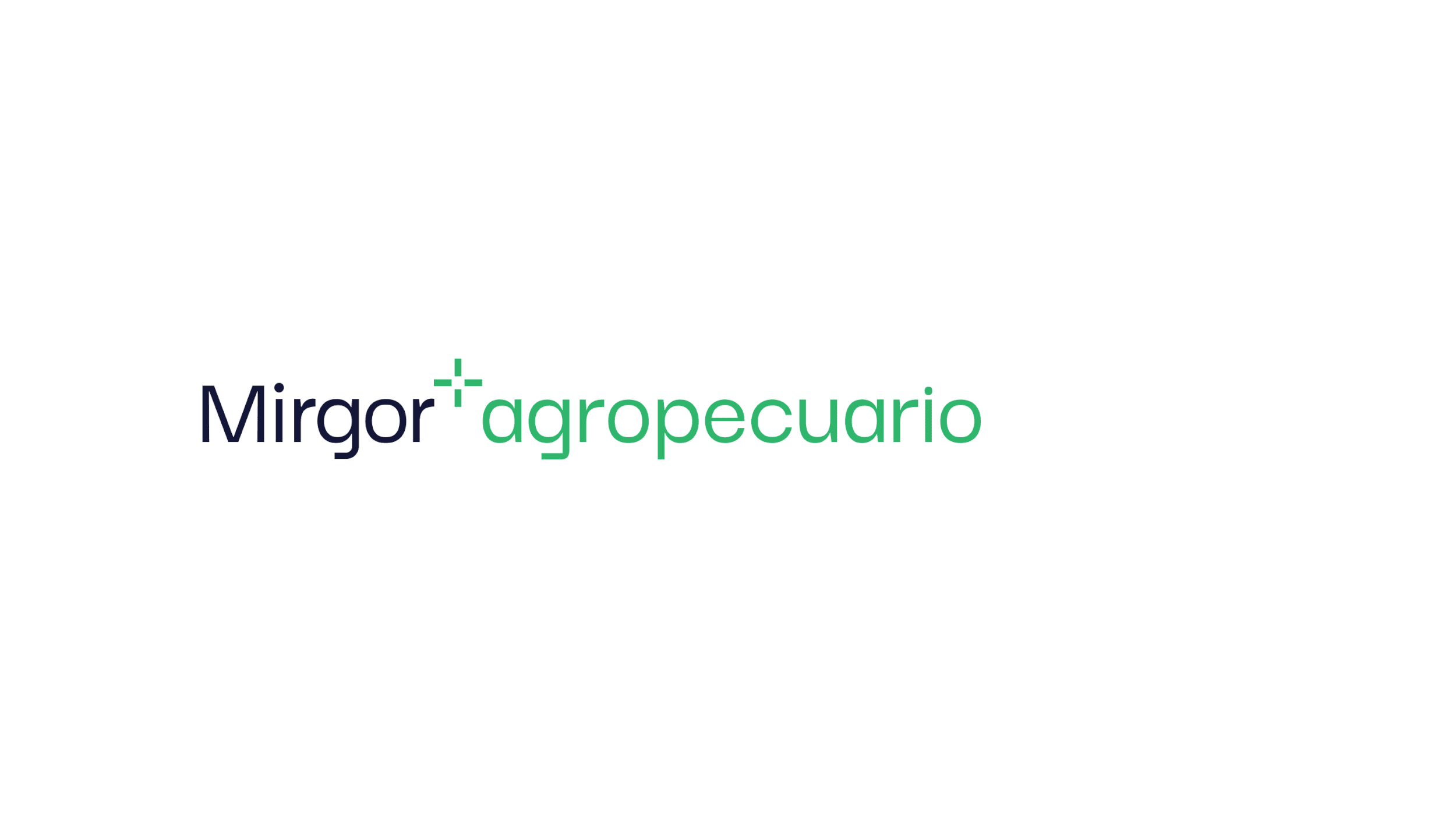
Mirgor
Building the future
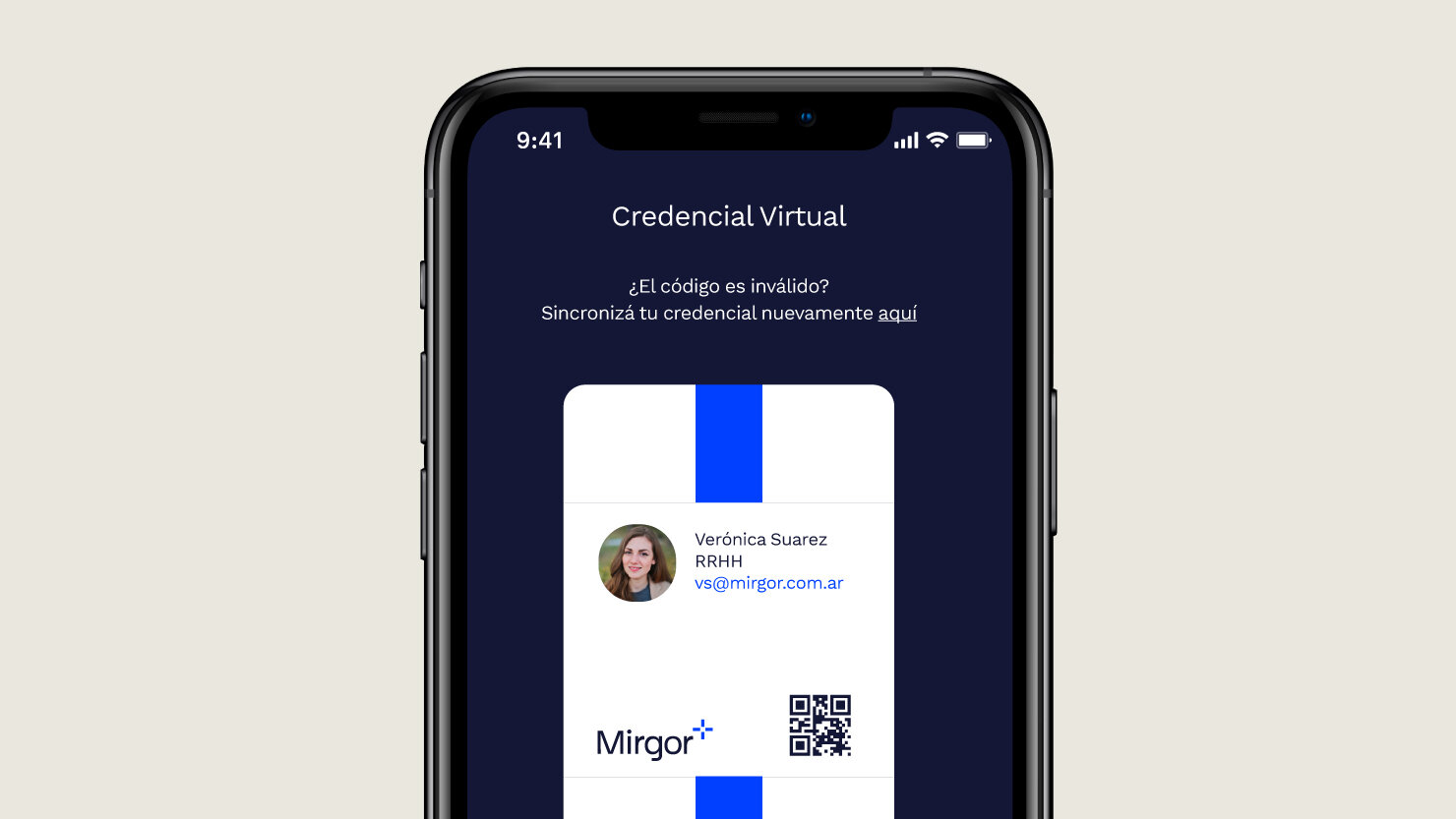
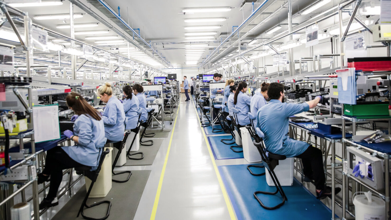
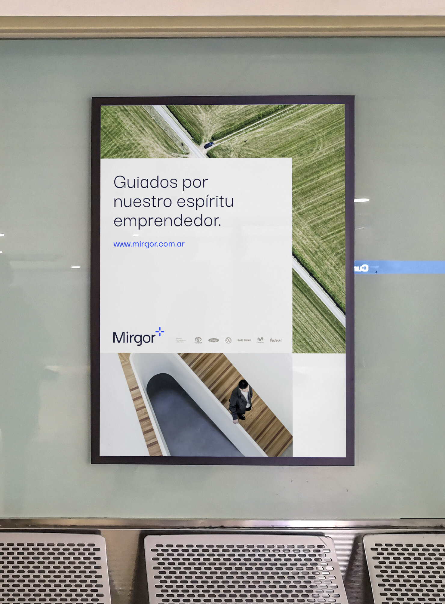
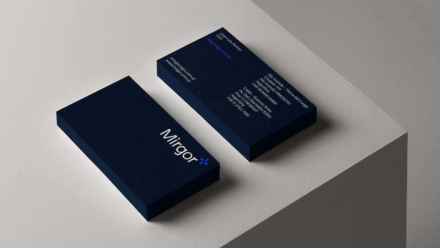
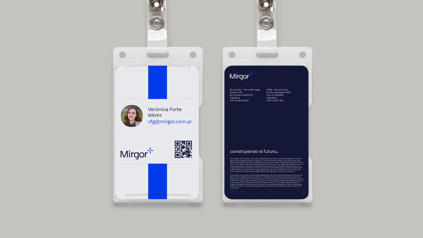
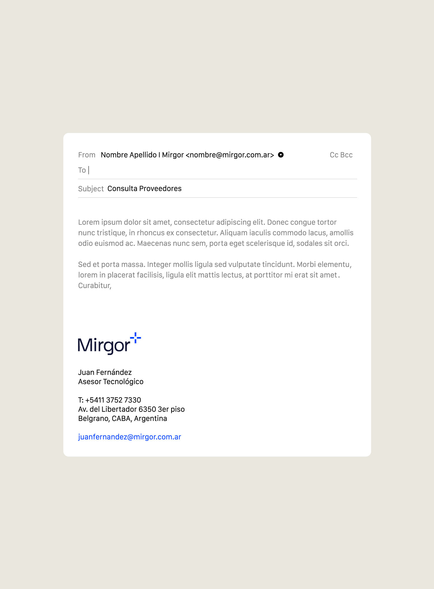
Mirgor is an Argentinian organization that serves as a leader in technological innovation which, with investment and development, creates experiences that generate well-being and progress for the country and its people. We were chosen to rethink and redesign the brand's architecture and visual identity — including everything from the logo redesign to a custom iconography system, photo library, and much more.
Client: Mirgor
Agency: Nro.3
Year: 2020
Country: Argentina
Sector: Corporate
Branding
Visual Identity
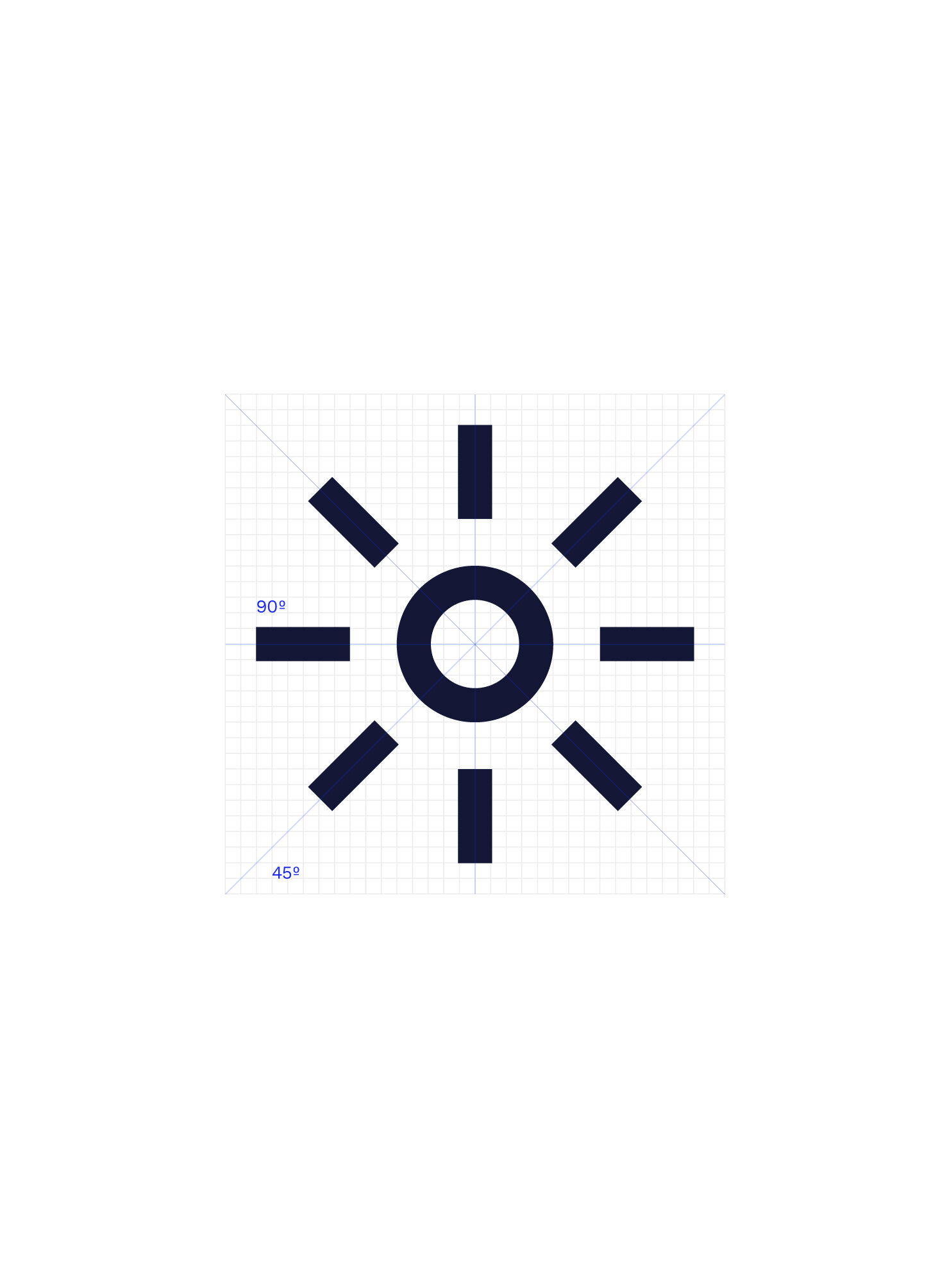
Iconography


The Challenge
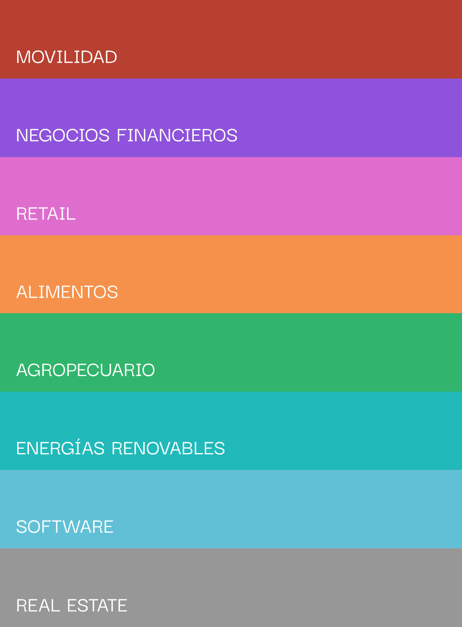
To position Mirgor as the driver of technological innovation, turning people's daily life into experiences that generate well-being and progress. To reflect the transformation of the local and regional industry and how Mirgor cares for the communities in which it works.


What we did
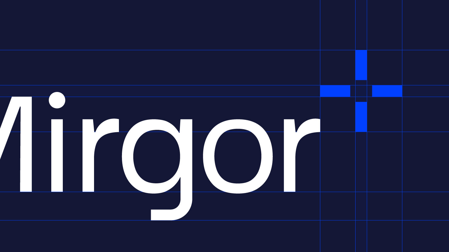
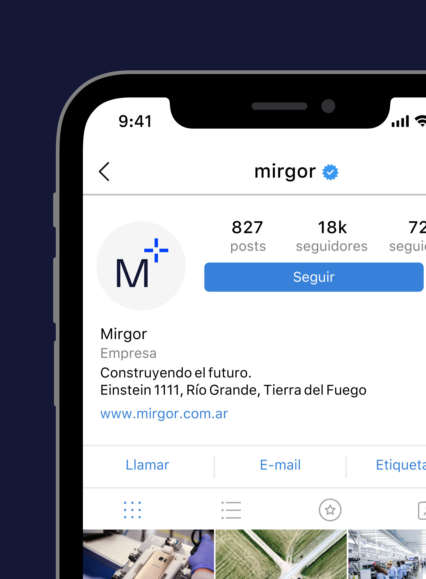
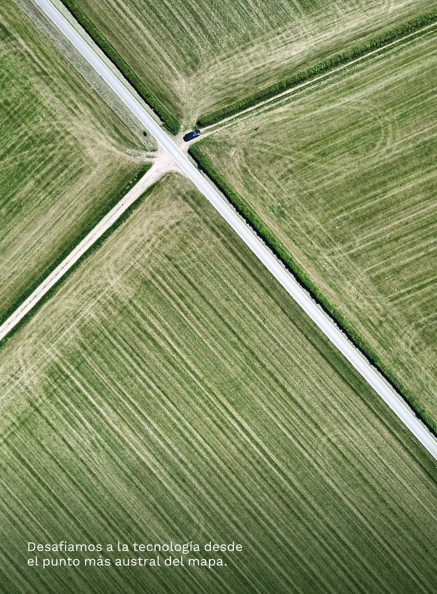
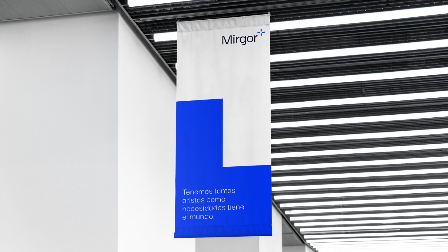
We were inspired by the southern cross constellation, an element typically used for guidance and navigation in our hemisphere. This element also forms a strong connection with the city of Tierra del Fuego, where Mirgor's headquarters are located. We used this concept as the main inspiration for the brand symbol's essence and color. This element is connected with positive meanings, the business units, and the new positioning of the brand, while it’s also synthetic and easy to adopt for the audience.
The color palette blends the vibrancy and energy of technology with the warmth of human relationships. The Darker Grotesque font is functional and straightforward, while embodying the technological feel of the brand.
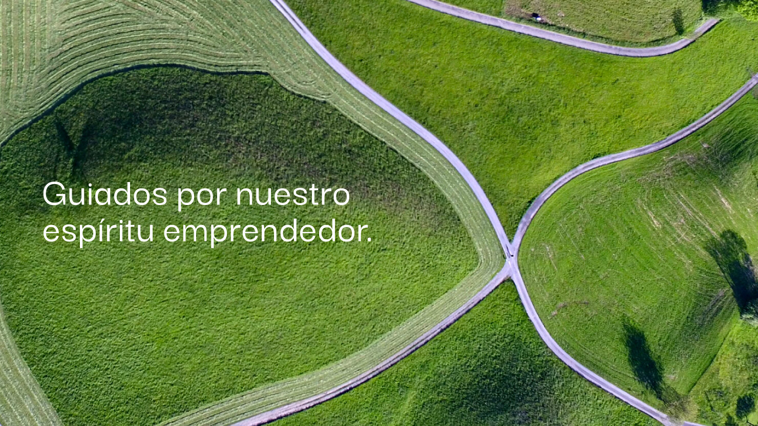
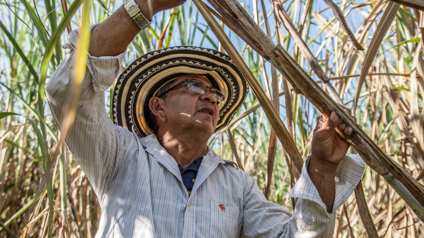
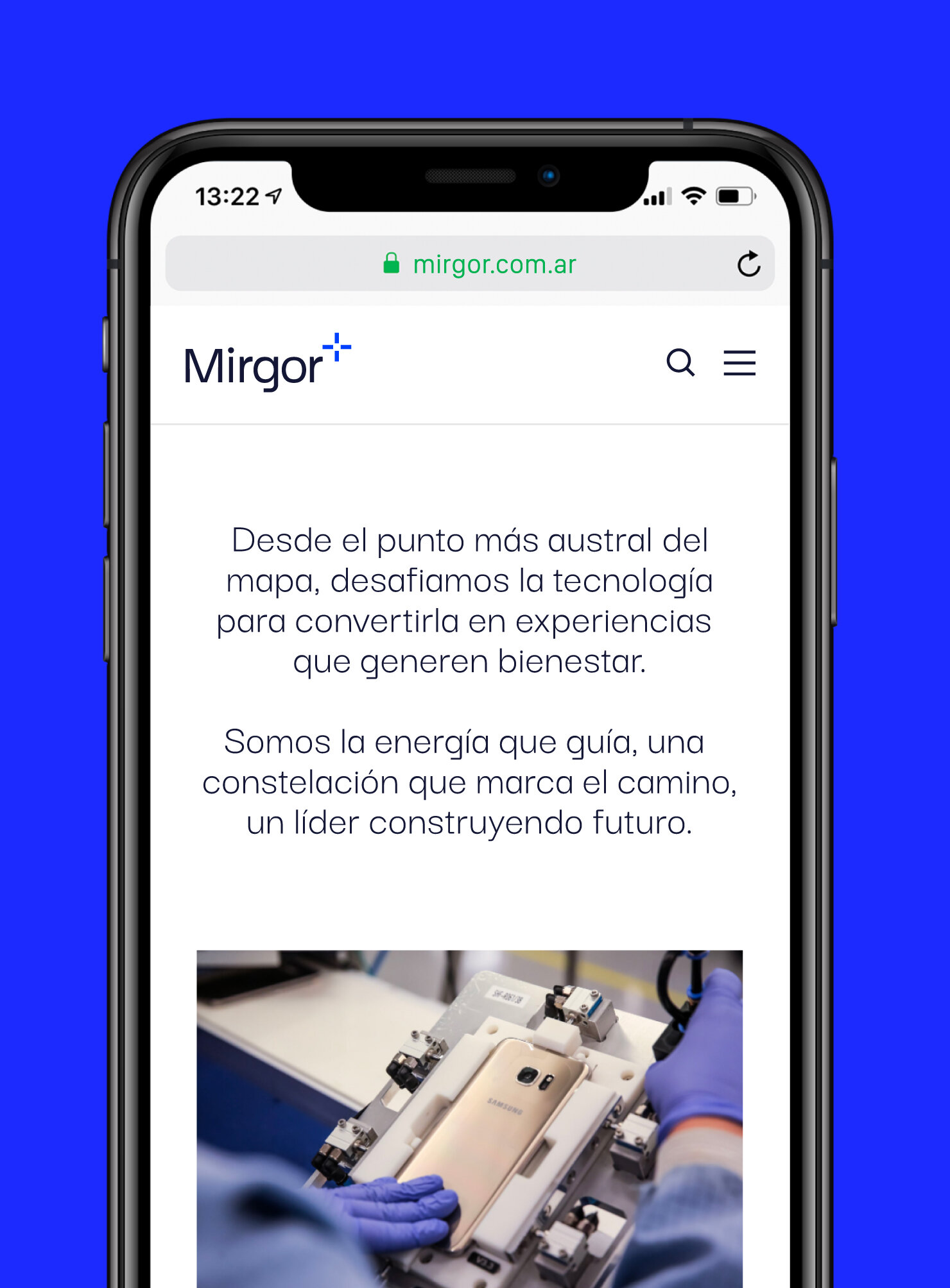
Aerial photography represents the concepts of Leadership, Strategic Vision, and Innovation. Like the brand symbol located at the top of the logo — the position of the camera in these shots reinforces the idea of a different perspective.

Other projects you may like: