
Modo
Connect your money
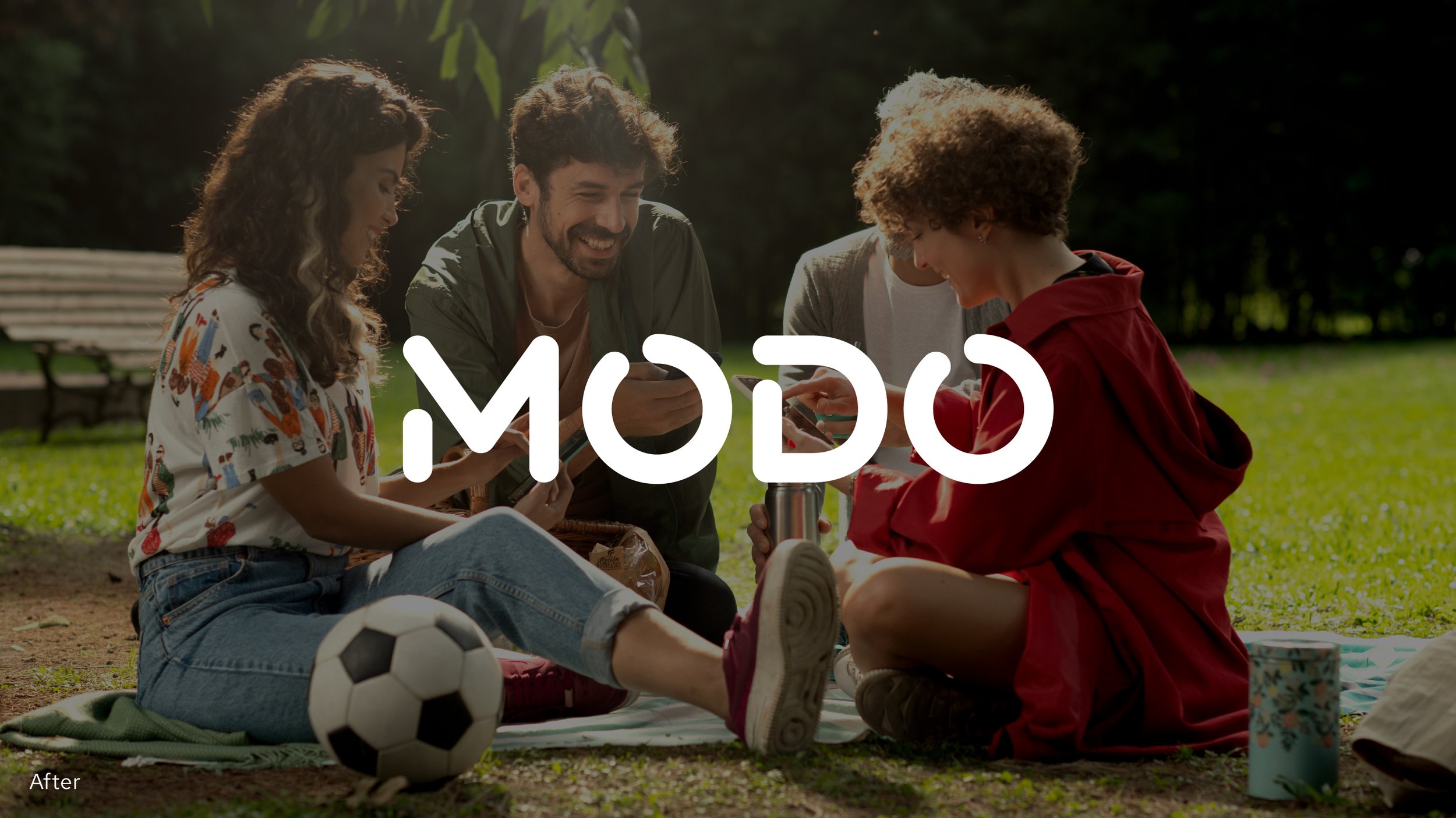
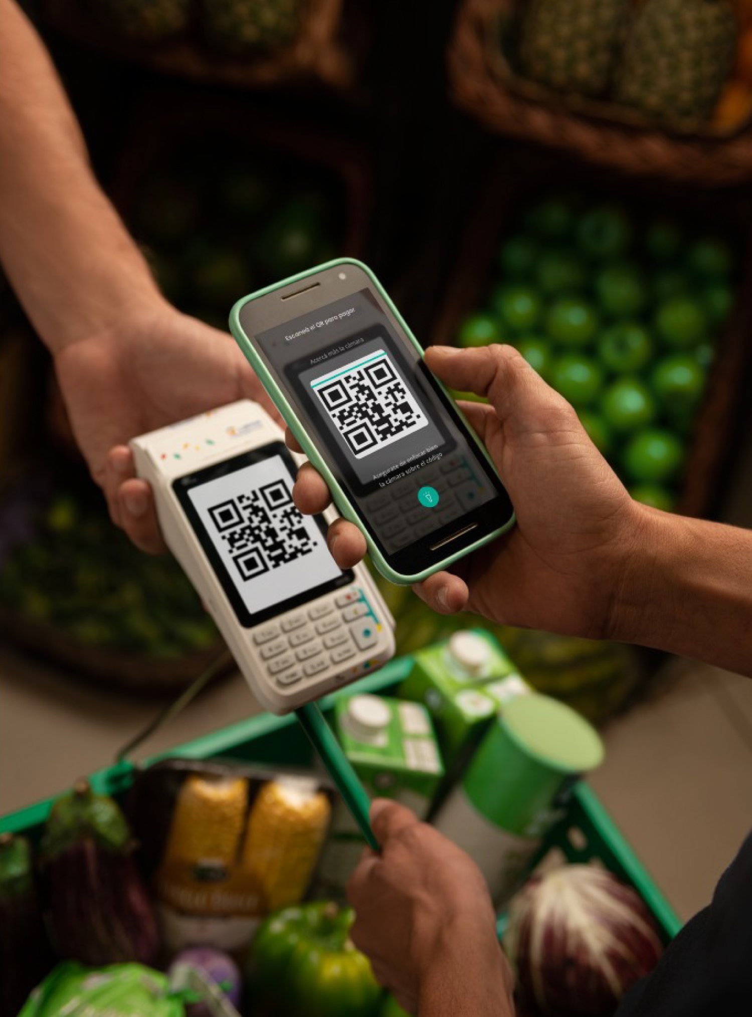
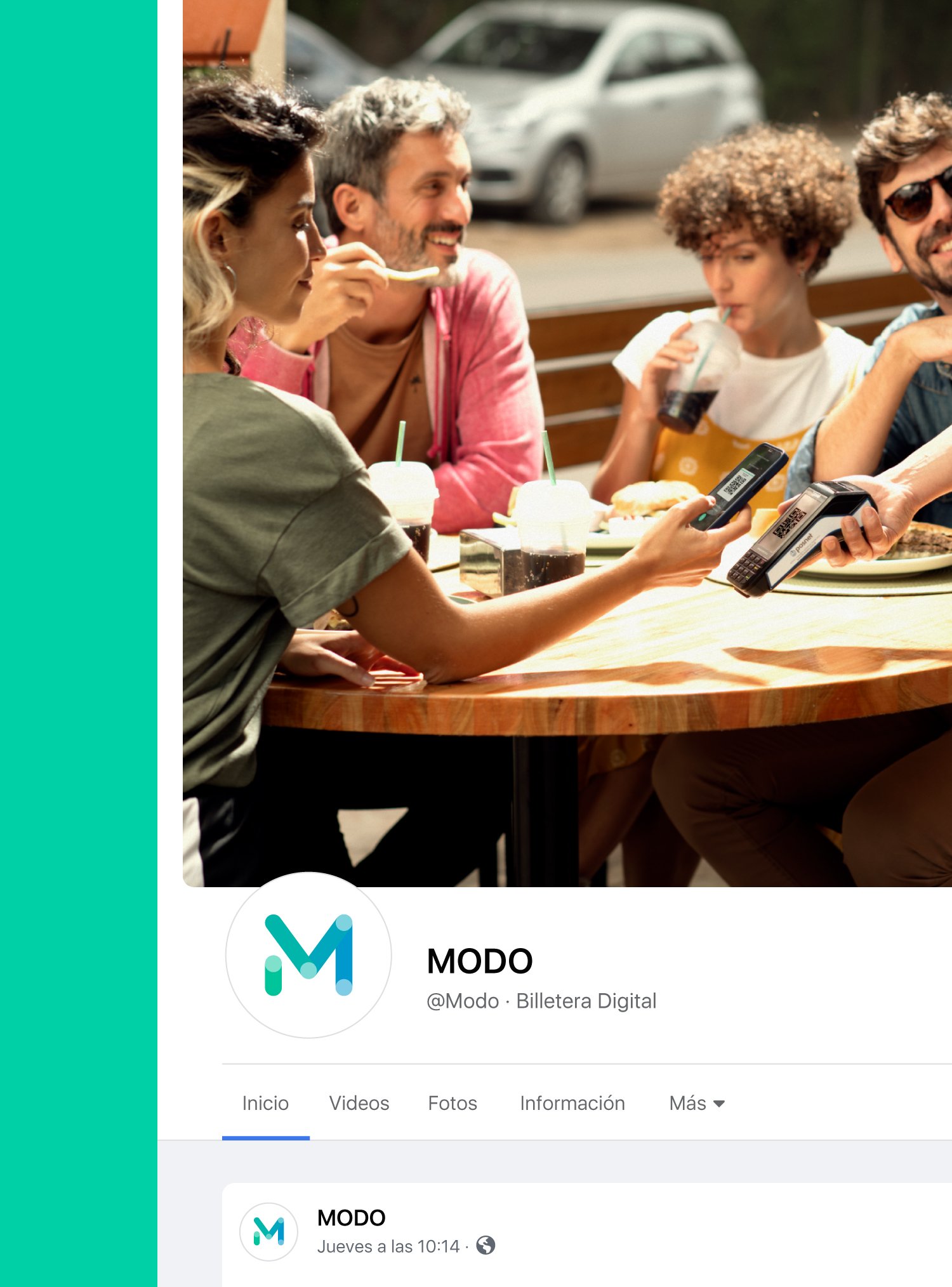
Modo is a digital solution to make money transfers and payments with QR through the users' existing accounts and cards in a practical, convenient, and secure way. We were approached to rethink and redesign the brand by focusing on optimizing digital media performance.
Client: Modo
Year: 2022
Country: Argentina
Sector: Fintech
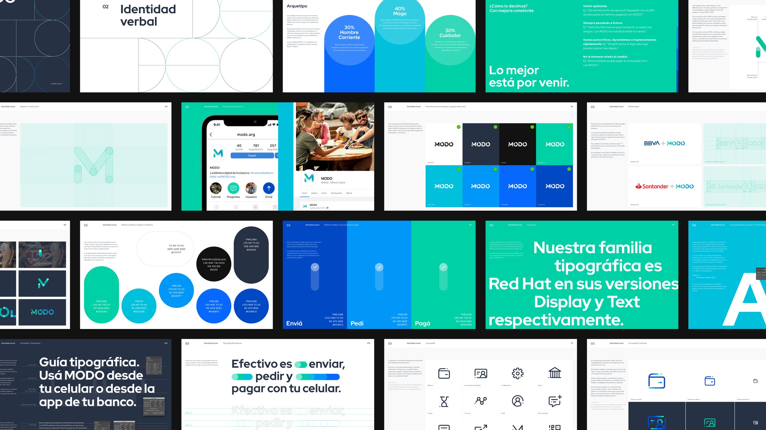
Visual Identity
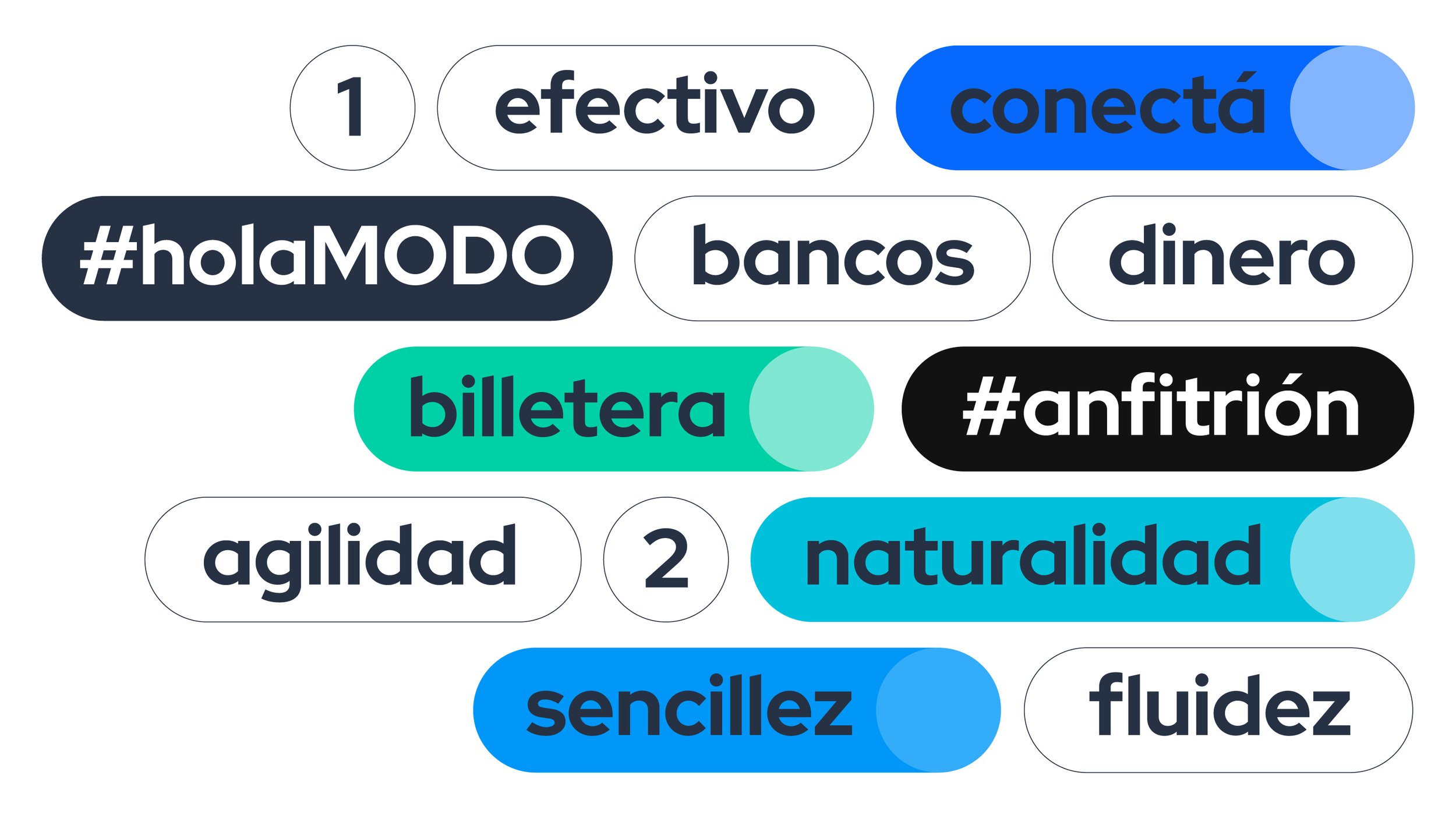
Verbal Identity
Motion Behavior
Illustration
Brand Guidelines
The Challenge
Modo’s marketing department approached us with the objective of optimizing their current brand ecosystem considering digital media performance and co-branded actions as the main goal.
Even though Modo was born to perform almost 100% digitally, their primary signs and brand expressions were considered dysfunctional and hard to use for the company’s designers and vendor’s creative teams, so a set of visual solutions to address these problems was needed.
On the same note, the challenge of increasing the performance in the co-existence of Modo’s primary elements with other companies’ signs for co-branded actions was detected.
What we did
We worked closely with Modo’s marketing and design team to solve the challenges and provide functional solutions for each of them.
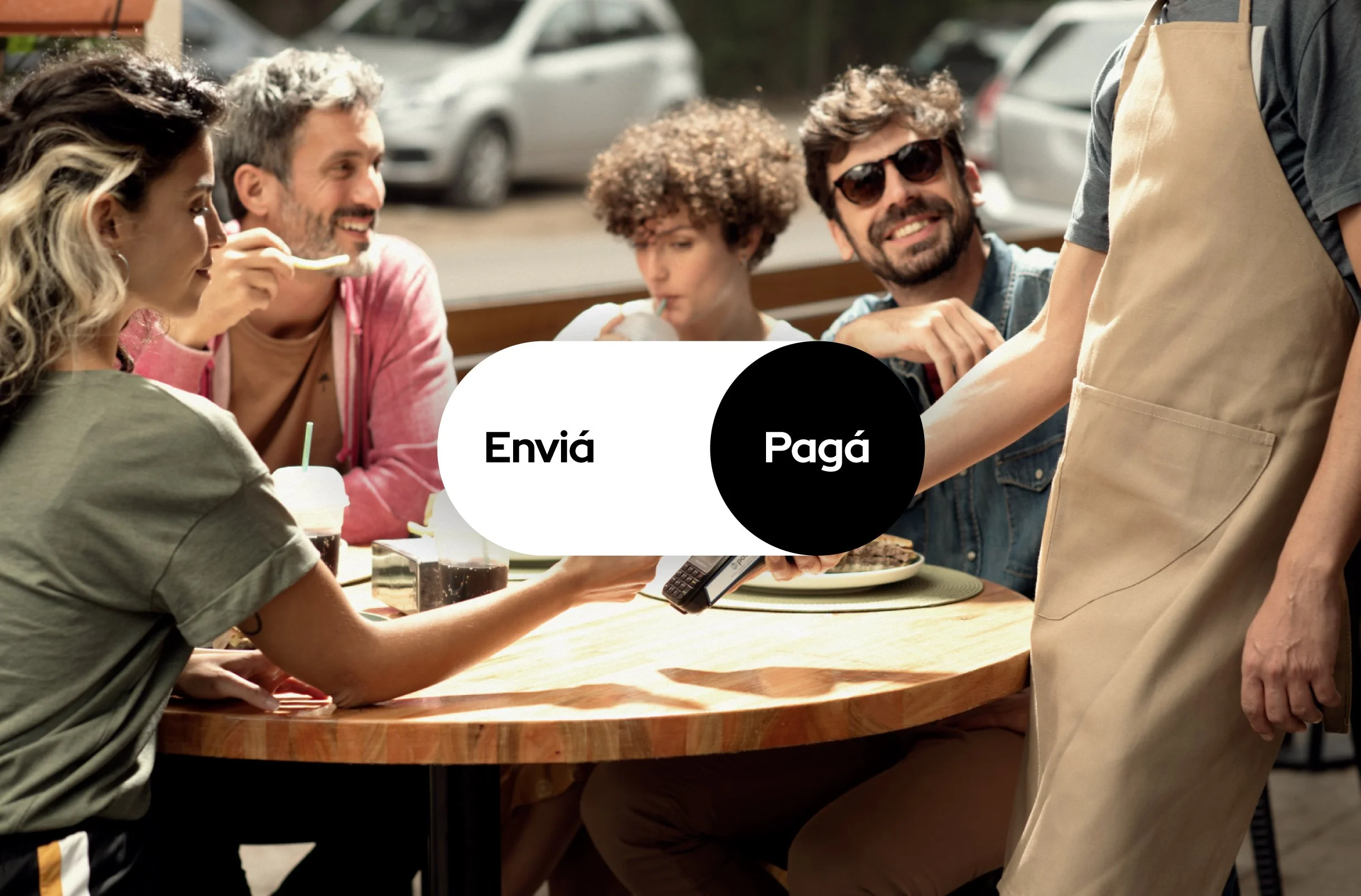
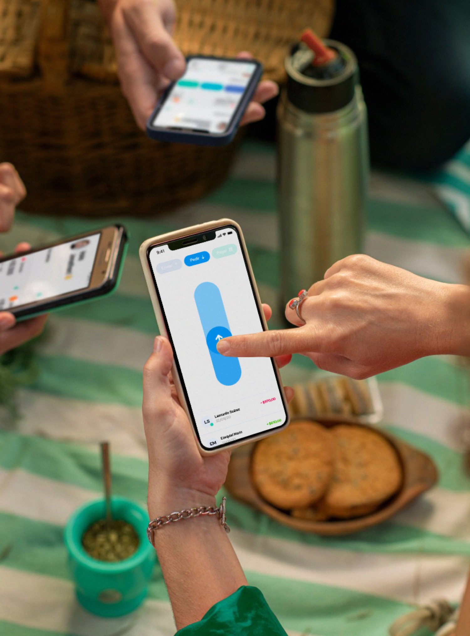
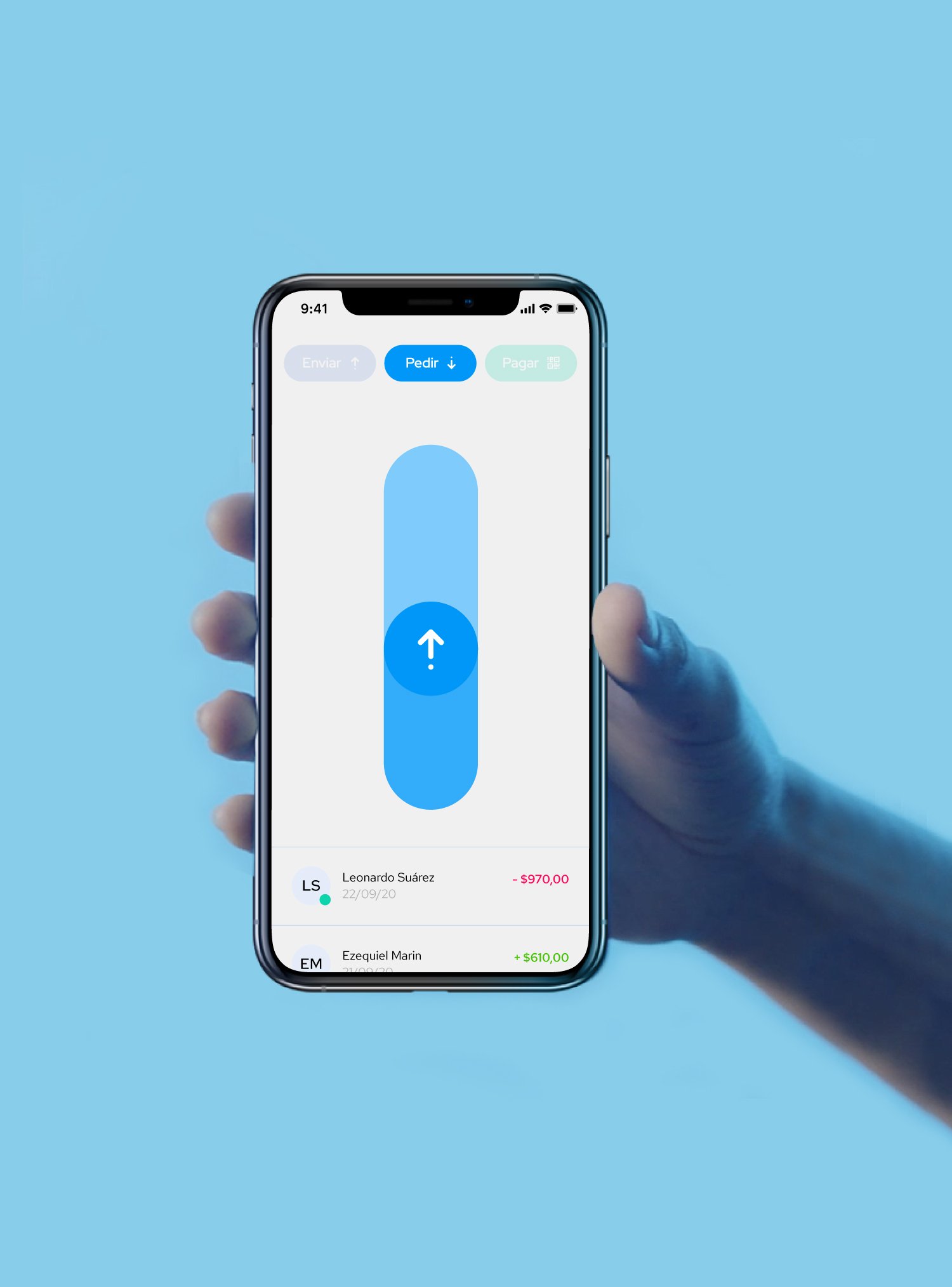
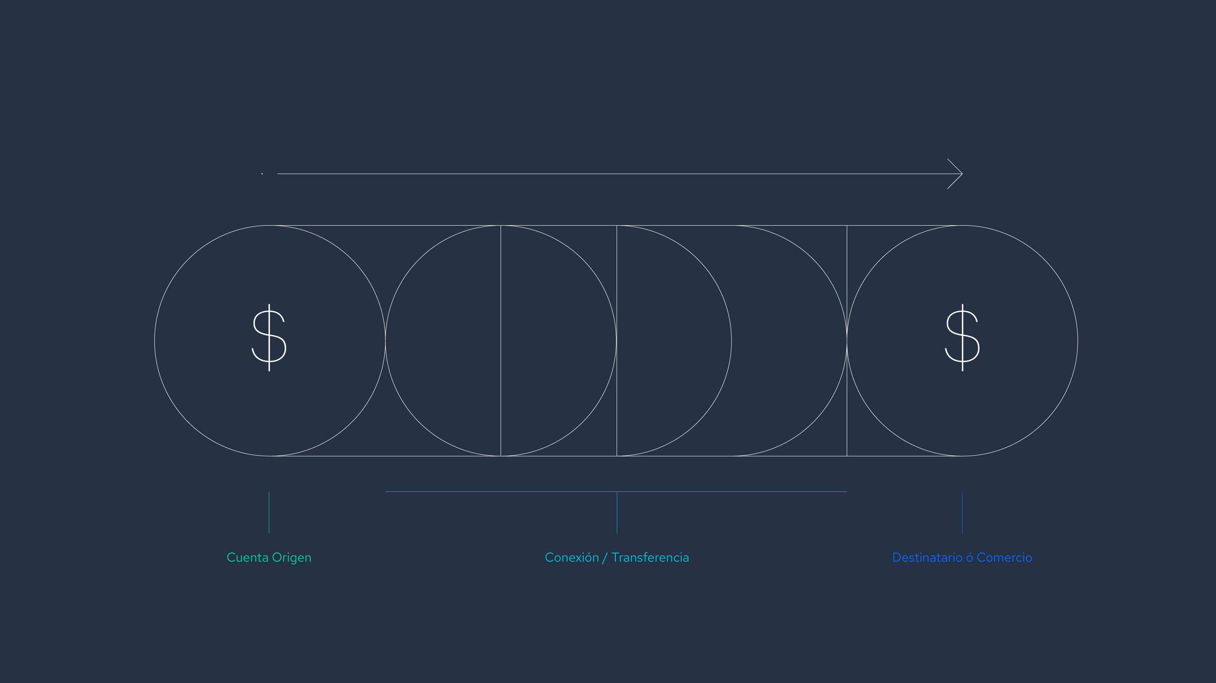
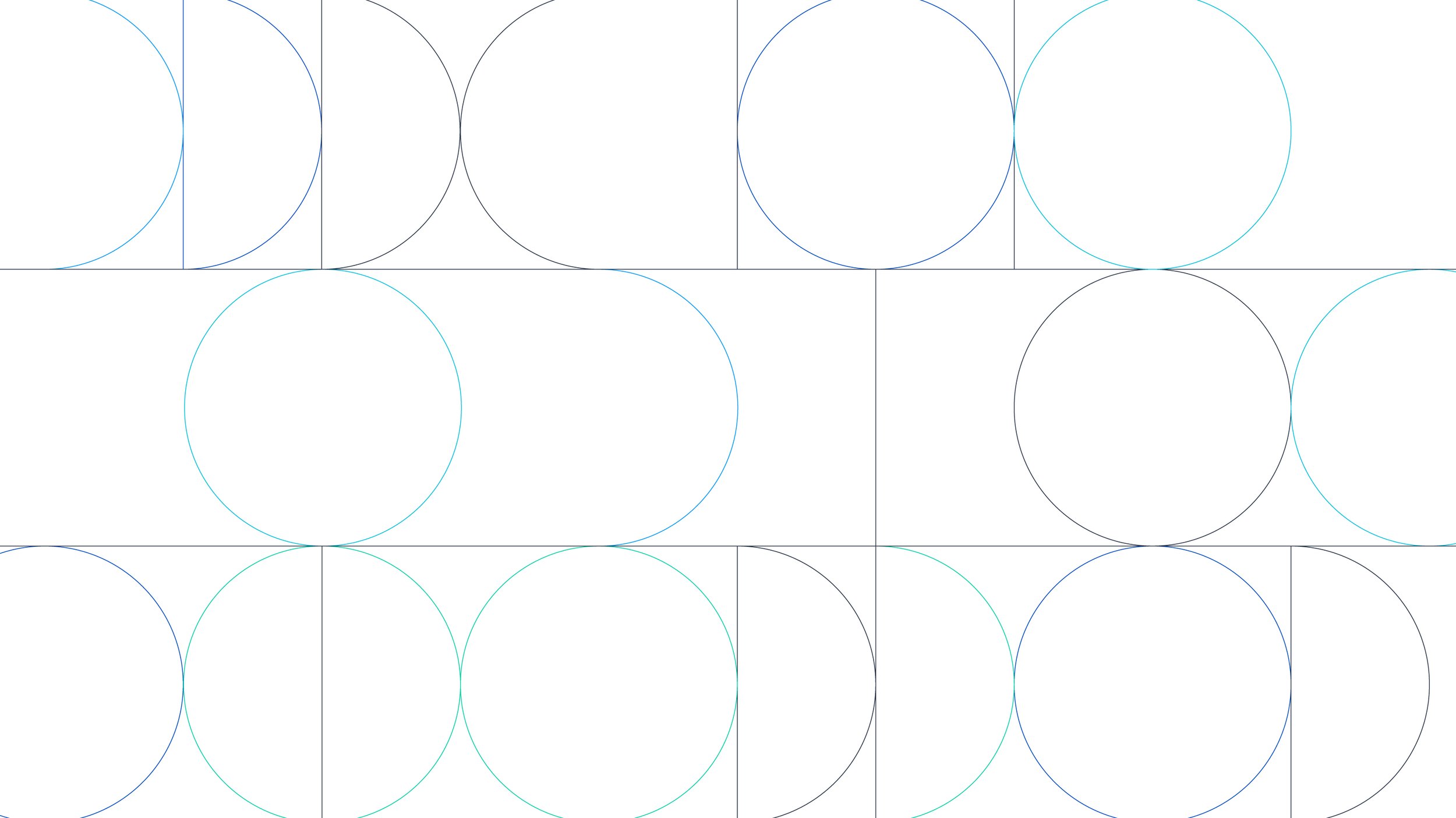
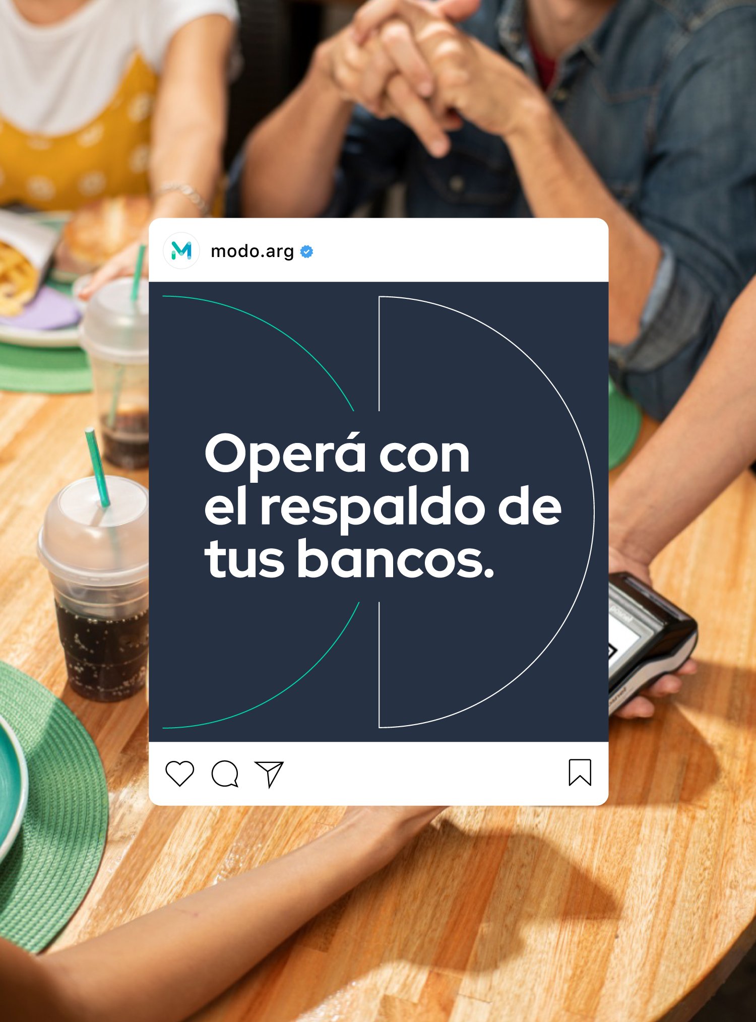
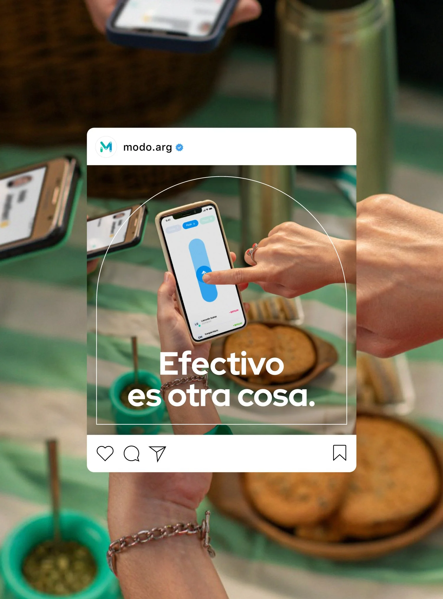
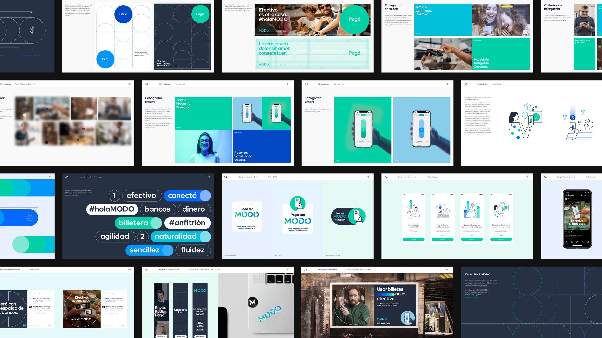
First of all, a master concept based on the swipe action was introduced to become the key to the creation of the graphic elements. This resource inspired and led the development of the set of graphic solutions.
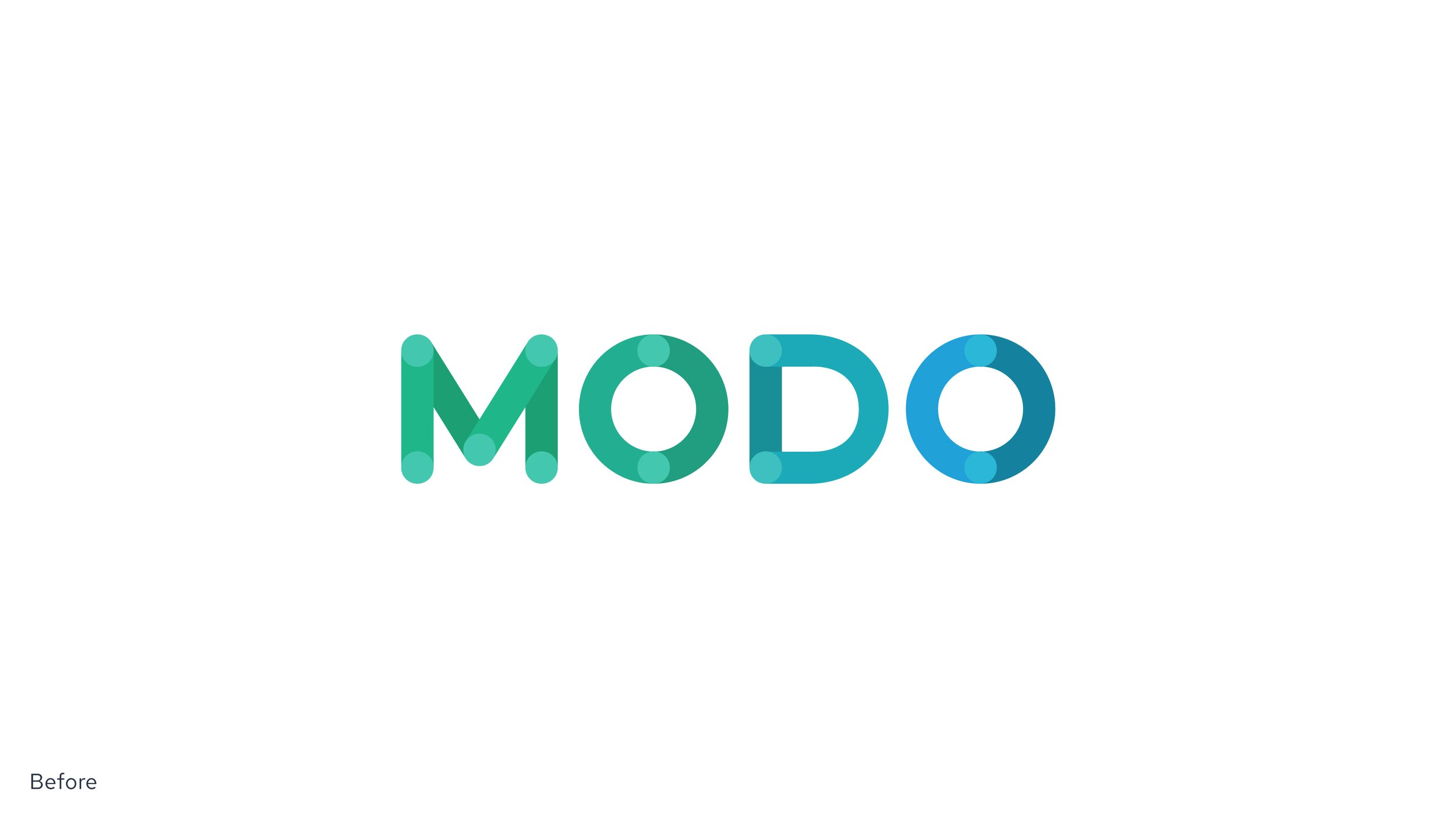
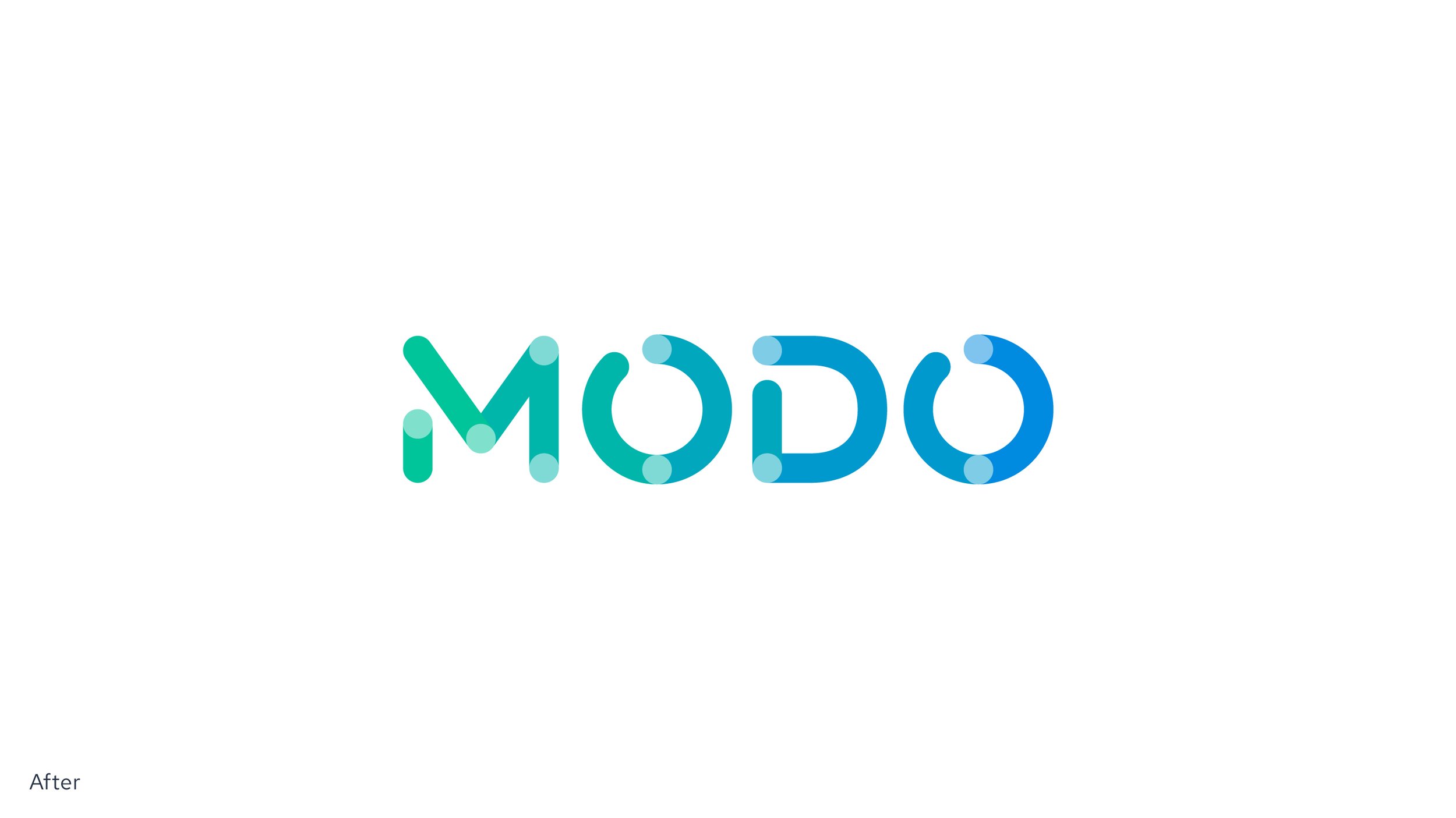
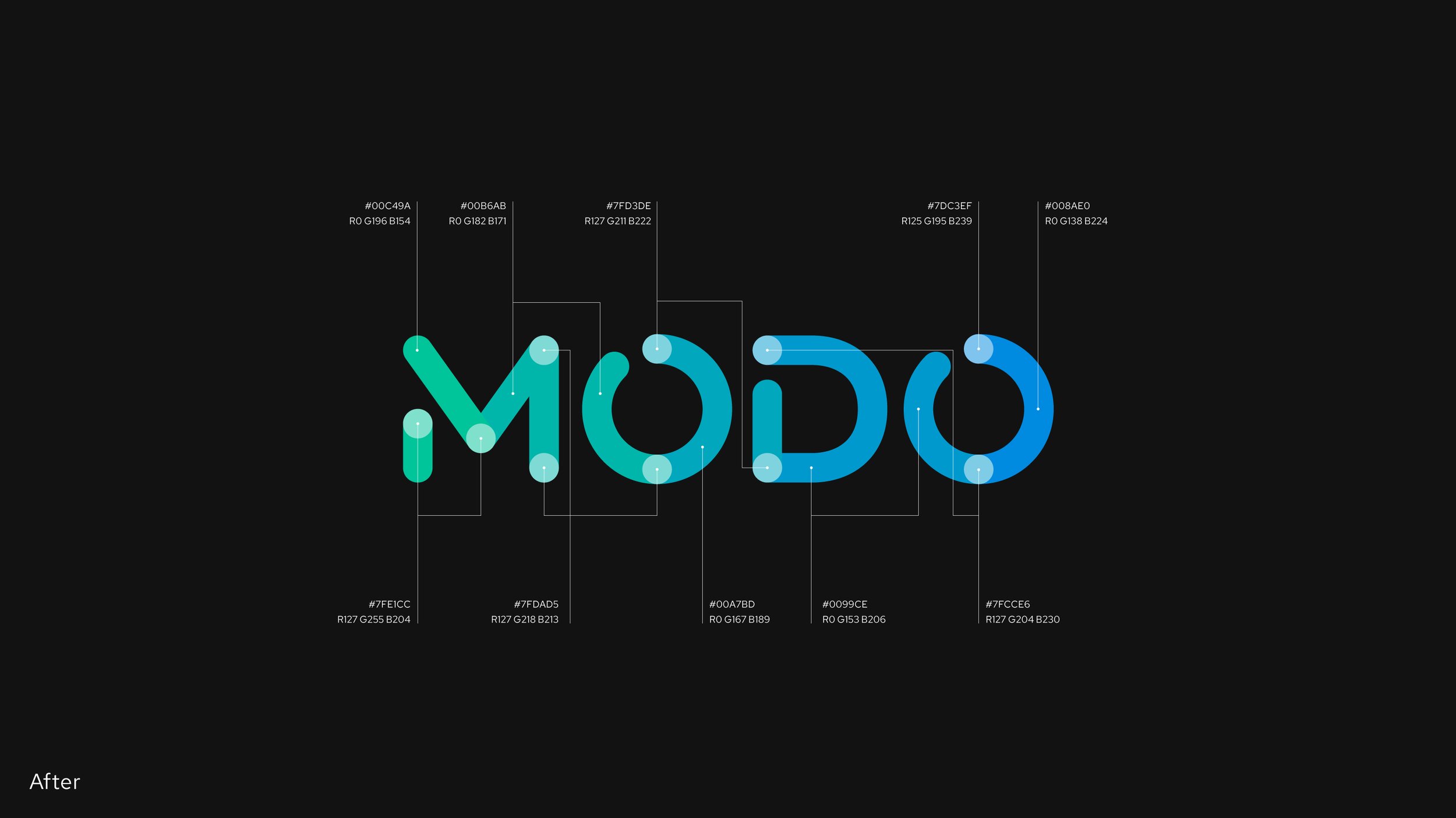
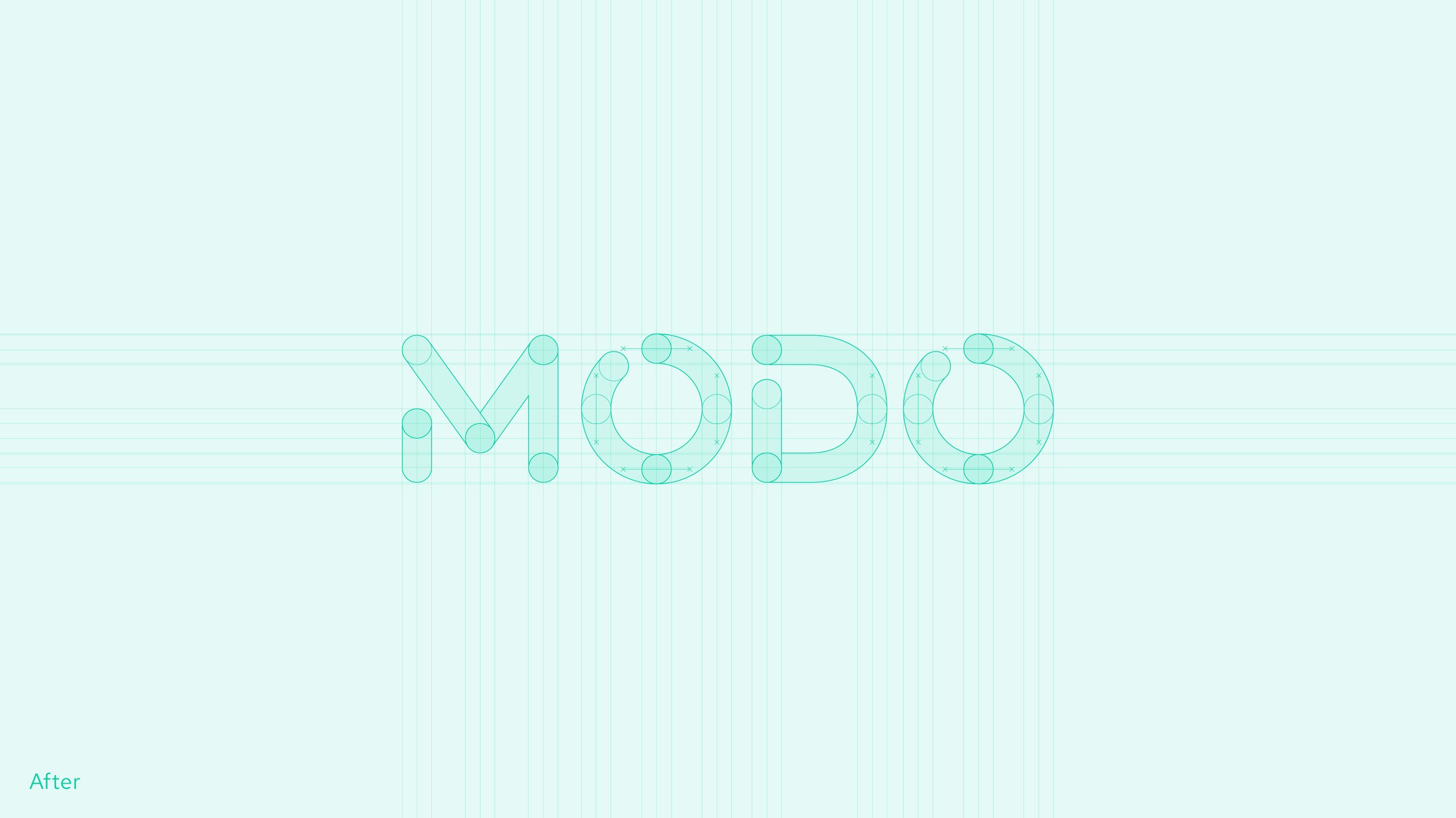
In order to solve the existing wordmark application and functionality, a new version was designed, maintaining the essence while optimizing the shapes, spacing, construction, and the number of colors, among other improvements.
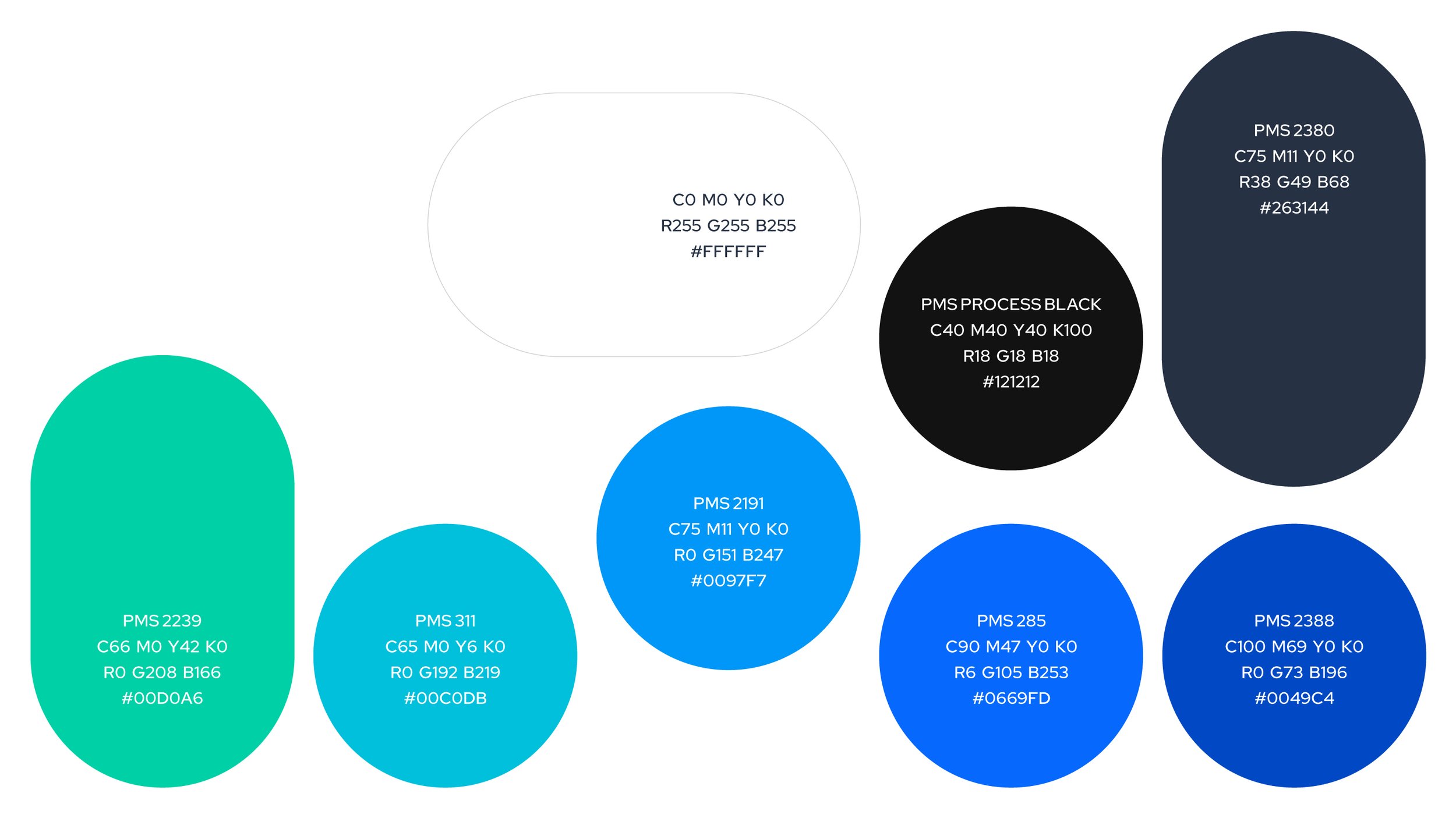
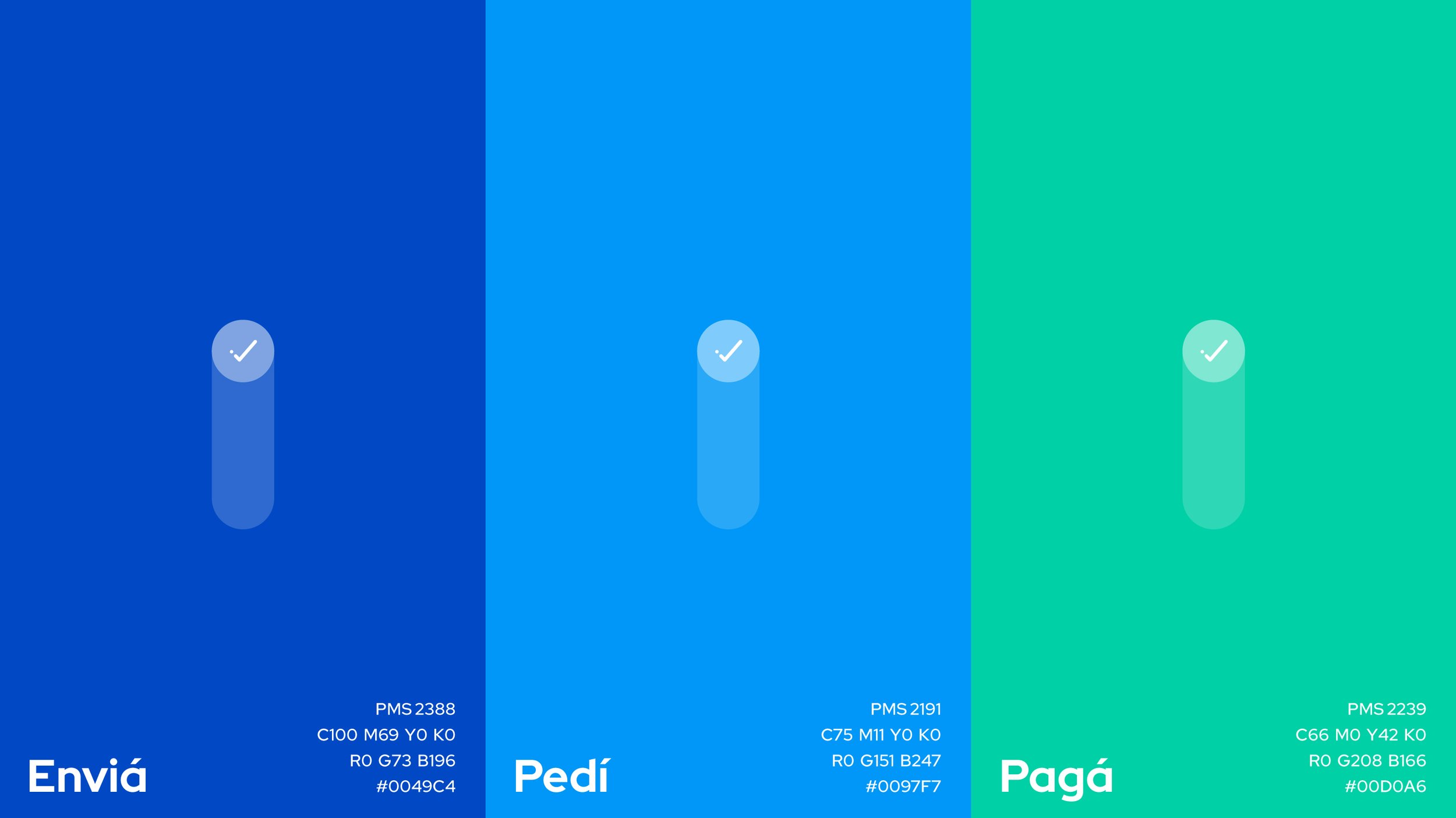
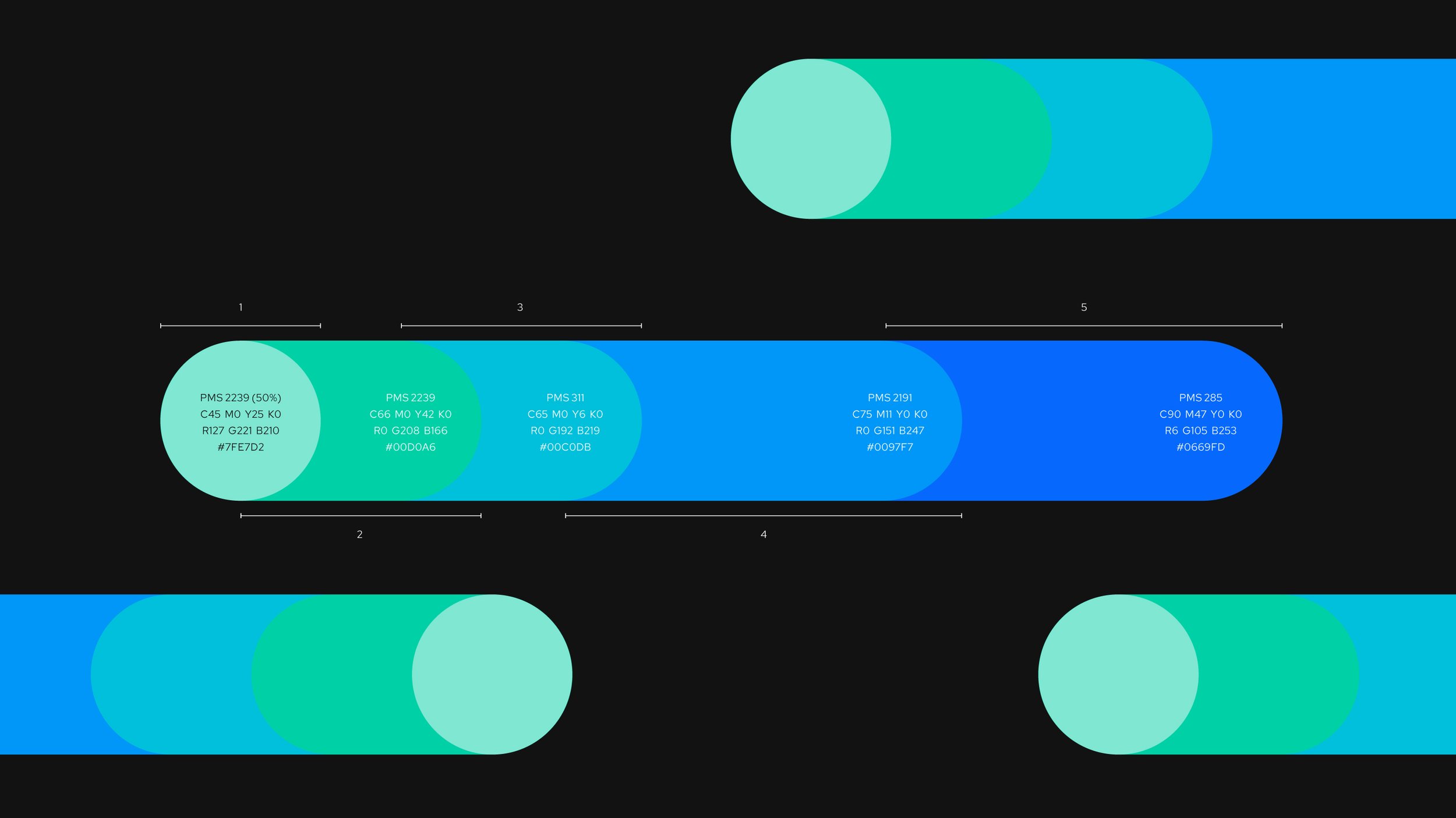
To address co-branding and coexistence with other companies’ problems, monochromatic versions of the wordmark and a flexible color palette scheme were developed in order to become dynamic signs, able to adapt to different environments.
To amplify these new resources in digital environments, we collaborated with motion design studio Baez Graphic Arts, who helped us bring the vision to life by developing Modo’s motion behavior in wordmark, illustrations, and app screens.
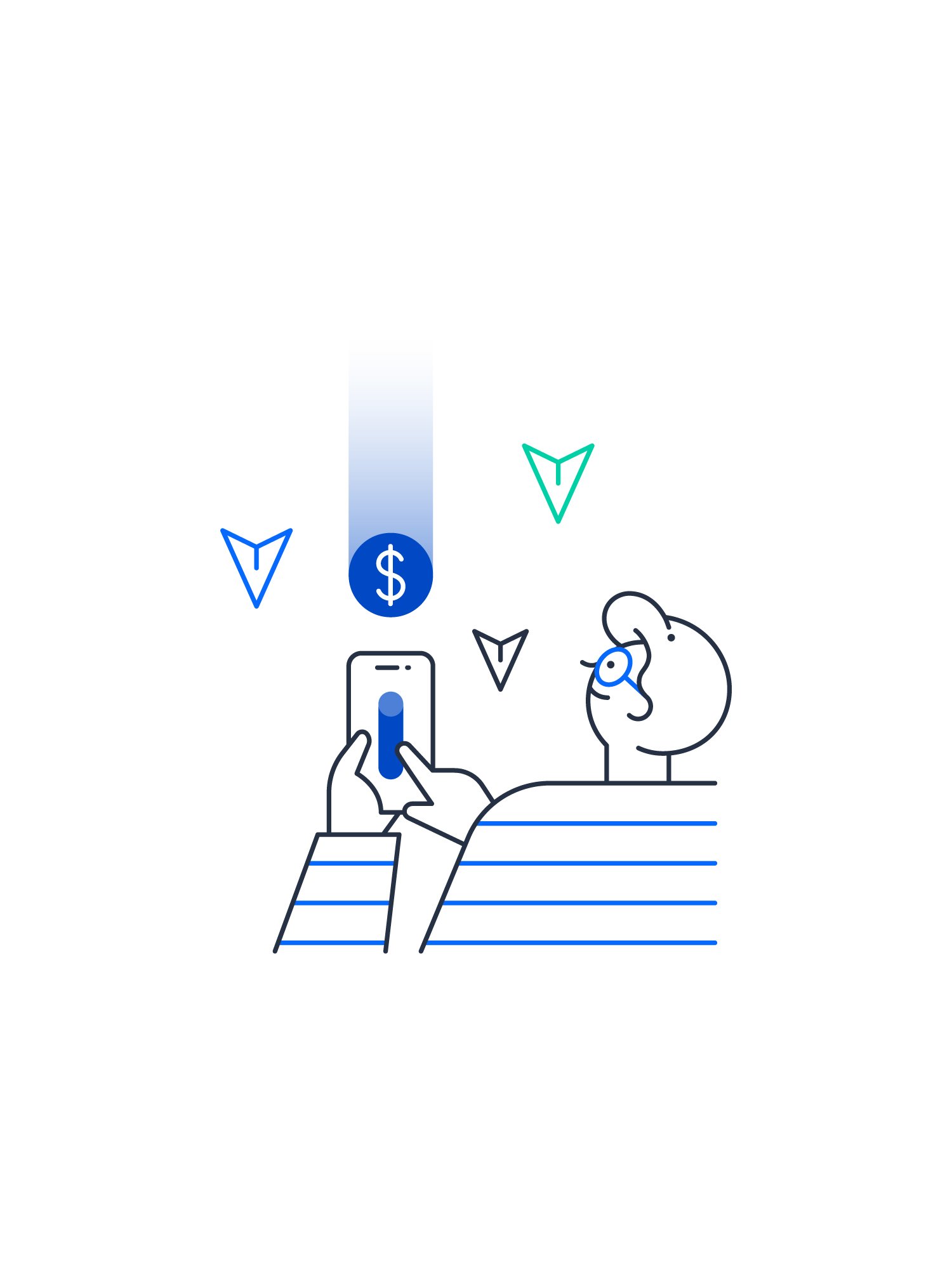
The rest of the visual ecosystem was also revised and rethought, by providing new illustrations, typography, graphic resources, layouts, iconography, motion behavior, and a detailed set of guidelines both for Modo designers and vendors’ teams.

The key
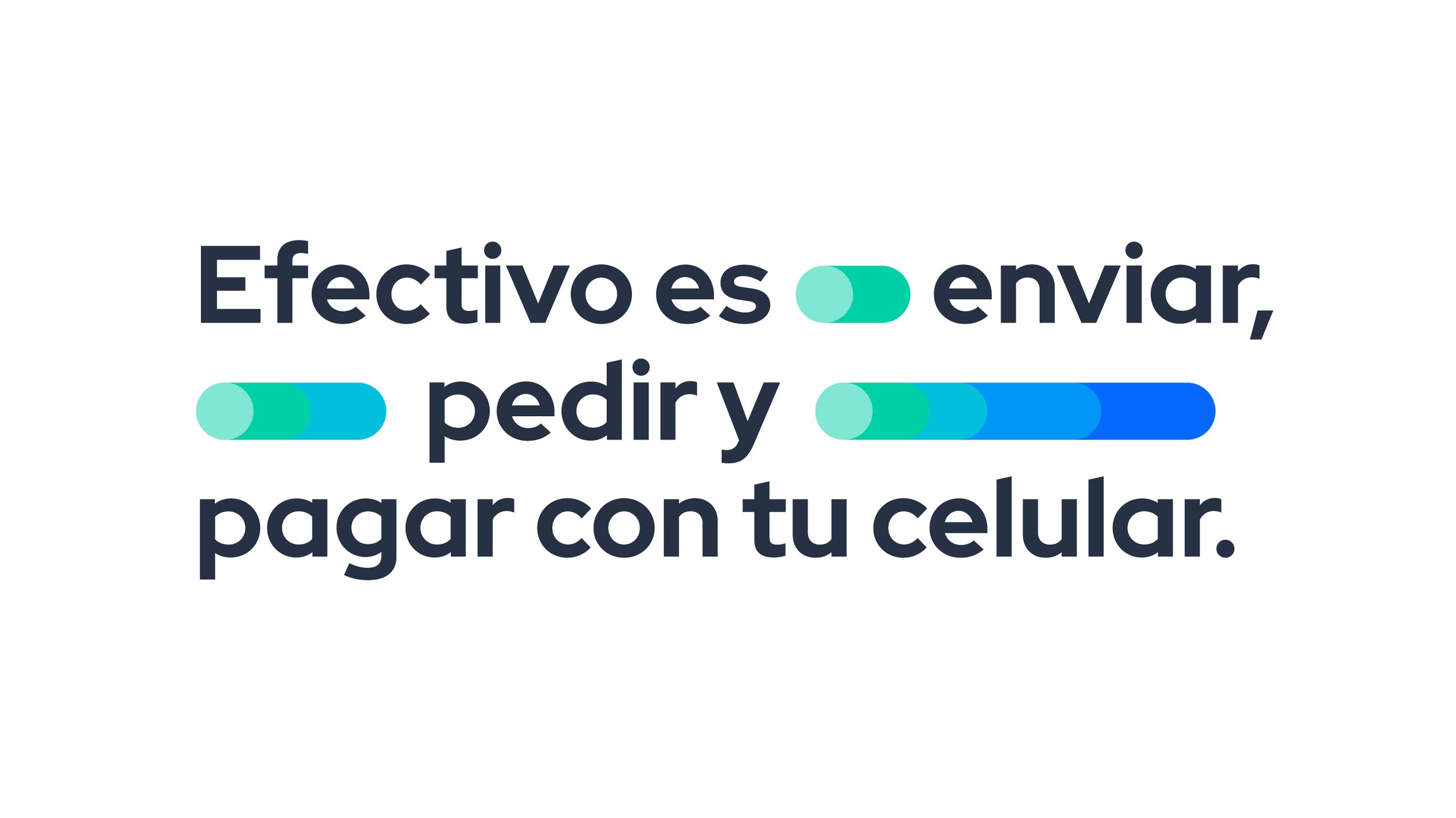
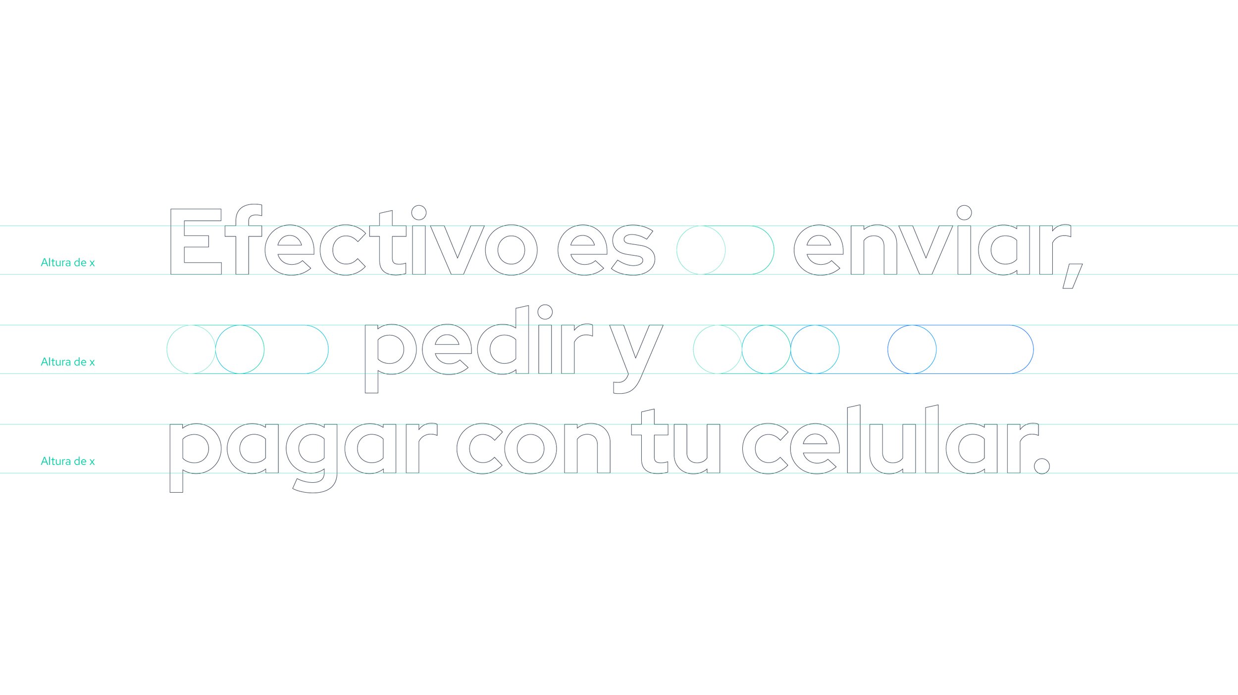
Modo’s new swipe concept became a new key element for the brand's overall experience. It is the cornerstone around which all visual signs revolve, and the starting point for every new concept or brand application.
This element not only is a graphic resource but a gesture for influencers in social media, actors in TV commercials, and people at the store's checkout, who know that a vertical swipe means paying with Modo.
With this resource and the new ecosystem tools, Modo’s designers and vendors are now able to quickly –and smartly– solve from daily-life communications to social media campaigns, app functionalities, and events to street interventions, and out-of-the-box brand applications.


© Motion graphics were developed by Baez.tv. Campaign photographs were provided by Modo.
Other projects you may like: