
Front
Invest without a degree
Front is a project developed by economists for everyday people — focused on giving the opportunity to invest in a safe, reliable, and easy way to those who are not experts in the field. Following its objective of building confidence for first-time investors, we developed an approachable, and friendly visual identity with a powerful, charismatic, and strong verbal identity.
Client: Front
Year: 2016
Country: Argentina
Sector: Corporate
Strategy
Positioning
Branding
Visual Identity
Brand Applications
Iconography


The Challenge
To create a brand framework capable of representing a ‘New kid (on the investment market’s) block’ by introducing a warm, human component to a brand segment saturated by corporate blue-ish brands. Also, to quickly establish a connection with the audience — reinforcing the idea that being casual or cool shouldn't mean being risky or clumsy when it comes to business.


What we did
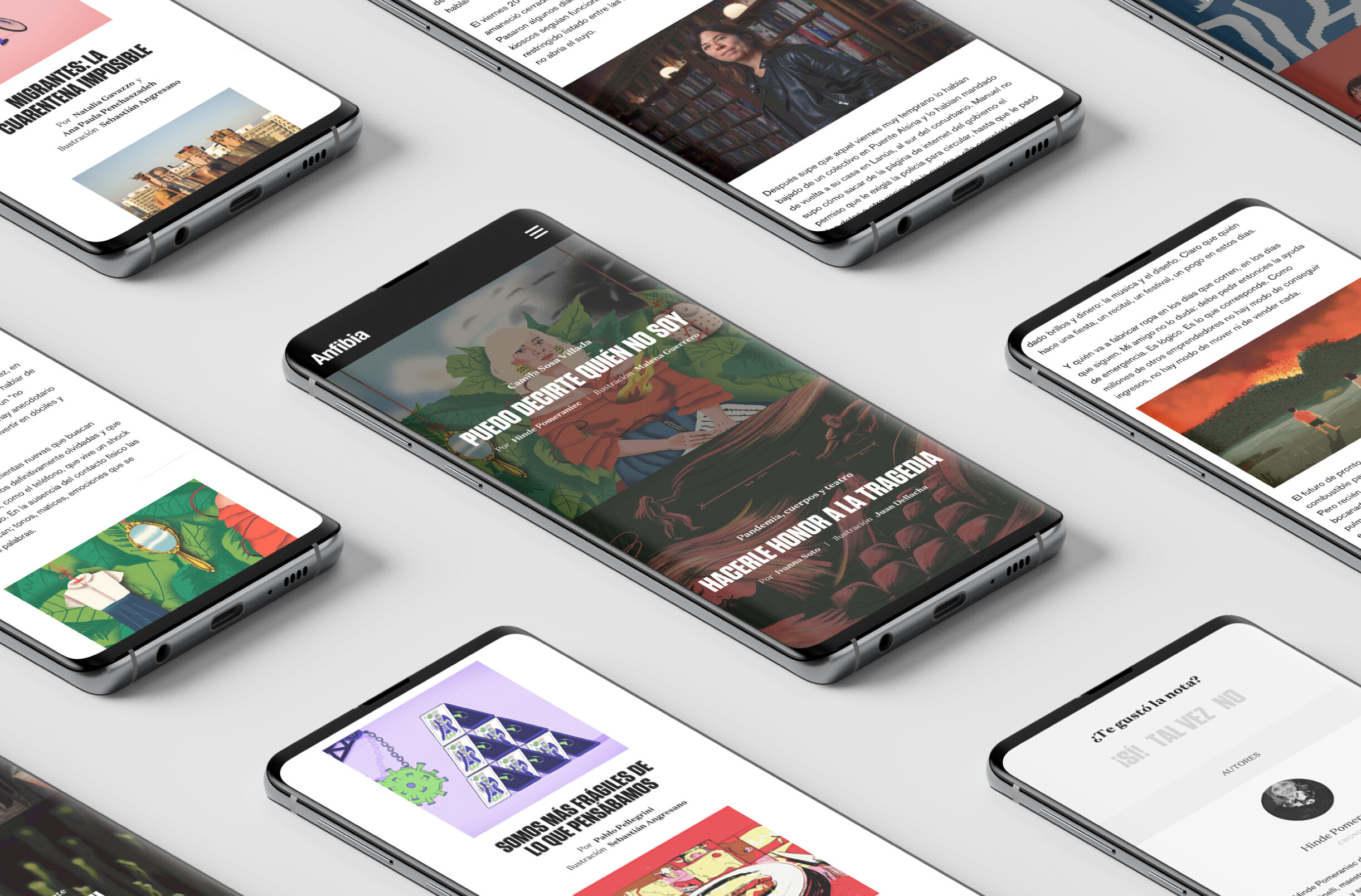
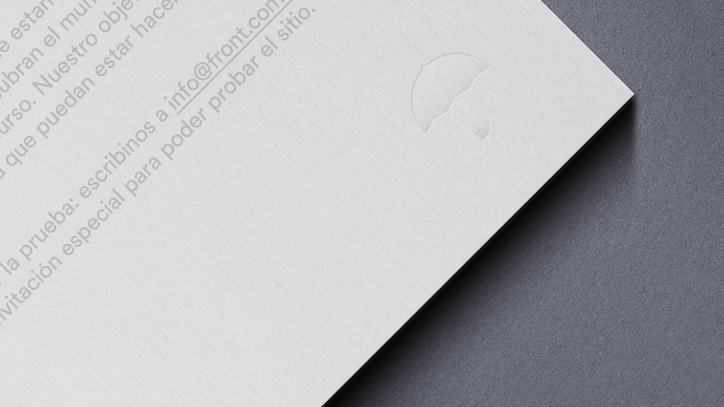
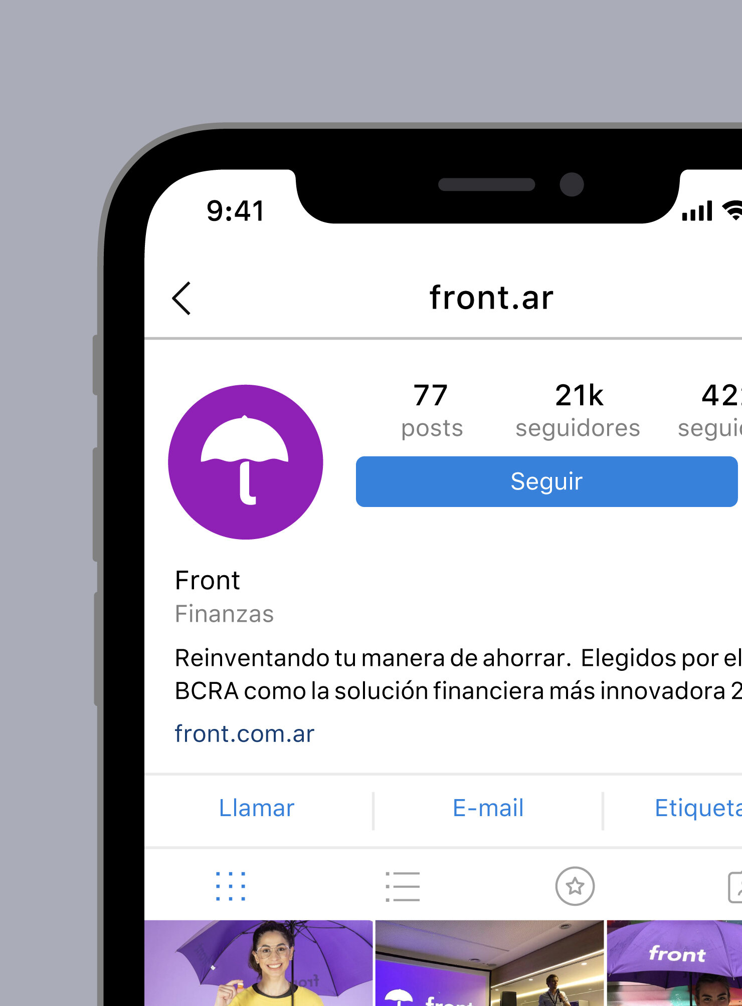
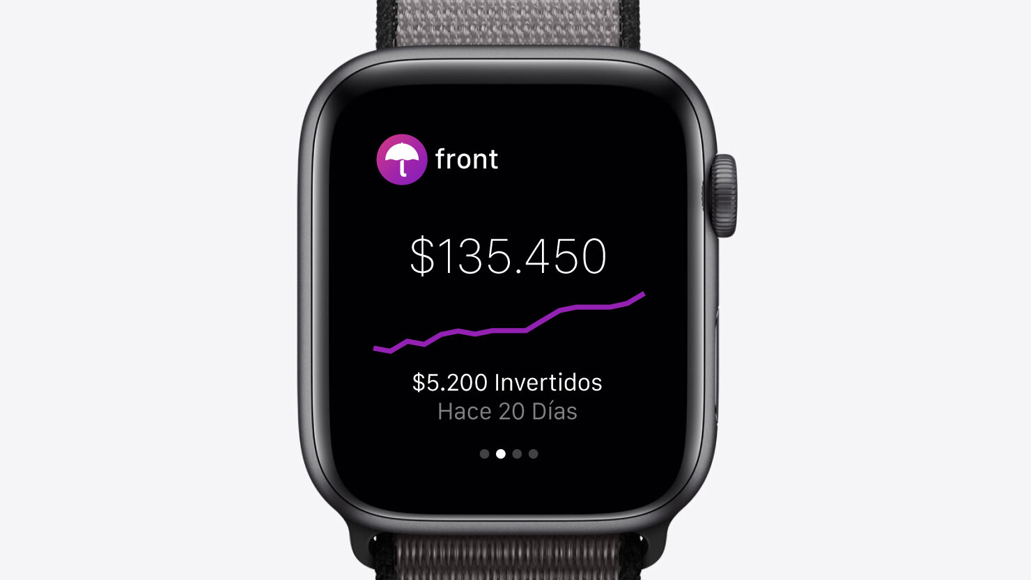
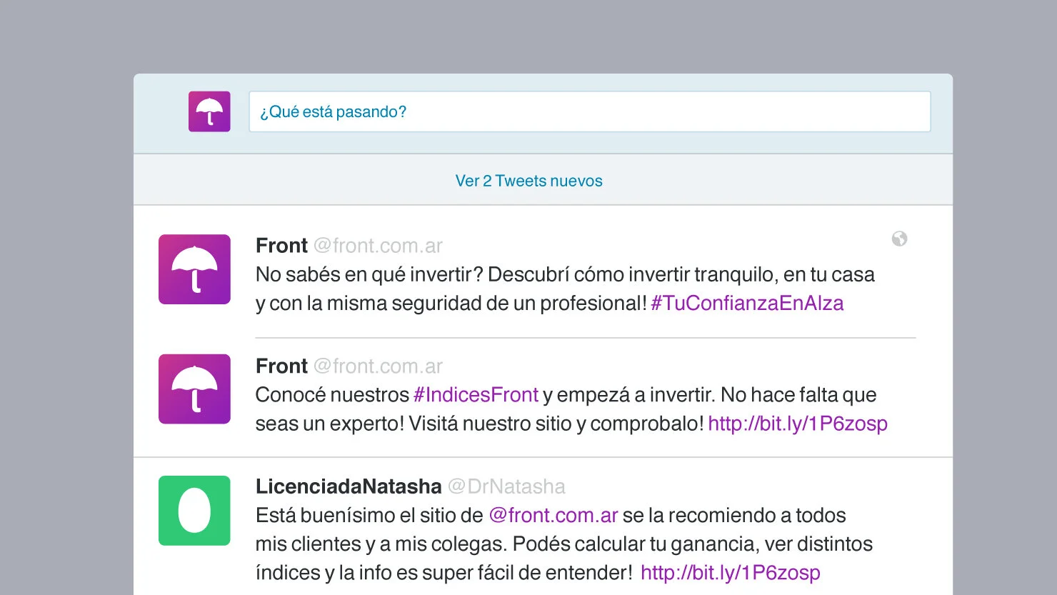
We delivered a friendly and funky brand that breaks away from the brand segment's stereotypes by adopting vibrant colors and reinterpreting traditional brand signs with different approaches and meanings. The wordmark is simple and straightforward, combined with the umbrella brand symbol — representing both protection and happiness.☂️
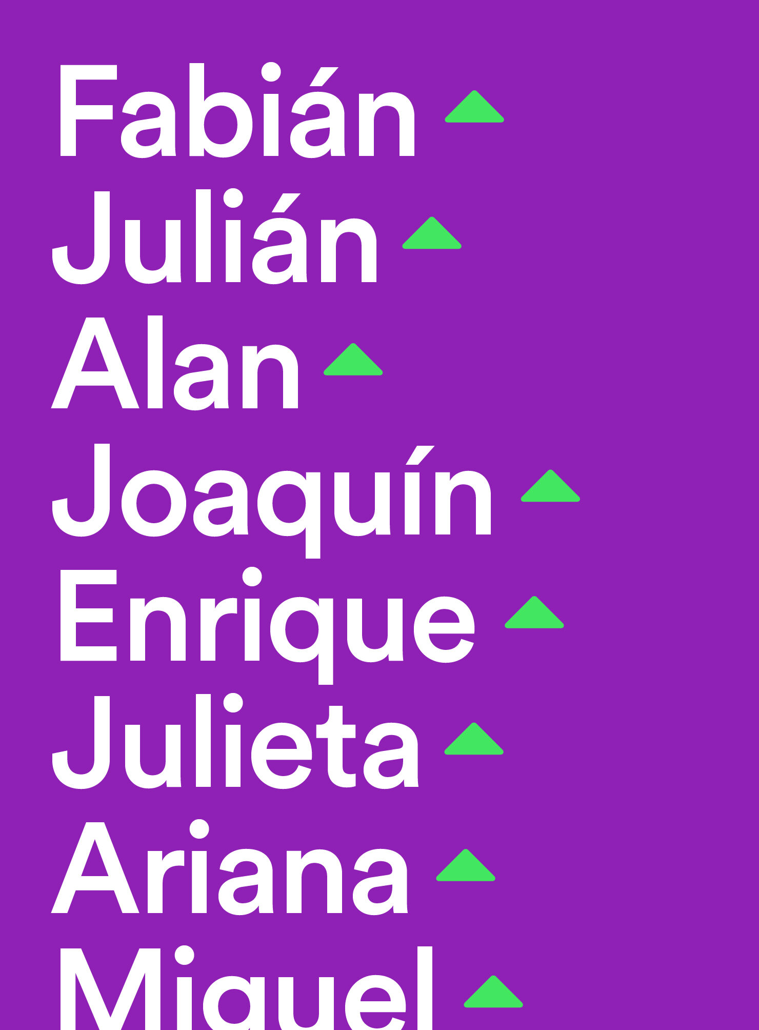
The tone of voice celebrates diversity in ideas, lifestyles, and objectives, while the typography and its usage reinforces the concepts of friendliness and clarity.


Other projects you may like: